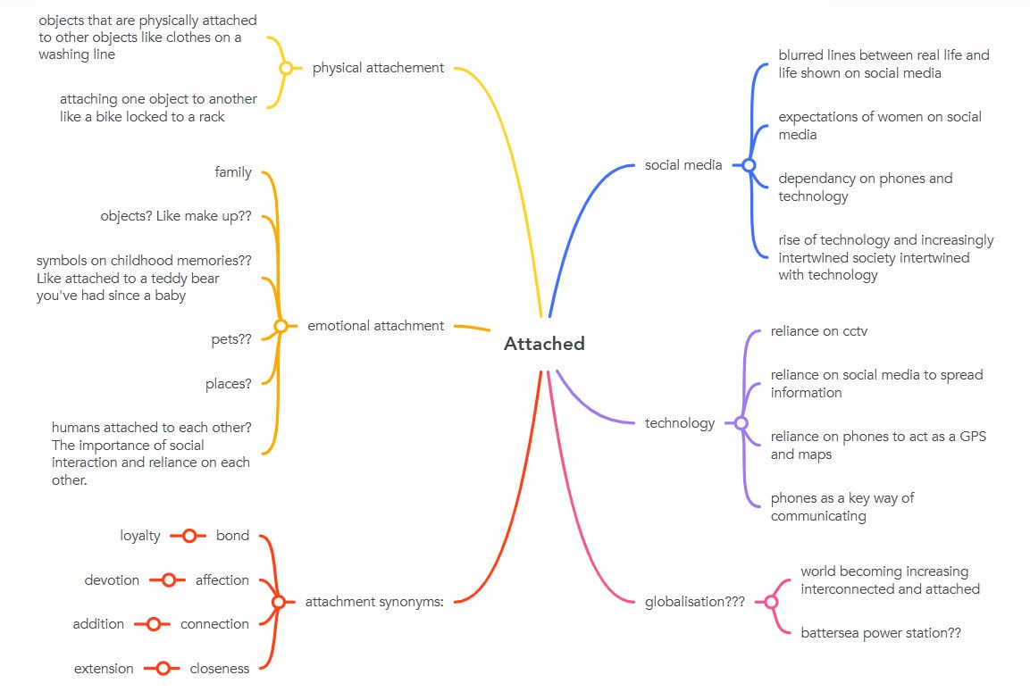
Chosen word: Attached
Definition
- joined, fastened, or connected to something.
"please complete the attached form" - full of affection or fondness.
"during the journey Mark became increasingly attached to Tara" - attribute importance or value to.
"he doesn't attach too much importance to fixed ideas"
Mind mapping ideas
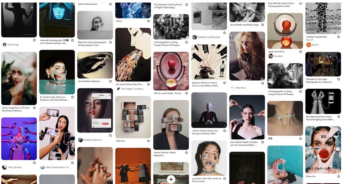
Pintrest board
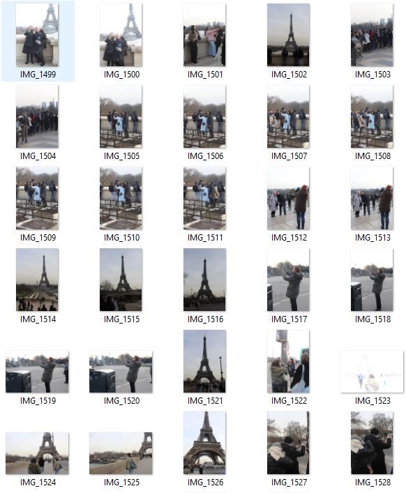
Exhibition Visits
Before I began my project, we went on a trip to Paris to look around different galleries and exhibitions to gain inspiration for our upcoming project. As I went around these different galleries, my main aim was to find artists and pieces that related to my exam word attachment, and more specifically attachment to technology which was the strand I knew I wanted to develop and explore. Below I have displayed some of the most interesting and inspiring artists and exhibitions that I visited.
Pompidou Centre
The Centre Pompidou, designed by Renzo Piano and Richard Rogers, is a 20th-century architectural marvel, immediately recognizable by its exterior escalators and enormous coloured tubing. It is home to the National Museum of Modern Art and is internationally renowned for its 20th and 21st century art collections. The works of iconic artists are displayed chronologically over two sections: the modern period, from 1905 to 1960 and the contemporary period, from 1960 to the present day. There was lots of interesting work here, and I came across a key photographer who inspired my entire project. I came across a piece by Kiki Kogelnic, an Austrian painter and sculptor. The piece was called 'Woman with an artificial heart', and depicts a female body in machine form. She links technology with feminism, commenting on the increasingly industrial society the artist was living through, and the connection between humans and technology, which came to be a key theme of my project responding to the title 'Attached'.
Maison Europeenne de la Photographie
The Maison Européenne de la Photographie, located in the historic heart of Paris, is a centre for contemporary photographic art opened in February 1996. The exhibition on show was the work of photographer Zanele Muholi, who's work I have looked at before in a previous exhibition I visited. Muholi is a South African visual activist and photographer. For over a decade they have documented black lesbian, gay, bisexual, transgender and intersex people’s lives in various townships in South Africa. Responding to the continuing discrimination and violence faced by the LGBTI community, in 2006 Muholi embarked on an ongoing project, Faces and Phases, in which they depict black lesbian and transgender individuals. While not directly linked to my attachment project, I am extremely inspired by Muholi's work, seeking to "to re-write a black queer and trans visual history of South Africa for the world to know of our resistance and existence at the height of hate crimes in SA and beyond." Their powerful portrait photography is something I will be taking into my project going forward, the ability to create such powerful commentaries and statements through such clear, simple portraits.
Anika Yi - Biologizing the Machine (tentacular trouble)
I visited an exhibition created by Korean-American artist Anicka Yi, titled 'Biologizing the Machine (tentacular trouble)'. Destabilising boundaries between the organic and the synthetic, science and fiction, human and non-human, Anicka Yi’s protean creations are what the artist describes as the “biopolitics of the senses”. This body of work centres on recent enquiries into “biologizing the machine” as she focuses in on the sensorium of the machine and contemplates how new channels of communication can be established between artificial intelligence (AI) entities and organic life forms. This series was very inspiring to me, and links in closely with my theme of attachment to technology as it considers the ever blurring lines between AI, and real life. She contrasts nature with machinery and technology, emphasizing how far technology and mechanisation has come in the past century.
David Salle - Tree of life |
'Chernobyl', 2011 - Diana Thater |
|
The exhibition presented paintings from his most recent ongoing body of work, the Tree of Life series. In these paintings, Salle creates a Garden of Eden rife with canonical symbolism and moral conflict. The juxtaposed protagonists are drawn from the work of illustrator Peter Arno, whose cartoons exemplified the sophisticated visual style associated with The New Yorker magazine at mid-century. The lower panels serve as visual counterpoints to the action above ground, representing certain art historical "roots," the idea of the subconscious, and the past. Together, they continue David Salle's legacy as a master of postmodern painting known for his deconstruction of images and uncanny compositional instinct. One thing that really stood out to me in his series was the use of colour, bright and a cartoon-like style, and this is definitely something that inspired parts of my project.
|
Diana Thater is an artist who lives and works in Los Angeles, California. For this work, Thater spent time in the ‘Zone of Alienation’ which surrounds the site of the nuclear disaster, filming the eroded architecture and wildlife of the one-hundred mile wide radioactive territory. The animals she films have managed to survive amid the devastation of the only existing post-human landscape, demonstrating a wilderness of man’s making. Through this installation, visitors will experience a world where a man-made catastrophe has abruptly halted all progress and animals inhabit an irradiated landscape. Overlaying physical and filmic spaces, Thater confronts the successes of civilisation with its profound failure. This links to my theme as it explores the relationships between man made disaster and nature, and I will be exploring the relationship between technology (man made) and humans (natural beings).
|
|
|
|
Mathilde Denize: Never Ending Story
Mathilde Denize's practice is oriented towards painting, installation work, sculptural composition, performance, and video. Denize's work is born from a desire to make meaning emerge from a fragmented present. Her garments, which often resemble a sexualized female form, act as both armour and camouflage. Her paintings are an open diary, punctuating and dialoguing with her sculptures. With subtle gestures, Denize constitutes a set of forgotten and anonymous forms, witnesses of a contemporary archelogy. Mathilde Denize's costumes are but illusion and appearance. They are not civilian, everyday, urban, or theatrical costumes. They are, at most, apparel for an exceptional ceremony for which only the artist knows the date of the performance. To see for yourself, look at the Haute Peinture performance from 2019. On bodies reduced to black silhouettes, painted fragments of aborted clothes compose and recompose unrestrained figures, frameless paintings in motion. What I am most inspired by is her abstract style; pastel colours, interesting patterns and tones. This idea of abstract inspired me and is definitely something I will take forward in my project.
Three artist/strand responses
1.) Attachment to objects
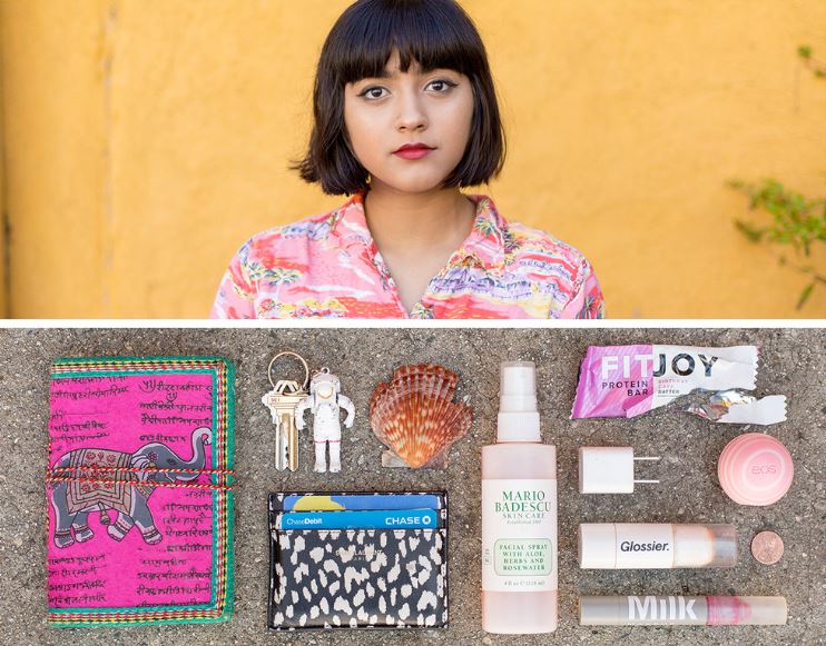
Jason Travis : Persona
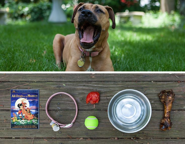
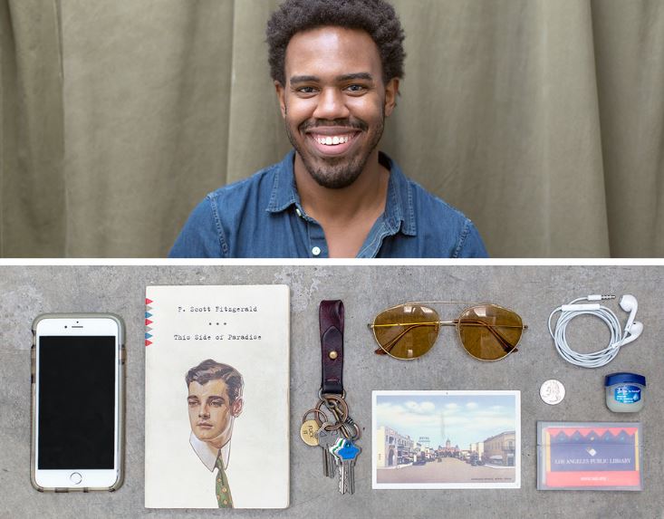
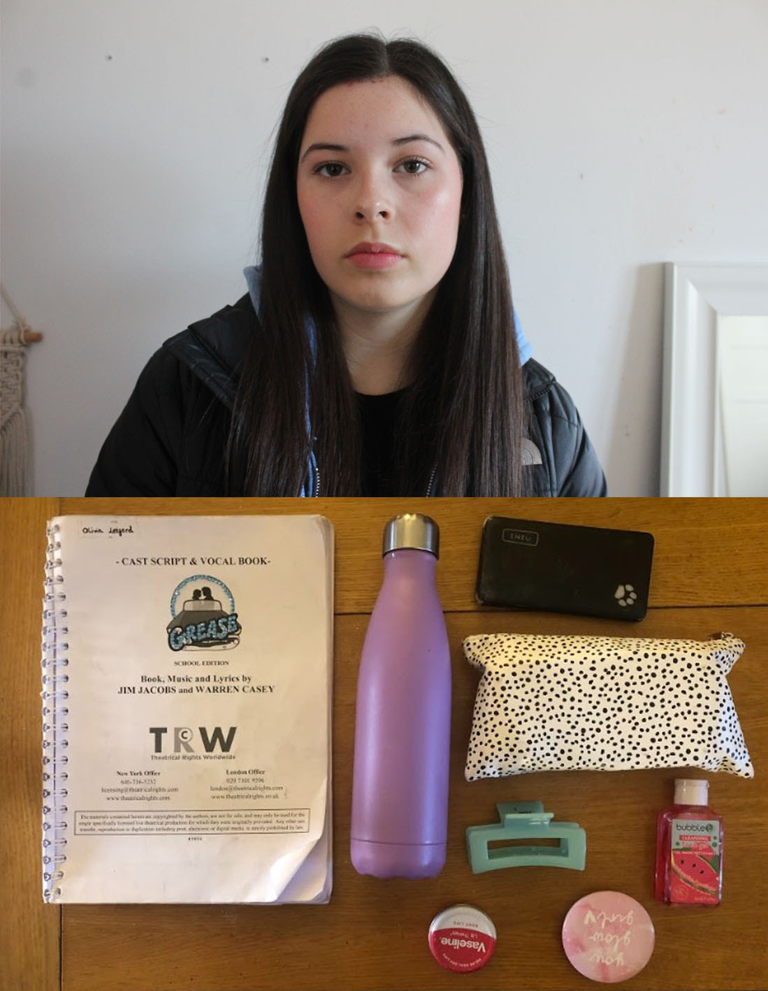
Persona features portraits of people and the things they carry. Travis started the series in the winter of 2007, and has since photographed more than 550 individuals from all walks of life. He photographs a portrait of a person as well as an image of the objects they carry in their bag, in an organised neat group on the floor. He puts the portrait above the objects image, and his series is a beautiful way simultaneously highlight the uniqueness of each person while creating a common connection between all of us, based on what we find important enough to carry. In an interview, upon being asked about the meaning behind the name of the series, he said "Everyone's bags are personal, and their contents give a snapshot of their personality. It can be a reflection of the individual and their appearance to the world." This series really interests me as I think its fascinating this attachment humans have to different objects and items that we carry with us at all times everyday.
|
|
|
Response
In my response to Travis, I took portraits of my family and then the contents of their bags. I think that the items in their bags are quite reflective of who they are and what they do; both my parents are teachers and so in their bags they had pencil cases, notebooks and laptops, and my sister does drama and so she had a script and a pencil case. It's so interesting as a viewer to try and deduct the job or the interests of the person in the image, and I think I have created a solid interesting response to the work of Jason Travis. This work links to my theme of attachment as it portrays the attachment of humans to objects and items. If i were to reshoot this series, one thing I would consider would simply be to photograph more people, in order to create more rounded and diverse series, similarly to Travis.
|

|

|

|
2.) Attachment to place
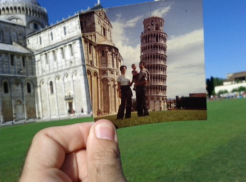
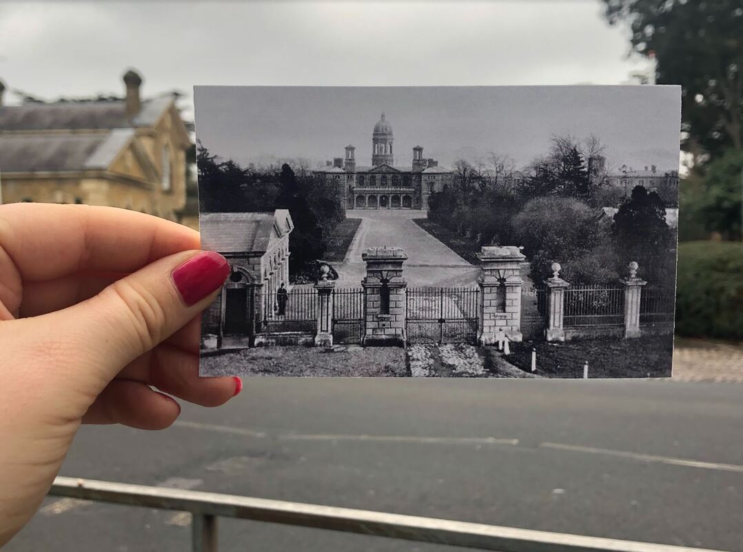
'Dear Photograph' series
Upon brainstorming ideas that link to the word attachment, I came up with the notion of attachment to place. Different places and environments can hold different meanings for different people, and I think its really interesting how simply returning or visiting a certain place and make one feel emotions. I came across a series called the 'Dear Photograph' series, which has been created by hundreds of different collaborators, and depicts a hand holding up an old picture in the same place, perfectly lining it up and creating a kind of illusion. In an article Sarfraz Manzoor considers that the success of Dear Photograph has its roots in our nostalgia for pre-digital technology: there is a crudeness to holding a picture in one hand and photographing it with the other, yet the final image has a potency that cannot be bestowed by Photoshop. I also this this sense of nostalgia is present because of the linking of the past and the present, these old images carry so much memory for people and this kind of recreation and merging them with modern day is actually quite emotive. This links to my theme of attachment as it depicts people sense of attachment to place and reminiscing on old memories captured in photographs.
|

|

|
Response
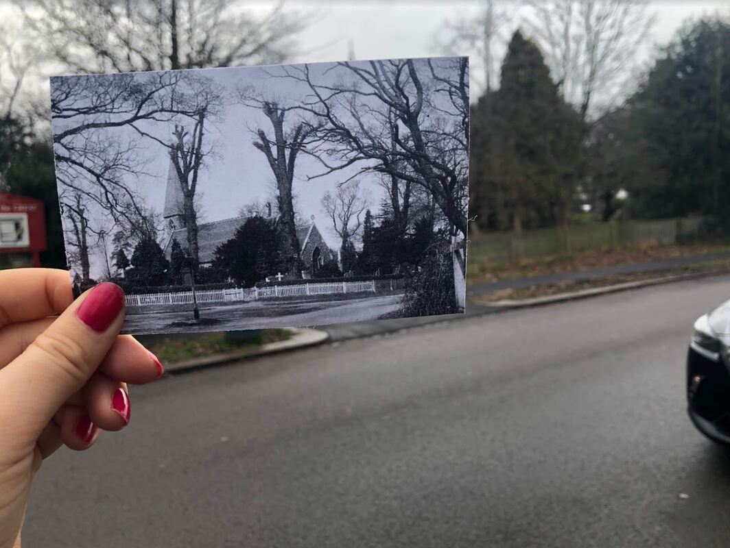
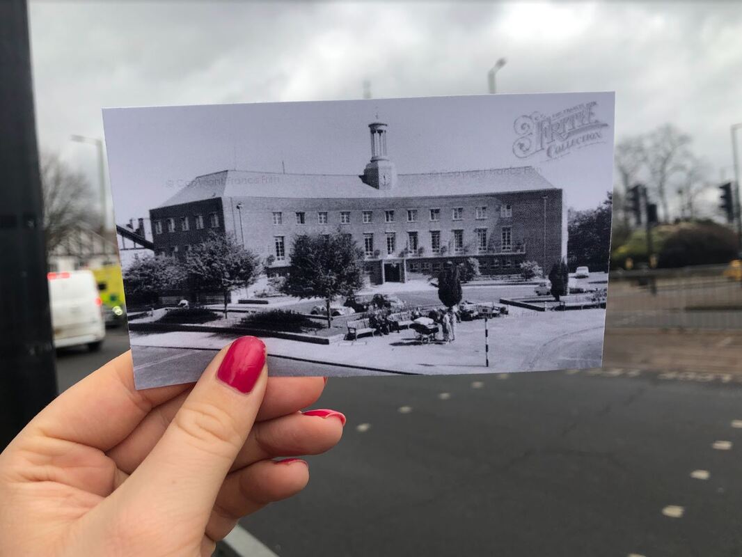
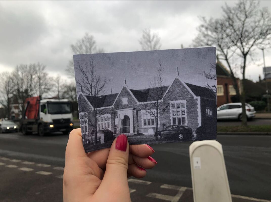
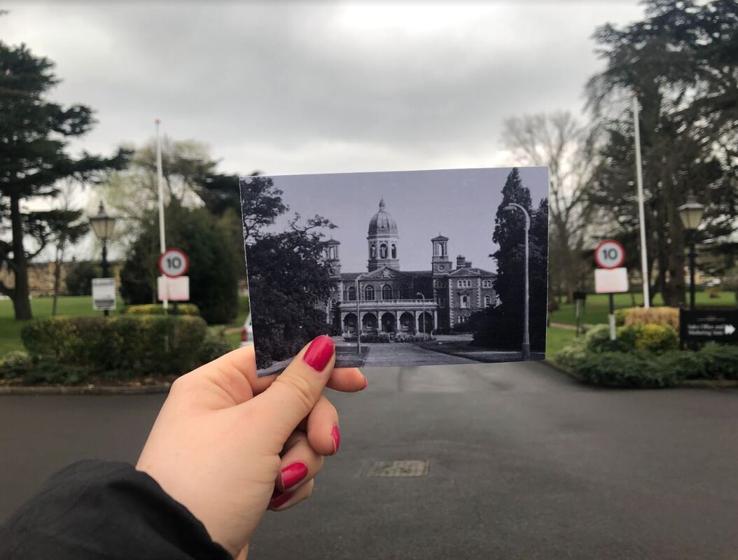
In my response to this series, I decided to photograph my local area, and different spots that stick out in my mind when I think about Friern Barnet. Each place is memorable and recognisable and that is why I chose my different locations. I decided to go online and find some old pictures since I didn't have any as I have only lived here for around 5 years and only ever taken images on my phone which are high quality, and the effect I'm looking for here is a lower older quality image to be inserted into a modern day setting. I printed out these images and walked around my local area, trying to align then images with the real life background. Since I didn't take the original photos, I found it quite difficult to try and perfectly align them, and while I think my response was still successful, if I was to reshoot I would have taken the original images myself and edited them to look old and ancient.
Images I used:
Final images
|
|
|
|
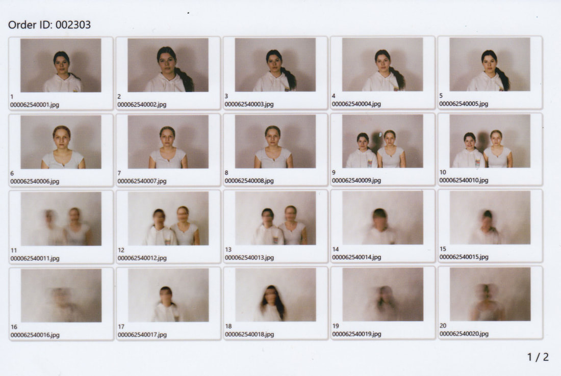
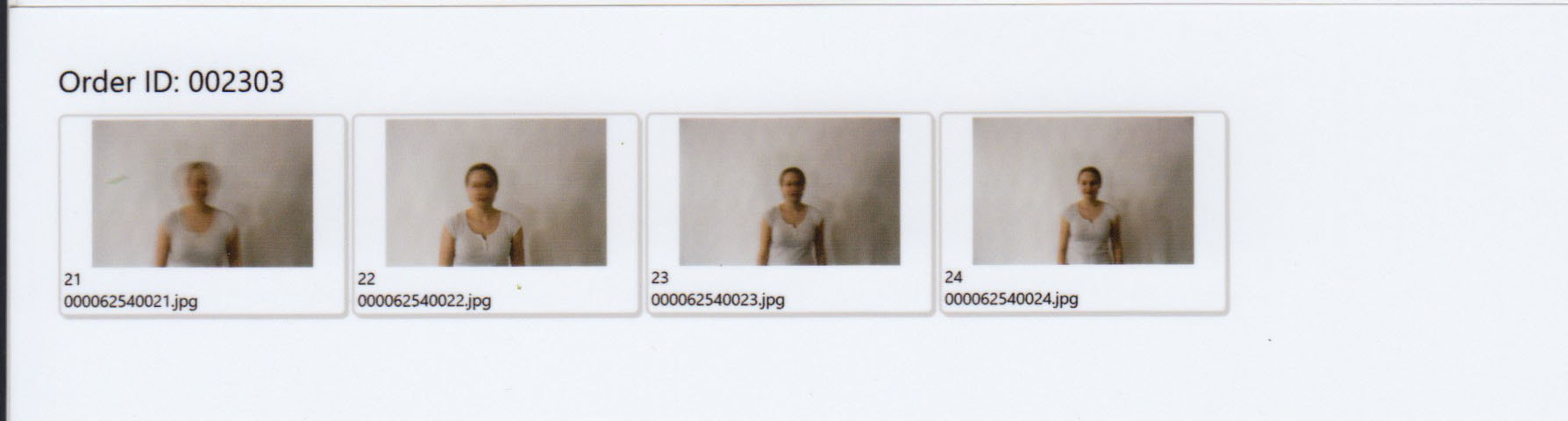
Contact Sheet
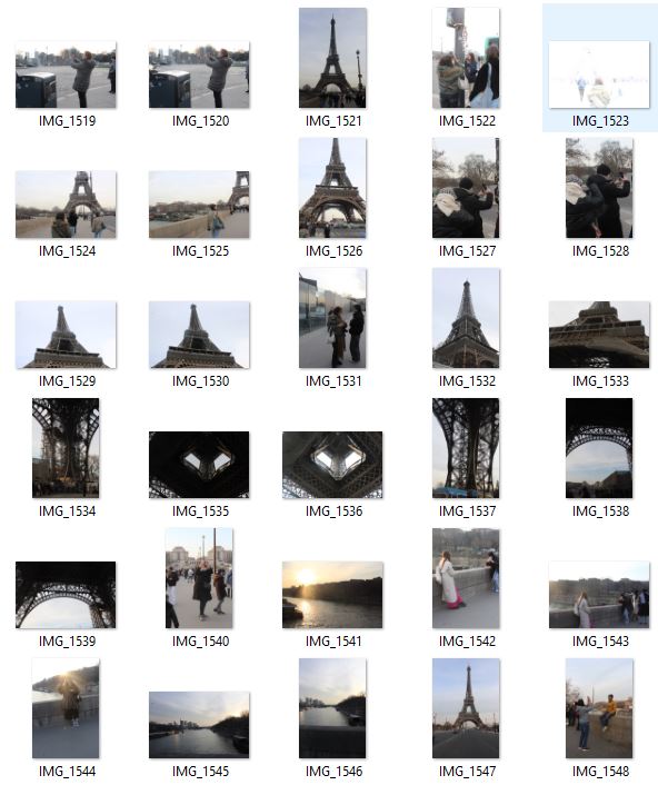
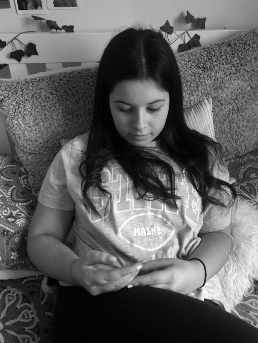
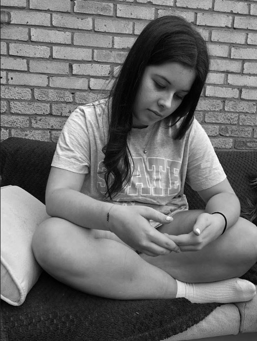
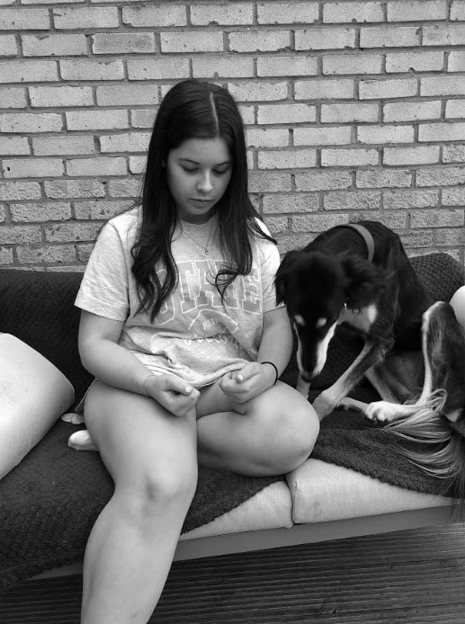
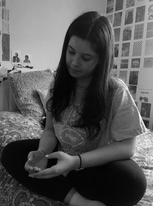
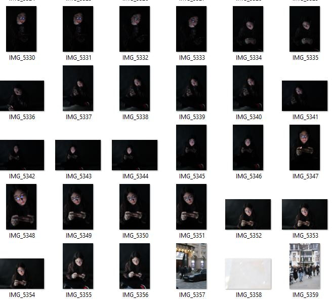
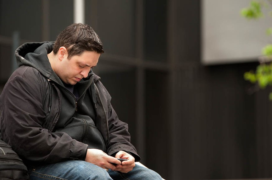
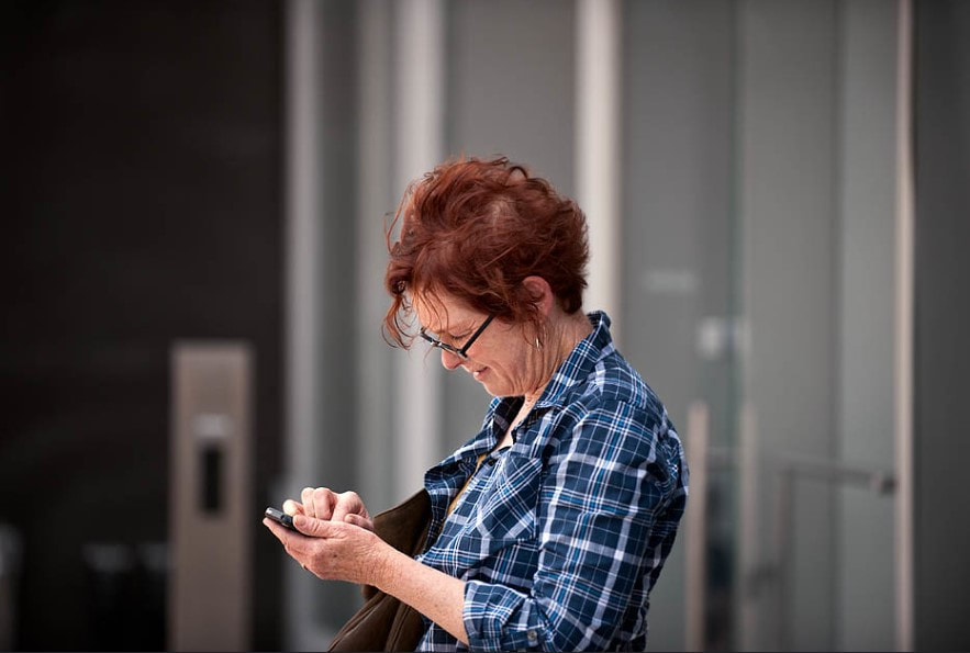
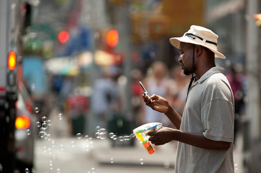
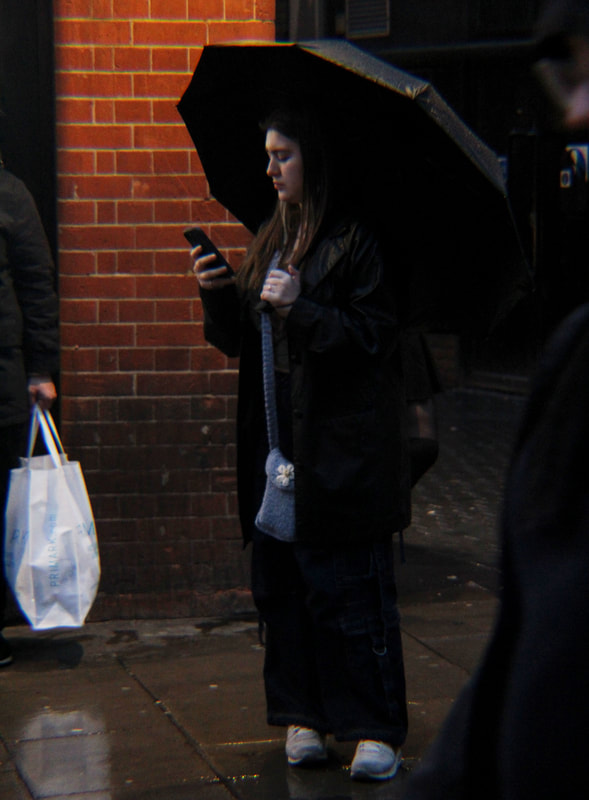
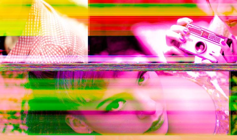
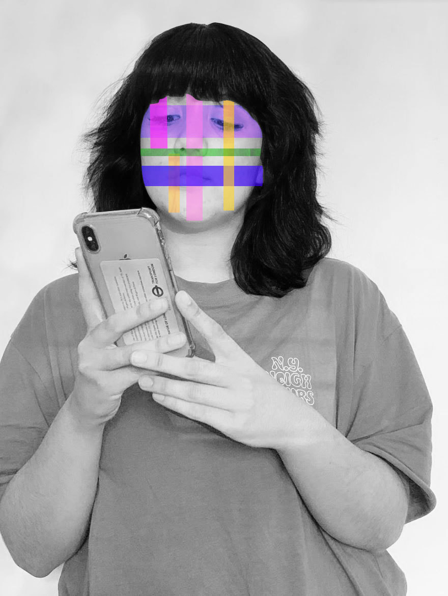
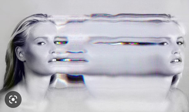
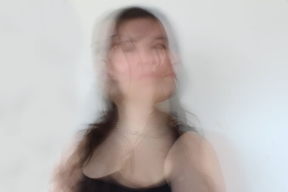
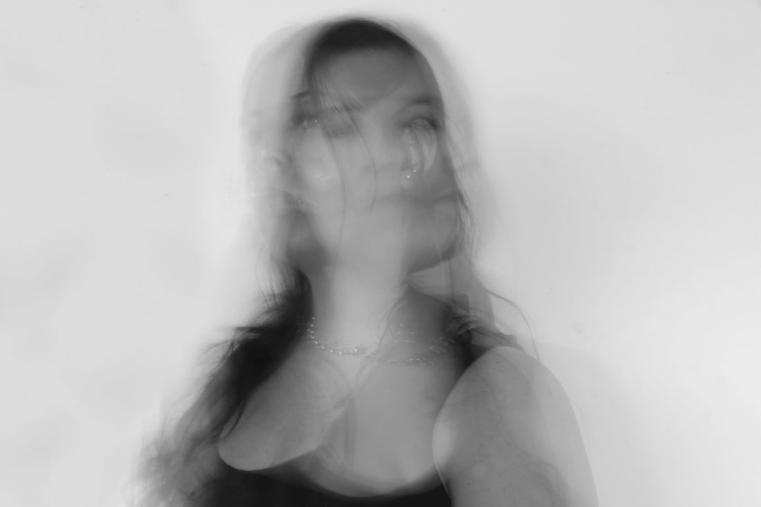
3.) Attachment to technology/social media (chosen to develop)
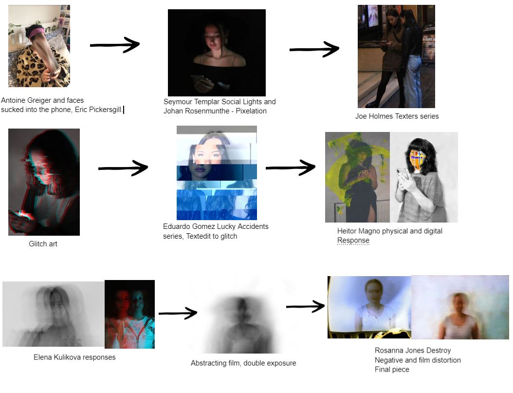
Antoine Greiger
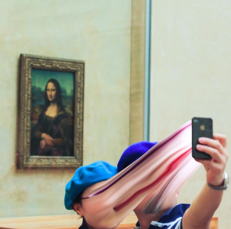
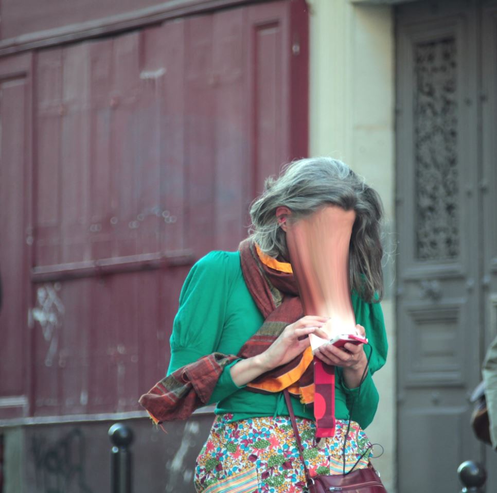
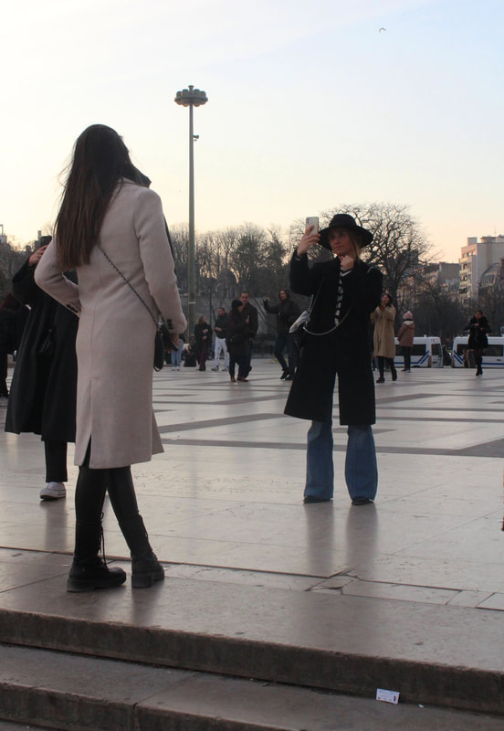
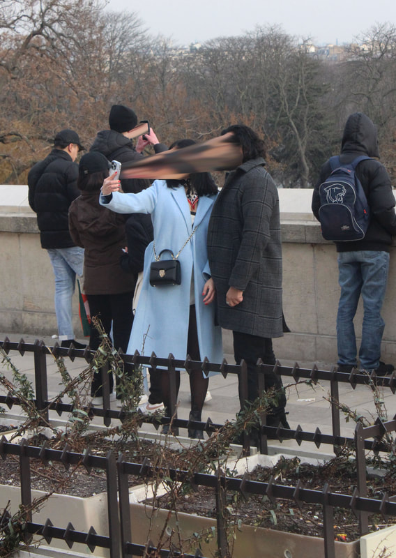
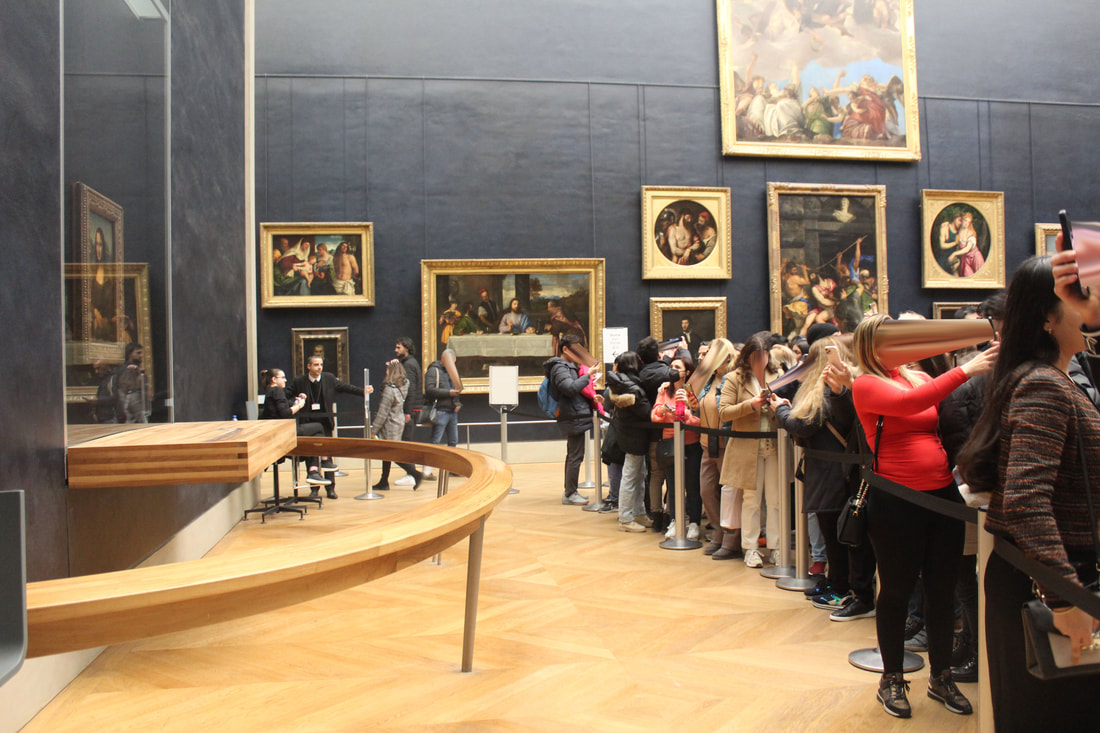
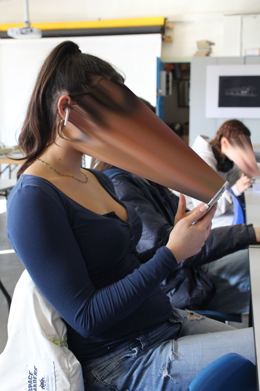
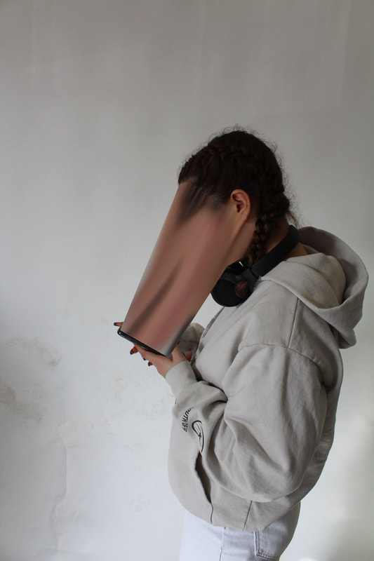
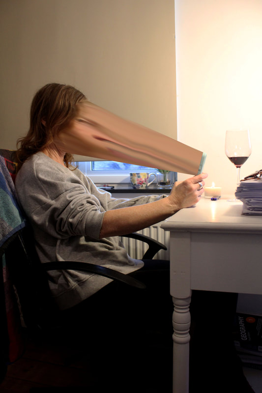
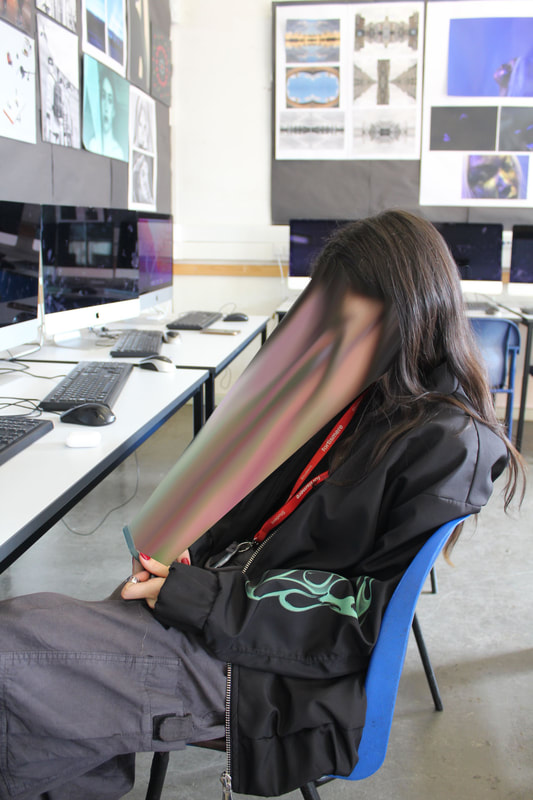
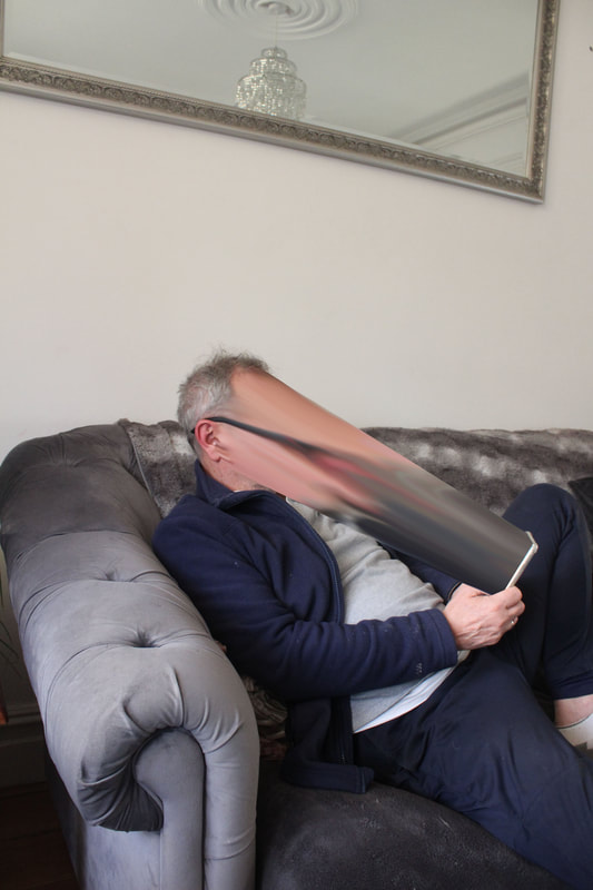
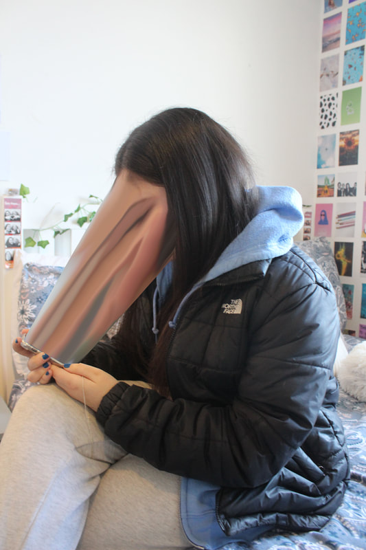
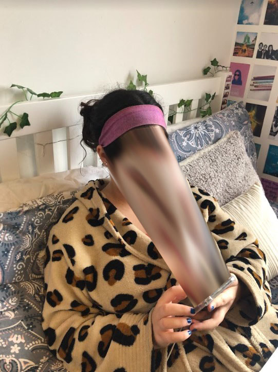
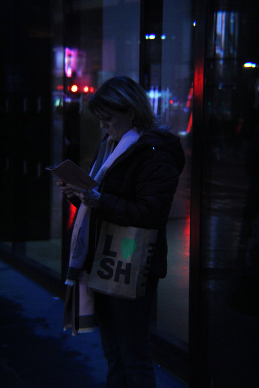
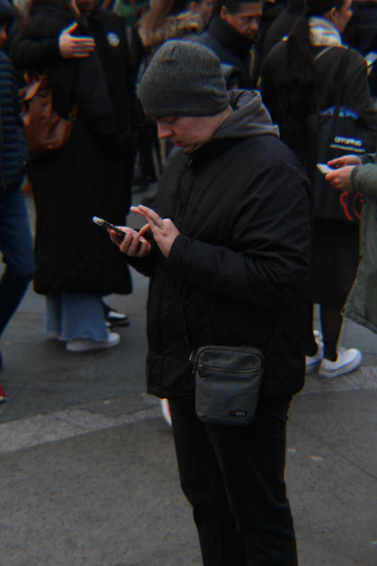
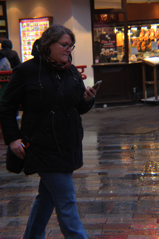
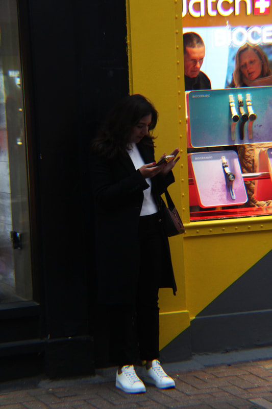
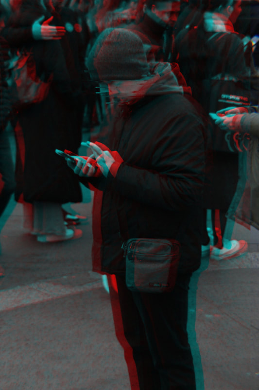
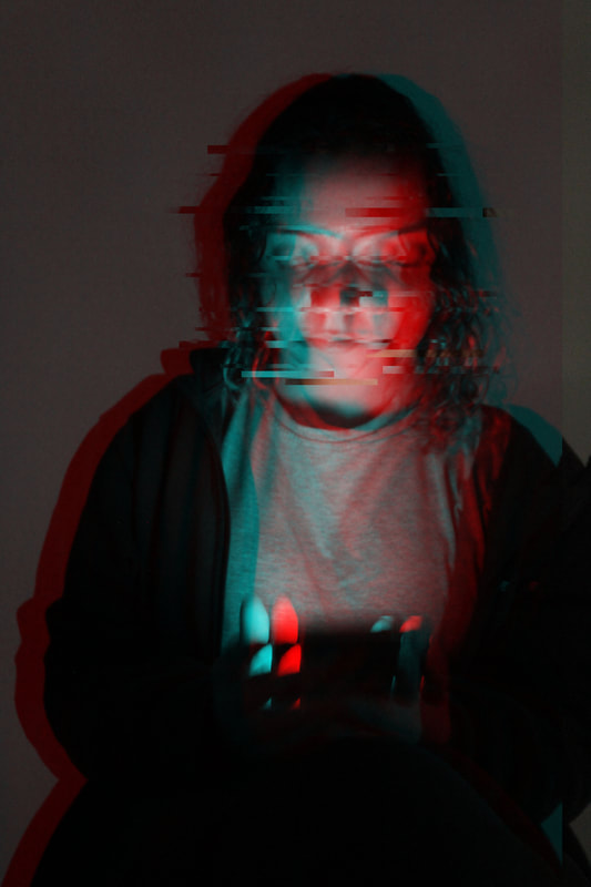
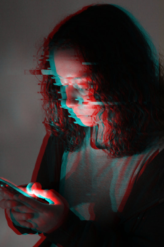
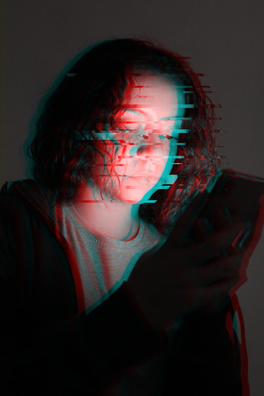
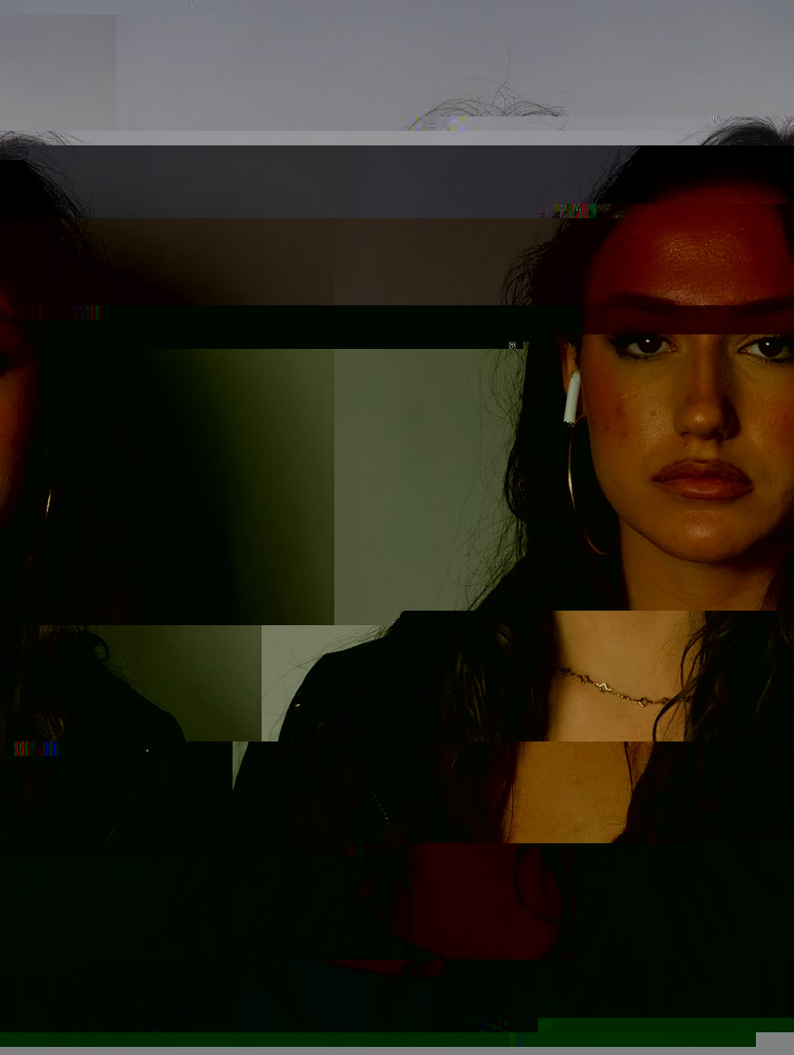
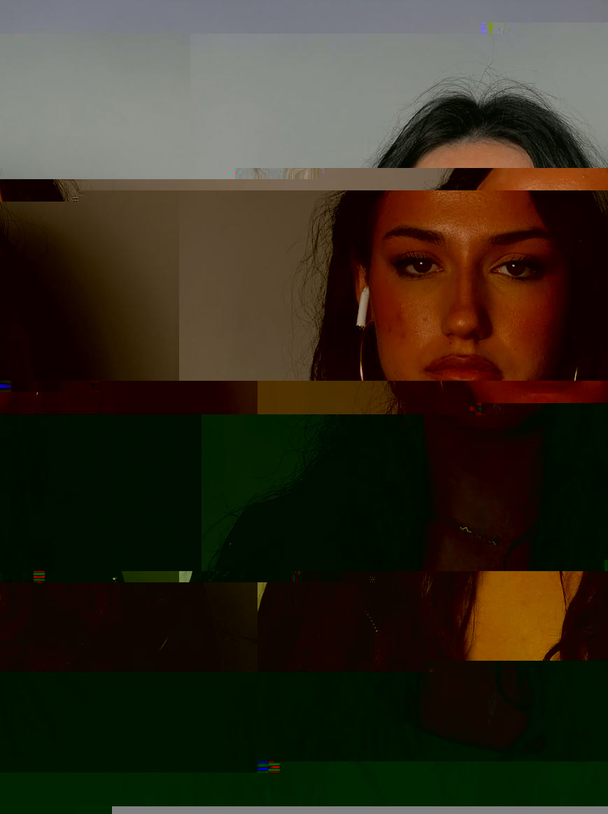
For my third strand I decided to focus on the relationship and attachment between humans and technology, and I was inspired by Antoine Greiger's series 'Sur-Fake', which comments on the inherent attachment of humans to their phones. Our increasing dependence on the information devices constantly stuck to our hands was the inspiration for the series, and the series consists of a group of digitally altered photographs depicting random people being sucked into the screens of their phones. The blur imposed by Photoshop completely masks any emotion once seen on the subject’s face, rendering each a personality-less drone. This series was shot in different famous landmarks and areas in Paris, and as I was going on a trip to Paris I thought I could create some interesting responses that take inspiration from Greiger's work. There's an irony in that people travel from all different places to visit these famous landmarks, and the first thing they do when they see them is to take a photo or film it, rather than see it through their own eyes. This idea that our phones suck our attention is clearly depicted in this series, and the sense a attachment is present and clear.
|
|
|
Response
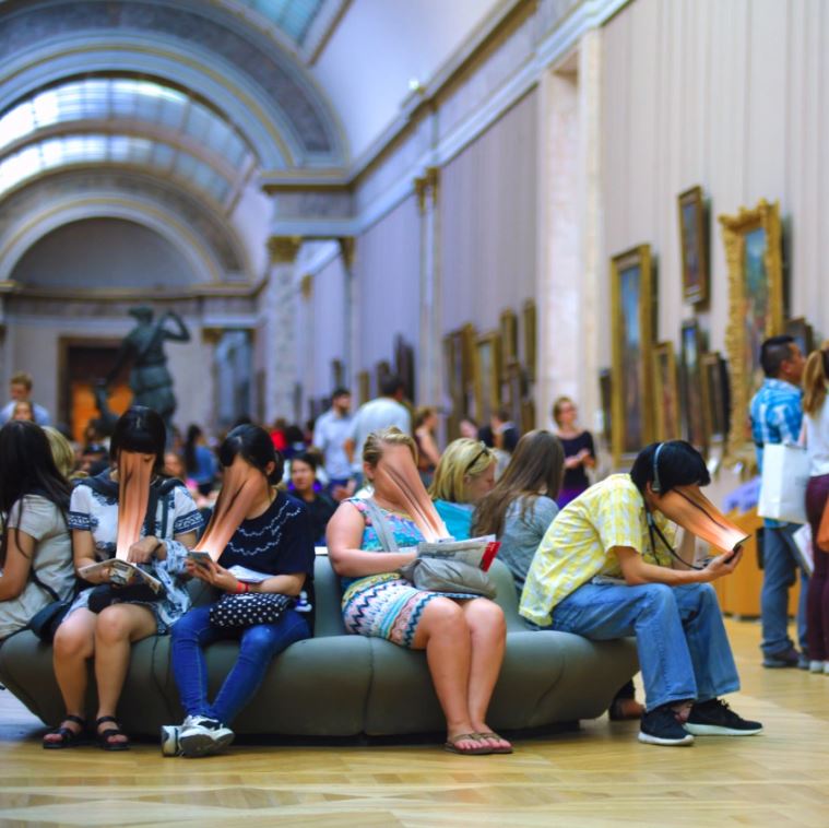
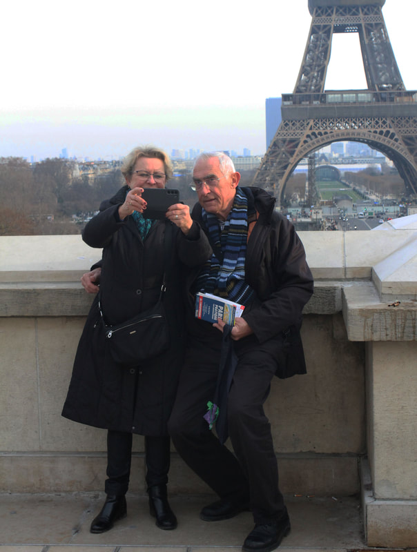
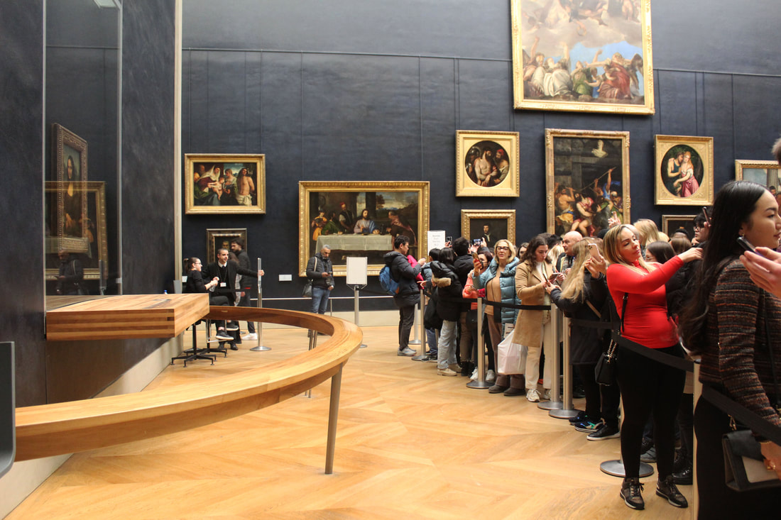
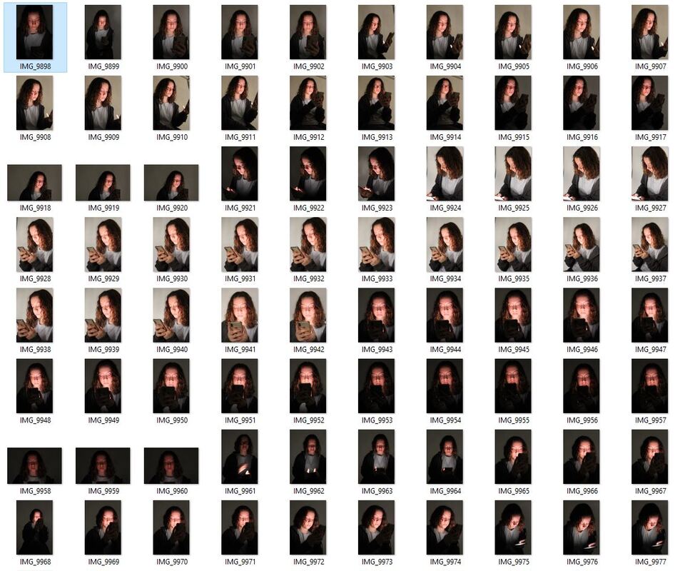
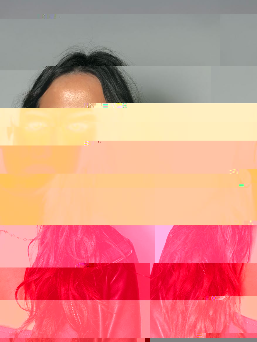
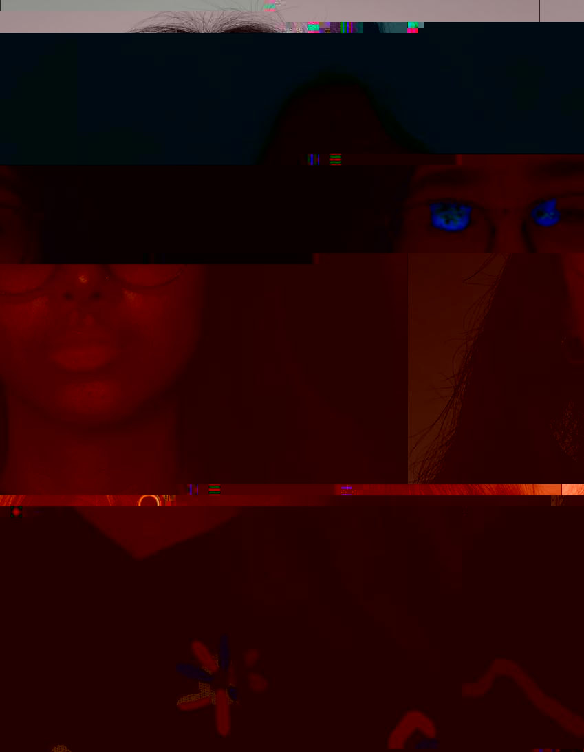
In terms of my response, I began by taking photos of people taking photos by famous Parisian landmarks, such as the Eiffel Tower, the Louvre and the Mona Lisa. I tried to capture both the famous landmark as well as the people on their phones, in order to capture their attention being distracted by the technology. There's a kind of irony in traveling to see these places in real time, and then the first thing you do is take a photo, or be distracted by your phone. My aim was to capture the power and absorption of people and their phones, and so I went through my images and picked the best ones that depict my aims. Below are my best original images that I decided to edit. I have also displayed my editing process below, and on photoshop I used the lasso and smudge tool to blend the faces into peoples phones, creating this illusion of them being sucked in and completely absorbed. I think this editing is really effective and I think my first response overall is successful. One thing that I think could have been improved is my exposure, I think some of these images re slightly overexposed, and so I would lower the exposure in order to create less brighter images. I also think some images do have a slight blur, and so so moving forward I might consider using a tripod to shoot in order to avoid blur. Potentially I could have improved my composition as well, some photos were a bit awkward to edit as the angles I shot of people looking at their phones were a difficult to edit. Next time I will make sure I shoot people looking down at their phones.
Original images

|
|

|
|

|

|
Editing Process
Edits
|

|

|
|
Contact sheet
|
|
Development 2
Upon reflecting on my first development, I decided to re respond to Greiger's work. I found that in my previous response often the angles that people were looking at their phone were a bit awkward to edit and didn't really have as much of a dramatic effect that I was hoping to achieve. So I decided to shoot some new images of people specifically looking down at their phones, which is a much more effective angle. I think these images with only one or two people in are much more effective than those with big crowds, as it really places focus on the single persons' distraction and while being much more of a close up portrait, it also creates a sense of greater anonymity and loss of identity. What's effective is the everyday setting I shot these photos in, as it reveals how phones and technology are so intertwined in our personal everyday lives and routines. My composition really helped to support my response here, as it was something I wanted to work on after my last development, and making sure that the models were facing down at their phones really made the editing process much easier, and made the final edited photos much smoother and neater.
|
|
|
|
|
|

|
|
Development 3
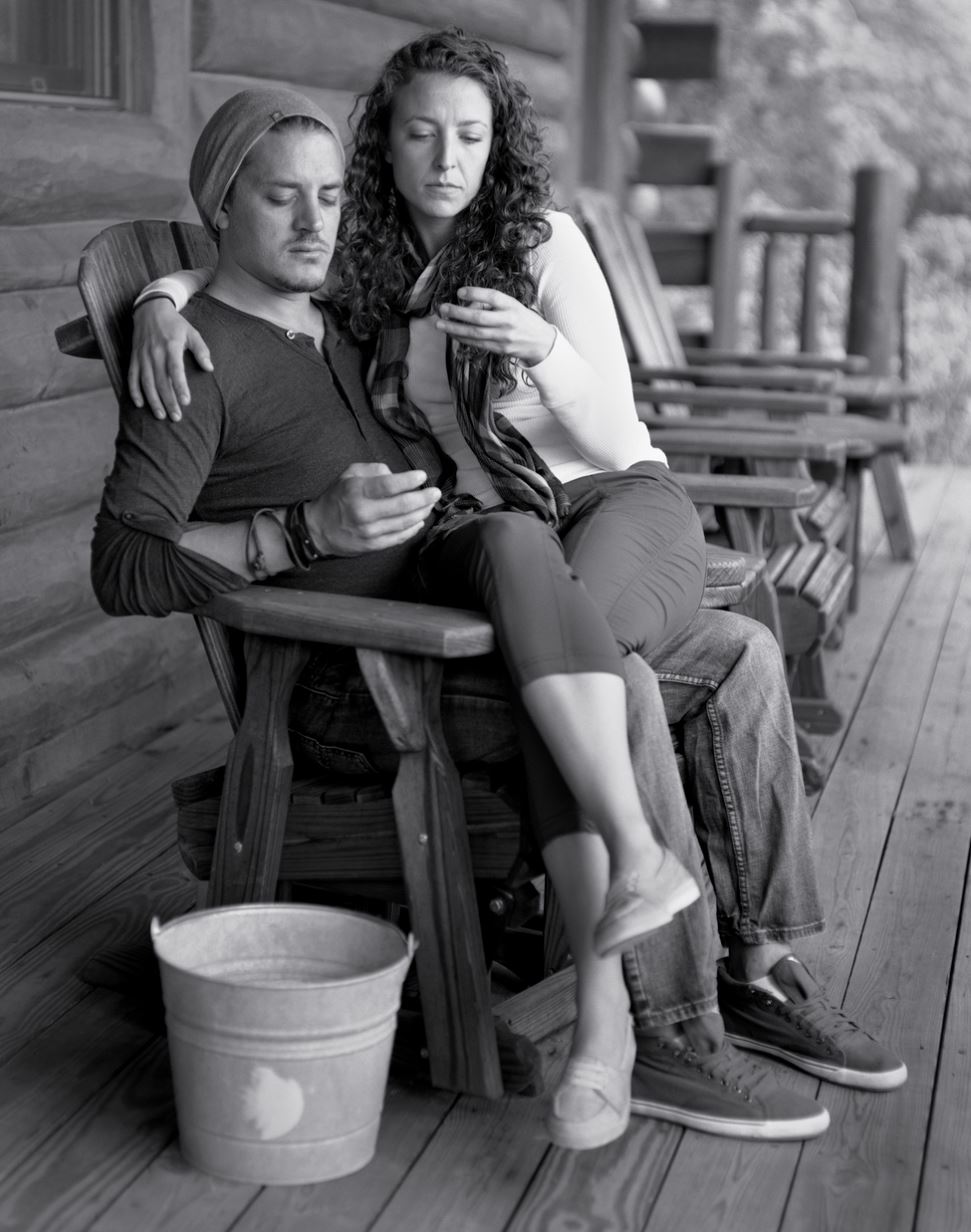
Eric Pickersgill - Removed
Eric Pickersgill's Removed is a photographic series that explores the way personal devices play a role in society, relationships, and the body. The joining of people to devices has been rapid and unalterable. The application of the personal device in daily life has made tasks take less time. Far away places and people feel closer than ever before. In similar ways that photography transformed the lived experience into the photographable, performable, and reproducible experience, personal devices are shifting behaviours while simultaneously blending into the landscape by taking form as being one with the body. In each portrait, electronic devices have been “edited out” (removed before the photo was taken, from people who’d been using them) so that people stare at their hands, or the empty space between their hands, often ignoring beautiful surroundings or opportunities for human connection. The final images are rather sad and slightly ominous, and the black and white filter adds to this eerie tone. What's striking about his images is that they feature people of all ages, genders, races, reminding the viewer that these technological advancements affect so many people in this modern age. I really like this series, I think they are so effective in conveying to the reader the normality of our close relationship wit phones, how its now an everyday thing, but Pickersgill's photos really make you question and consider why we spend so much time on out phones.
|
|
|
Response
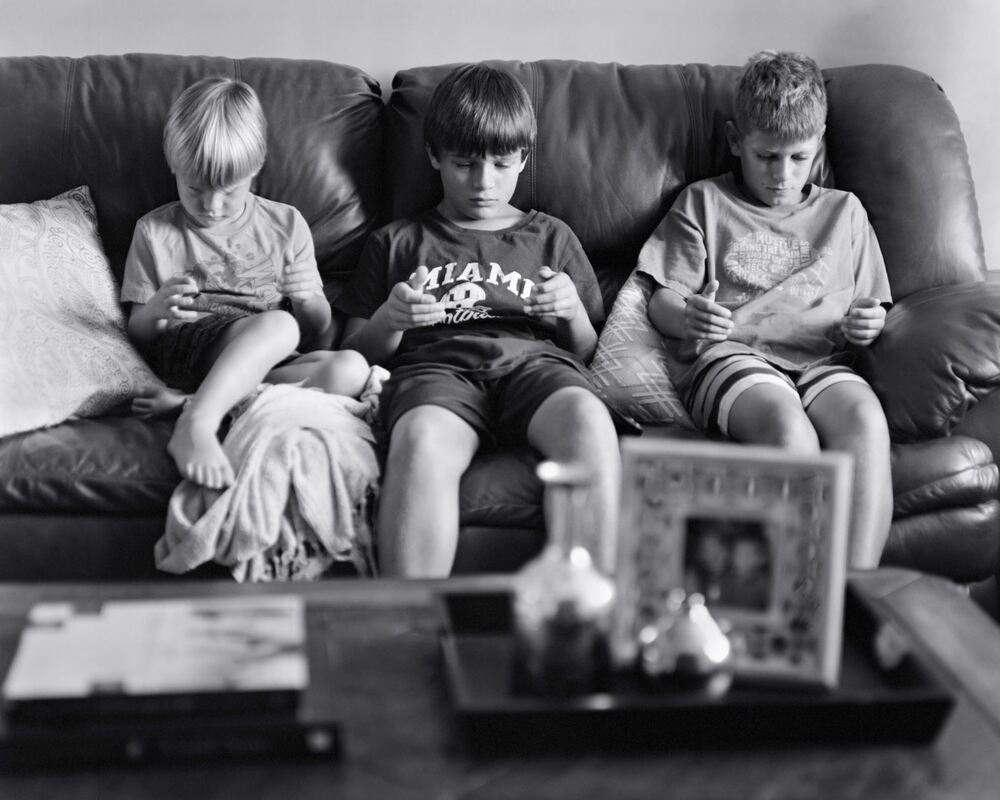
For my response to Pickersgill, I had my models sit or stand in different places and backgrounds, posing as if they were holding their phone and looking down at it. I shot these photos on my phone, and once I had downloaded them I pulled them into photoshop and turned them black and white, while also slightly increasing the contrast. This development links to the theme attached, as it shows the increasing attachment of humans to our phones, and I think the fact that I shot these photos in such everyday environments such as at home in bed, or on the sofa, really reveals the commonality of people being on their phones all of the time. These photos have been very successful in depicting my intentions, and link very closely with my theme. I think if I were to re-shoot, I may experiment with different places to shoot, maybe some more interesting places. I know my intention was to shoot everyday places, however maybe a series of photos of people without phones might be interesting to shoot in a busier location, such as on a bus or on a train.
|
|
|
|

|
|
Contact Sheet
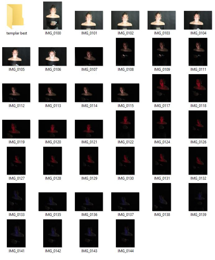
Development 4
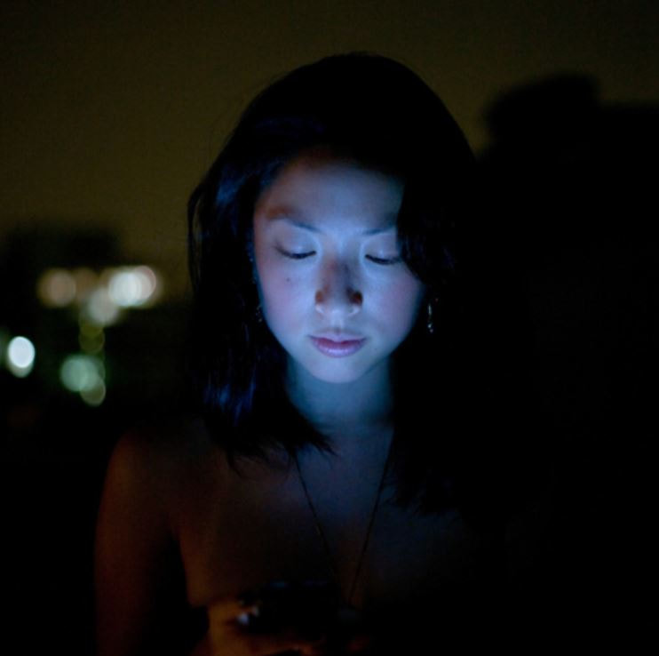
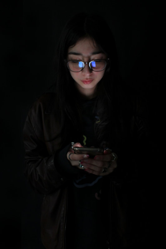
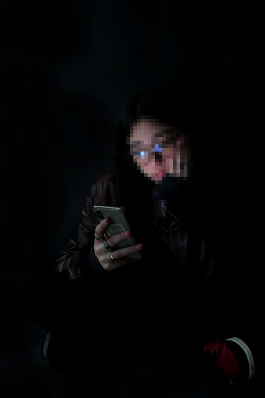
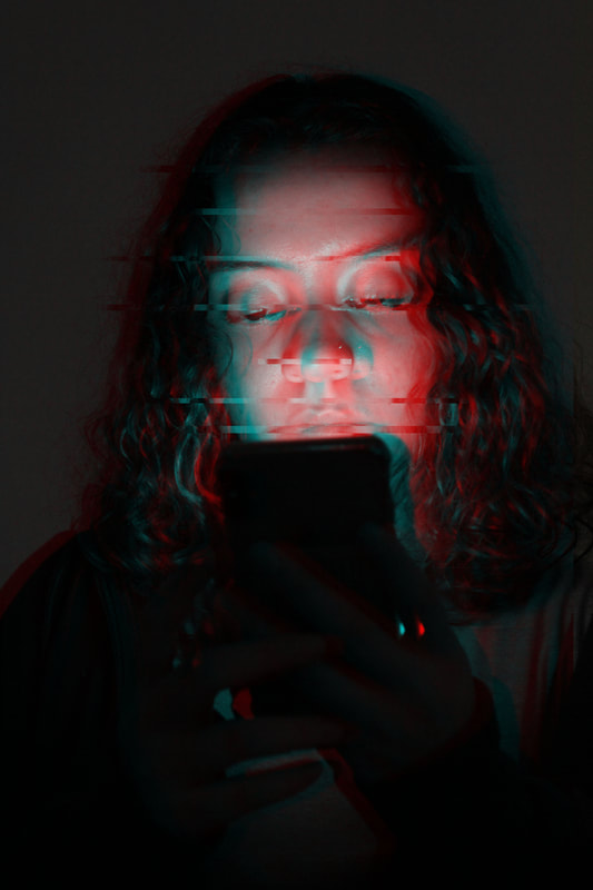
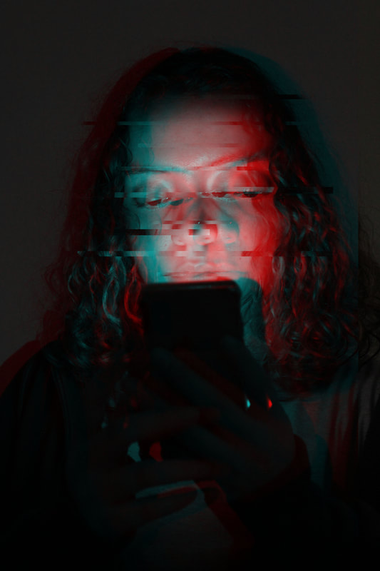
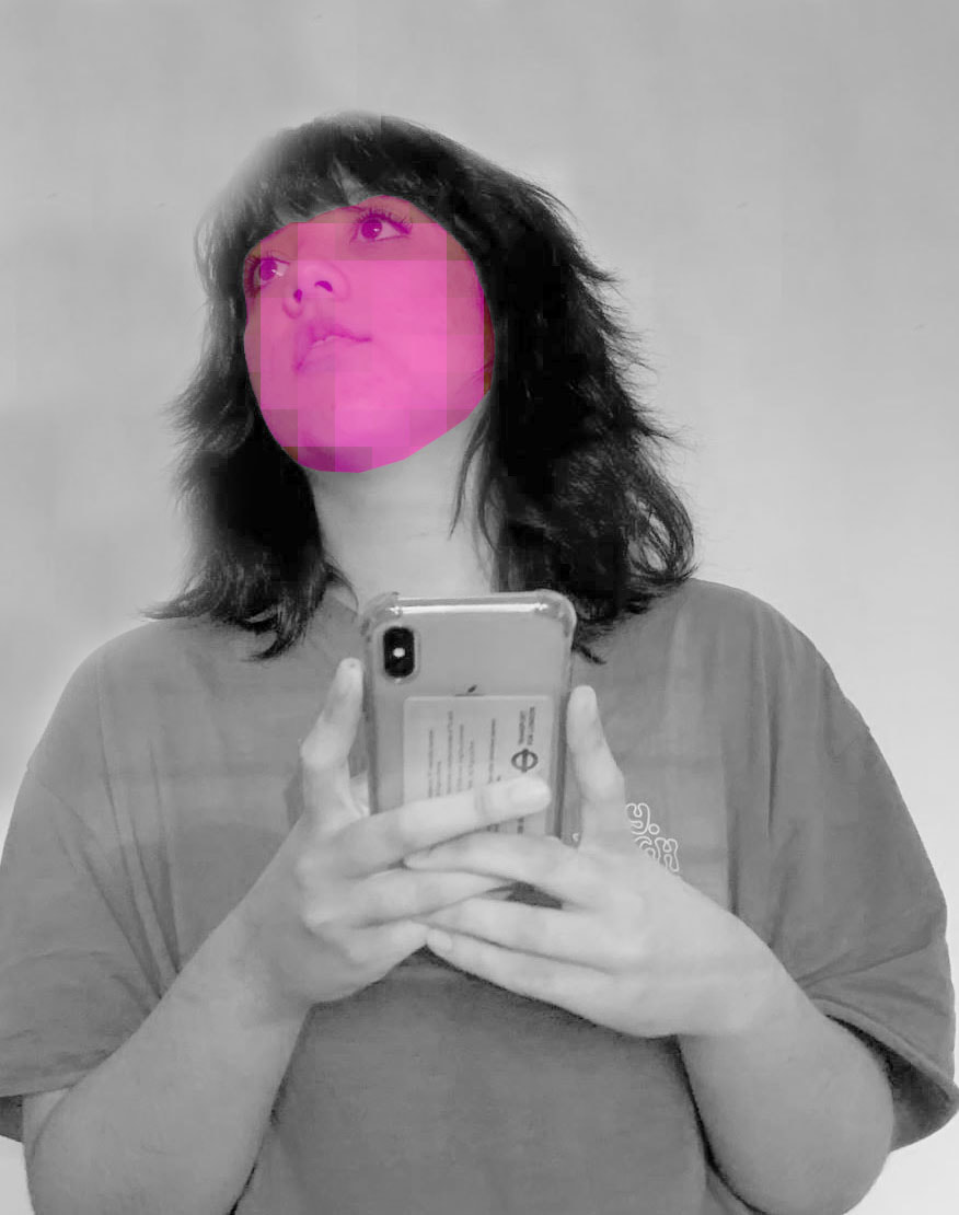
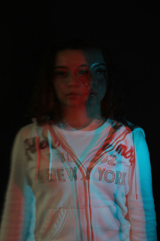
Seymour Templar - Social Lights
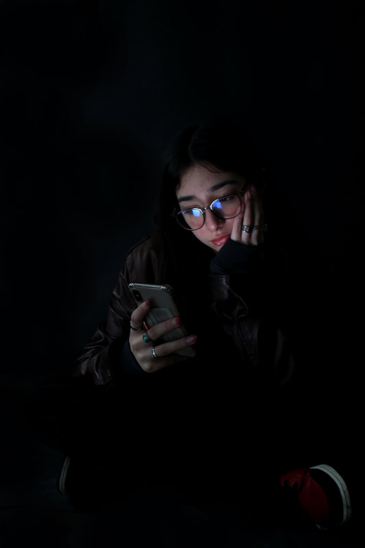
New York-based photographer, Seymour Templar took these photos as part of an intriguing series called Social Lights: A Certain Night Life. The title is clever and points out how, in this day and age, we're so attached to our phones. In fact, all types of people, from different walks of life, seem to have their eyes glued on them. While these people are immersed in their technological world of text messages and the Internet, Templar is more interested in capturing peaceful emotions as the light of the phones radiates against their faces. Although the photos point out this newfound attachment to technology featuring 21st century human beings in their so-called “natural” environment, the clever use of lighting in thee images makes them quite beautiful to look at. The illumination of the face by the phone screen creates a face that is lit up and glowing, an interesting perspective on this increasingly digital age. These images have a sense of softness to them with the darker background and the soft light on the faces. What I am most inspired by here is the use of light, which is really the focal point of the image.
|
|
|
Response
For my response to Templar, I used a black backdrop as I wanted it to kind of blend in and merge with my model, creating an ominous feel to these images. I had the model sit down holding her phone which was reflecting different coloured lights that were illuminating her face. I turned off all the lights in the studio, making the light on the phone the only source of light in the room, in order to emphasize the complete power of phones and technology to divert our attention. I used three different colours of light; blue, white and red, three colours that I thought would be visually striking and would illuminate the model in an interesting way. I had to use quite a fast shutter speed since it was so dark, I used around 1/20 and I think this setting worked successfully as my images aren't blurred or too dark, they're a good balance. Once I had shot these images I pulled them into photoshop and I used the cloning tool to fill in any gaps in the background that weren't completely black or dark enough. I upped the contrast and brightness lightly in all of these images, to really highlight the focal point of the image, the models portrait. Overall I think these images are very successful in conveying the notion that out phones have the power to completely distract us. I think the most successful images though are the ones with the more natural white light, as they really highlight the face of the model and illuminate it, and so in my next development i will make sure to use the whiter, more natural light.

|
|

|
|
|

|
Contact Sheet
Development 5
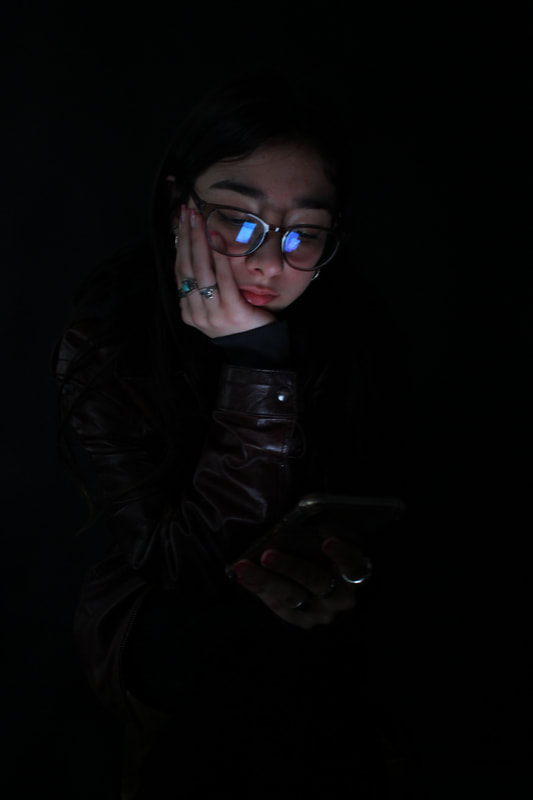
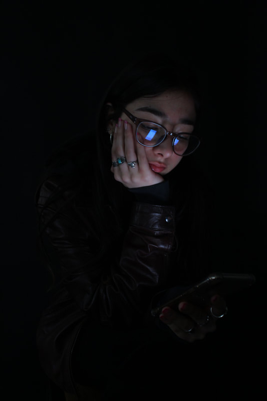
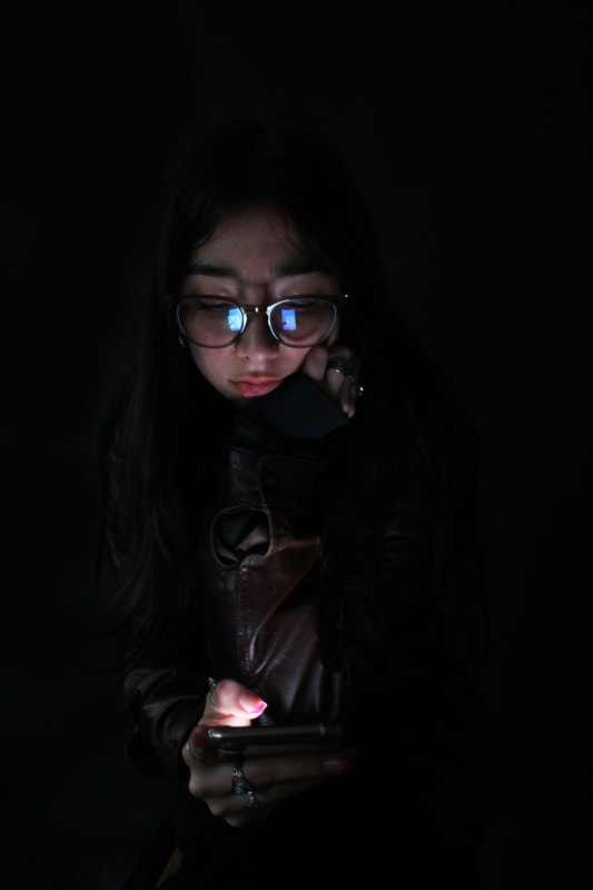
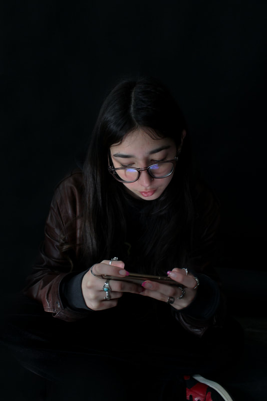
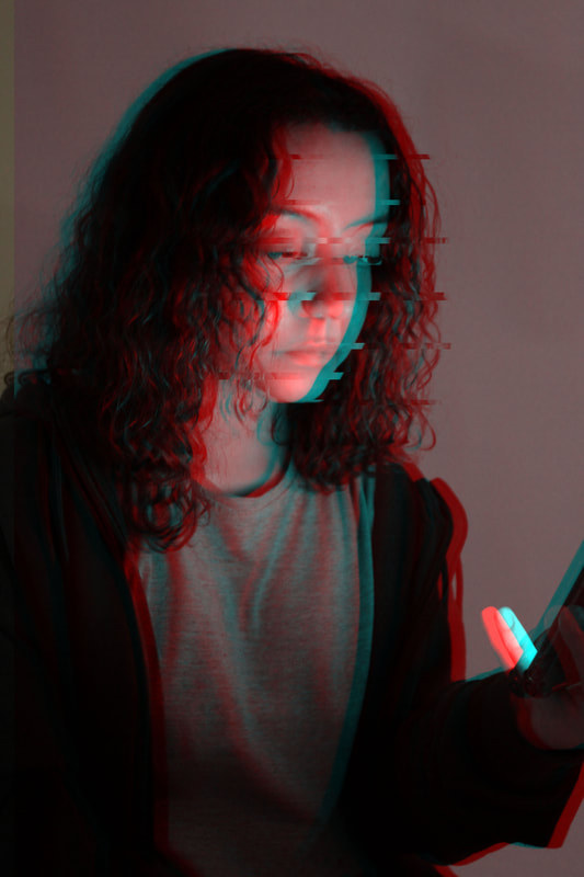
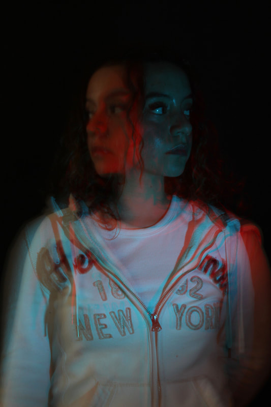
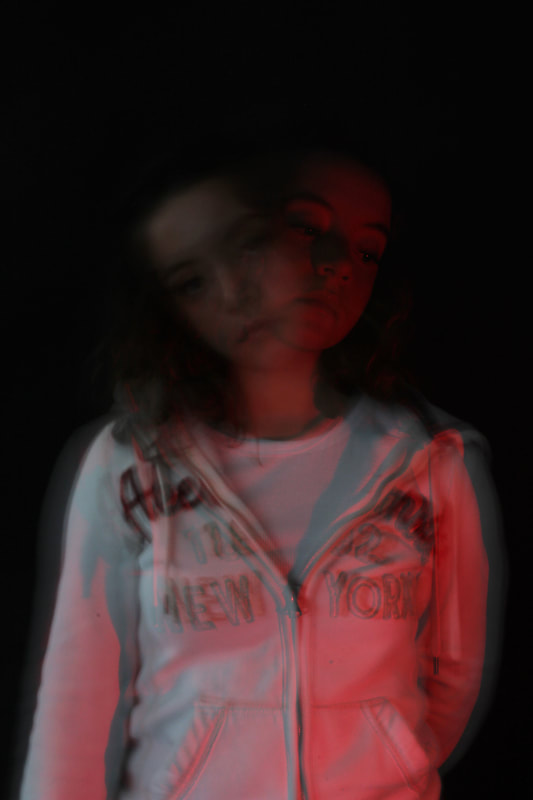
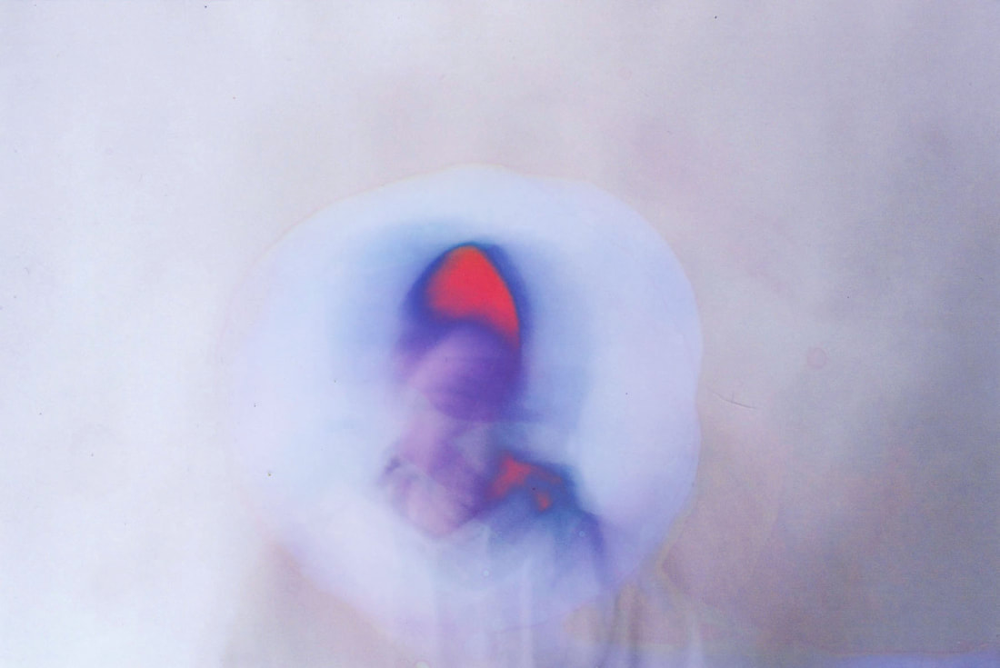
Templar second response
Following on from my previous development, I found that the images using the white light worked the best, and so I wanted to create another series using only white light on the phone to illuminate the face. This time I also had the model do some different poses; with her hand on her face, or sitting cross legged on the floor, making her stance a bit more casual in order to convey the sense that this attachment to technology is an so normalised now and is common among most people. I also had her wear a black outfit, and I think this choice is really effective because her hair and body really blend into the background, leaving only the face and phone the most visible parts of the image, drawing your attention, reinforcing the sense of isolation and the downsides that can come with spending too much time looking at a screen.
|
|
|
|
|
|
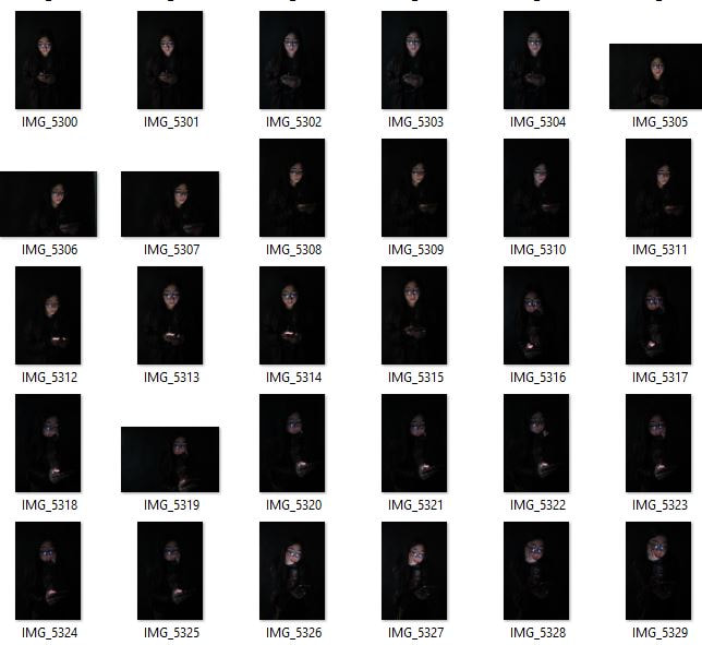
Contact Sheet
|
|
Development 6
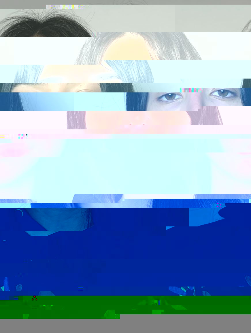
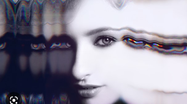
Johan Rosenmunthe - Pixilation
In his project ‘Off II 2010’ Danish Photographer Johan Rosenmunthe downloaded pictures of ‘friends’ that he only knew through the Internet, and gave them a new context. The people are only visible through a digital representation, while the surroundings are as analogue as possible. Inspiration for this project Rosenmunthe got through digital communication like Facebook, Twitter, online dating and personal websites, in which the representation of our personality becomes more and more streamlined. ‘We have the possibility to project an idea of how we are as a person into the world around us, but with the constant option of censoring information and invent fictional characteristics. Never have we had access to so much information about each other, and never has the information been so unreliable.’ The images themselves provide scenes of isolation and loneliness, as the characters within are so seemingly detached from their environment. The background is kept in focus, while the outline of the person is pixelated. "These pictures come to life when the viewer move in relation to them – seen up close, the people are blurred and the viewer has to step back to bring the motive into focus. At the same time, the scene in which the person is placed is blurred when viewed from a distance. From a distance you can almost only identify the pixelated part of the image. So you have to move back and forth. The movement is important — metaphorically, too." - Johan Rosenmunthe. These photos and their meaning really stood out to me when researching artists to respond to, and I think it links so closely with my developments and intentions for my project.
|
|

|
Response
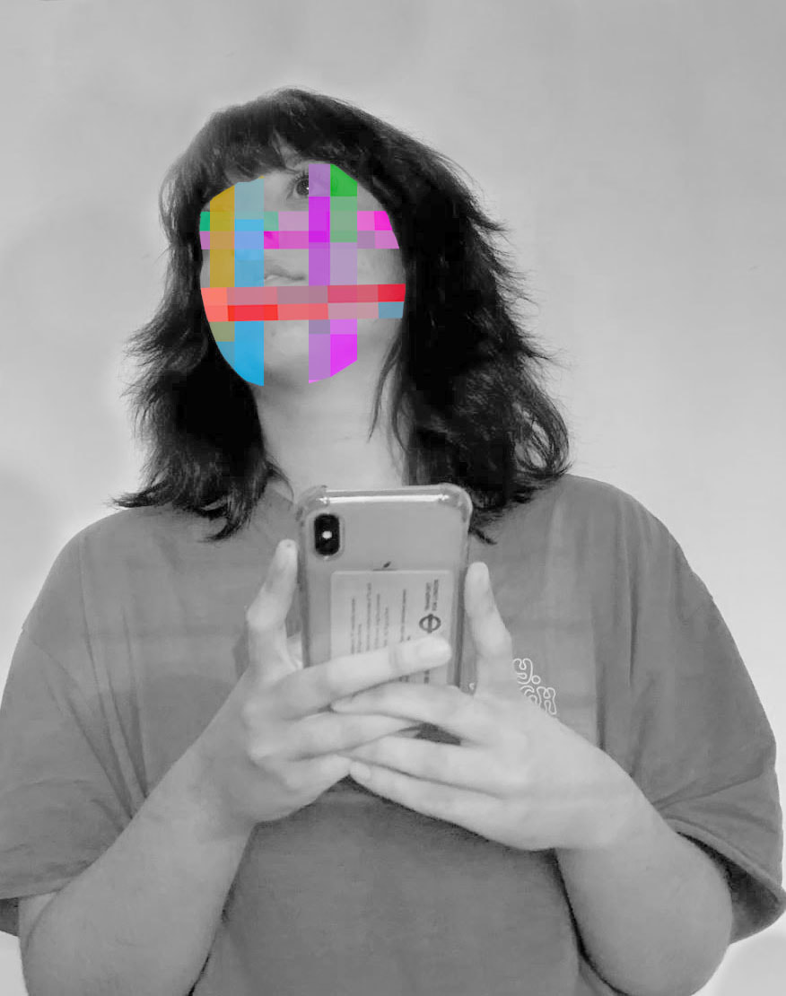
In developing my project, I decided to start focusing on ways that I could manipulate an image in order to incorporate features of technology. I decided to focus on pixilation, which happens when instead of blending seamlessly, pixels become visible to the naked eye. Rosenmunthe uses portraits of people and pixelates their outline, and so I decided to use the images from my previous two developments to experiment with. I selected my best 7 images, and below I have displayed my editing process on Photoshop. I decided to only pixilate the face rather than the entire body like Rosenmunthe, because I think it more effectively fits my theme of portraying out attachment to phones. I mainly used the mosaic pixilation tool in order to create the pixelated effect, creating two layers and rubbing out all of the area surrounding the face, leaving the illuminated face pixilated. While I think all of the final edits are successful, I think the most successful are the ones using white light from the phone, as again I think they just illuminate the face best, and when the face is pixilated, it makes the facial features appear more natural, and thus is more effective in portraying the widespread mass use of technology. If I were to reshoot, maybe I would experiment with a different coloured background, maybe a white background, in order to just brighten u the overall image.
Editing Process
Edits
|
|
|
|
|
|
|

|
Development 7
Joe Holmes - Texters
Joe Holmes is a photographer from Brooklyn, New York. Over time, Joe has fine tuned his eye for street photography, capturing the beauty in the ordinary with impeccable style. Since focusing on photography full time in 2005, Joe has been featured in solo and group shows and exhibitions around the world. He has won several photography awards and been a finalist for several more. For his project titled “Texters“, Holmes captured unsuspecting people lost in their own worlds while texting on their phones. His series is full of photographs of people texting while walking down the street, while sitting in cafes, and just hanging out outside. Holmes is from New York City, and this is where these images were taken. The series in total is made up of 32 photos, each one depicting a person giving their full attention to their phone. I am really inspired by his eye for street photography, perfectly capturing these moments of people being lost in their phones, and this is something that I took forward with me when forming a response. Something that is so endearing about his series is that in many photos, the subject is pulling a different expression, and this intrigues me as it reveals how far technology has come in that now by merely looking at a screen, this can provoke an emotional response from us.
|
|
|
Response
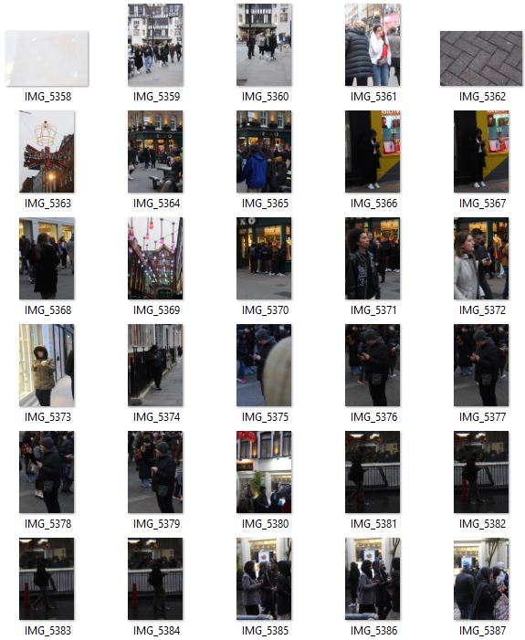
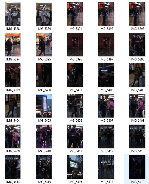
For my response to Holmes series, I decided to go into central London as I knew it would be busy and full of people walking around on their phones. I walked around areas such as Chinatown, Tottenham Court Road and Oxford street, looking for people using their devices. I went out as it was starting to go dark, between 5 and 6pm, as I wanted to try and incorporate the illumination of the face that I have looked at in my previous developments. However, trying to capture peoples faces being illuminated only by their phones proved quite a challenge, and while I didn't achieve this desired effect, I did still take a successful series of images inspired by Joe Holmes' series. I think one problem was that people didn't have their phone screens very bright, as so their faces could not be lit up. I also think that with London being such a vibrant city, it was hard to find areas where people were not being lit up by big neon signs or street lights, or lights off of cars and taxis. Definitely if I were to reshoot I would maybe try and stage these images; bring a model with me and make sure their phone screen was as bright as it could be, and also place them in a slightly darker area that doesn't have as much different sources of light, therefore making the phone light the focal point of the photo.
|

|
|
|
|
|
Contact Sheet
|
|
Development 8
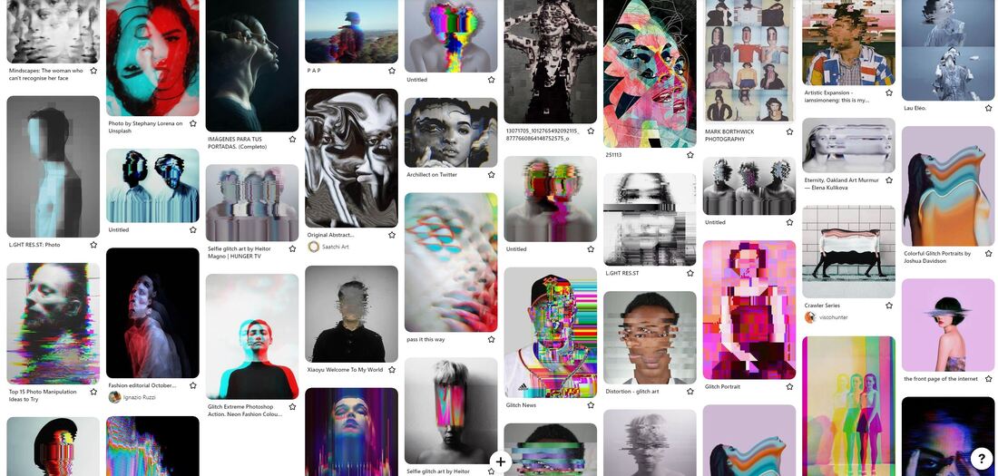
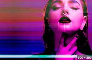
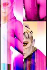
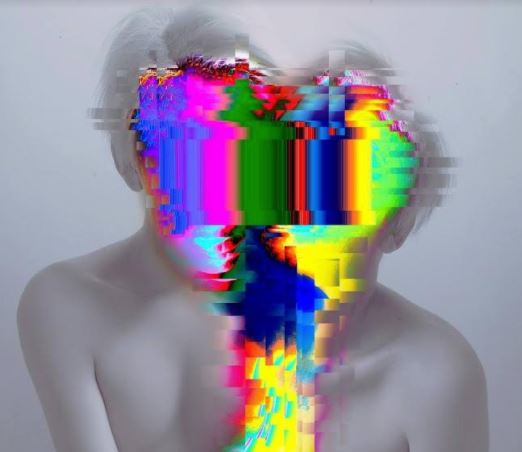
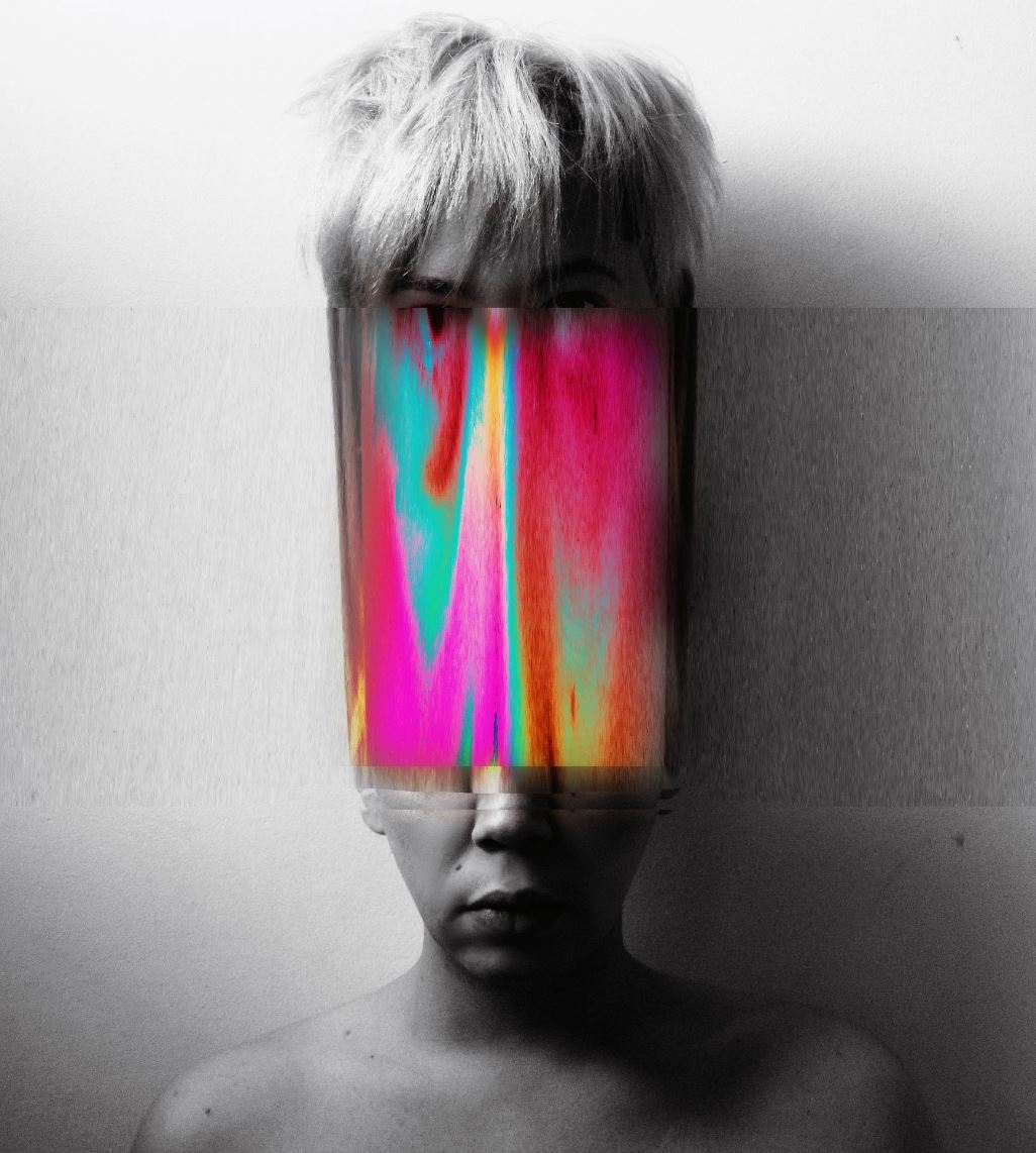
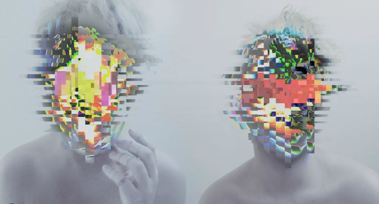
Glitch art
For my next development, I have decided to look at glitch art. This is another technique that is closely linked to the idea of technology, with glitch, in technical terms, meaning a "small and fleeting error in a system that occurs due to unknown causes." Glitch Art is becoming increasingly popular and common in the design world lately, even though it's been around for fifty years. Digital culture is taking over everything, and that includes the art and photography world. Essentially, Glitch Art is a visual style that is distinctive in its use of artistically curated digital distortions. Common techniques of glitch art include elongated images, pixelization, colour degradation, and double exposure. Glitch art is re-casting a new light on digital faults and interruptions and turning them into works of beauty. This style of photography links in well with my theme because it allows me to showcase the inherent attachment between humans and technology, by taking photos of people and experimenting using different techniques to glitch them, exploring this relationship and link. This genre of photography really inspires me, and allows me to be really creative in my responses, using bright colours and interesting patterns like in some of the photos below. Below I have created a Pinterest board showcasing some of my ideas and inspirations.
Editing Process
For my next development, I decided to experiment with glitch art. I used the images from my last development to experiment with glitching on photoshop, by layering images and nudging them slightly to create a glitch effect. I have displayed my editing process and my first attempts below. This was a very experimental development, just tying to master the technique of using Photoshop to glitch an image. These photos, as I explained in the last development, were not as strong as I had intended them to be as the phone lights were not bright enough, and so moving forward I would definitely want to make sure that the models face was lit up.
First attempts

|
|
Original Images
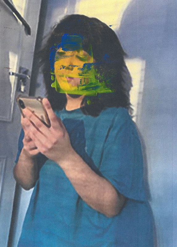
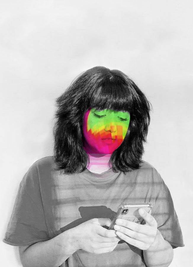
After having experimenting with the technique on photoshop using some previous images, I decided to take a new set of portraits to use to glitch. In these portraits I used a white background, and had the model sitting looking at her phone. I turned off the lights in the studio, and having learned from my previous developments, I only used a white screen on the phone to brighten up her face. I tried different angles, some further away and some closer up to her face, ensuring that in all images I included the phone in the frame, just to make sure that my intention was clear (to portray the increasing dependence on phones). I then edited these portraits using my process I have displayed above, glitching and distorting her face in order to convey this sense of humans intertwining with technology, and blurred lines between reality and what's online. What works well here is that I learned from my previous developments that a bright white light screen o the phone is needed, and this lighting up the models face is very effective. One thing I might have changed if I were to reshoot would maybe be to have the model stand in different positions, just to create a more rounded and diverse series of glitched portraits. Overall I am pleased with these images, I think they clearly express my intentions, and this theme of glitch art is definitely something I want to explore further.
Edits
|
|
|
|
|
|
Contact Sheet
Development 9
Eduardo Gomez
Eduardo Gomez is a portrait/fashion photographer based in Mexico. The series I am responding to and inspired by, is a series titled 'Lucky Accidents'. One of Gomez' portable hard drives was damaged and corrupt, and in an attemot to recover these lost photos he ran a program called Wondershare Data Recovery on his other backup discs to see if he could rescue some of those same files that they were previously stored there before being transferred to the disk that was damaged. Many files were recovered but he soon realized that unfortunately most of them were not in the same state that they had been before, many were 'glitched', which is a mistake of interpretation and representation of digital data quite common in video, audio and photographs. He carefully checked the almost eight thousand raw files, they were messy, with mixed names. I noticed the presence of the typical Glitch: intense colors of pink, orange, blue, green, very saturated and textures with lines and stripes, images combined with photos from other shootings. Gomez is mainly a portrait fashion photographer, so the images that he liked the most were the faces of beautiful models with that strange random digital look. He liked the idea that in the same photo faces of two or even more models were combined that have nothing to do with each other, they don’t not even know each other, and were originally taken on completely different dates but in the end they look a bit similar in expression and intention. The photographer ended up with approximately 100 images that when viewed as a series I find quite interesting. In a lot of his work Gomez always use desaturated colours and dark themes. These Glitch images propose much more vibrant and intense colors, and a kind of futuristic techno feel that is very fun and refreshing.
|
|
|
Response: Glitch using TextEdit
My intention for this development was to create some more 'glitched' portraits, but this time I wanted them to look a bit more chaotic, appearing more as if they had been corrupted or glitched, inspired by Eduardo Gomez' 'Lucky Accidents' series. Technology is so intertwined our society and in our lives, and so though these images my aim to reveal this interconnection by incorporating a style that is reflective of technology (glitch art), with portraits of different people. I took some portraits of models standing in front of a white background, with a few studio lights on to brighten their face, to create juts some plain, clear simple portraits. I wanted them to be plain and clear as I wanted there to be a big contrast when I 'glitched' them, transforming simple images into interesting glitched edits. I used TextEdit to create these edits; I opened up the app and selected the portrait I wanted to use, and the app converts the image into text. The text goes on for about 5 pages, and so I went through it, deleting different sections and rearranging it by copying and pasting, and once I was done I pressed save. One challenging thing about this app is that its trial and error; you cannot see the image while your editing as the image is converted into text, and so you have to wait and see at the end for the result. Despite this, I am really happy with the results of this editing, I think my intentions are very clear and I have completed my aim of showing the attachment between humans and technology.
Original portraits
Edits
|
|

|

|
|
|

|
|
Contact Sheet
Development 10
Heitor Magno
Heitor Magno is a Brazilian experimental artist and photographer who leans towards double exposure art as his main forte. Most of his work revolves around replacing models faces with painted glitches, fire or photographs of flowers. The double exposures in his photographs allow the brightest sections of the model to become transparent, giving the artist the opportunity to mix two or three different photographs together. When he uses this technique for glitching photographs, he usually covers the faces of the subjects. He also tends to digitally enhance photographs, moving sections and creating a broken/ corrupt look. A lot of his artwork is very pale and washed out which makes the glitch stand out a lot more with vivid colours and abstract shapes. Obsessed with technology and its affect on our behaviour, Magno questions our willingness to expose intimate moments in our lives, and the affect that the endless repetition and recycling of imagery on social media has on our psyche. What drew me to his series initially was the interesting colours he uses, almost blending and merging them into one another, and this is definitely something I would like to incorporate in my own personal response.
|
|
|
Response
For my response to Magno, I decided to do two different shoots that I would later on glitch. The first shoot I did I had the model pose in different ways; standing up on her phone, sitting down, laying down looking on her laptop etc. I tried using the artificial light of a lamp as the light source for the images. However, upon reviewing these images I found that because the lamp was not very bright, I had to turn my ISO up all the way, which resulted in some rather grainy images. I also found that the radiator was quite intrusive and stood out, which was not main aim and it kind of took attention away from what was supposed to be the focal point of the images; the model. Therefore I decided to try again, this time using natural light, having the model stand up straight so the radiator was not in shot, and I was able to use a low ISO due to the brightness of the natural light. Once I had shot both of these series, I experimented with different ways of glitching the images, inspired by Heitor Magno.
Original Images
First shoot |
Second shoot |
|
|
|
Physical Response
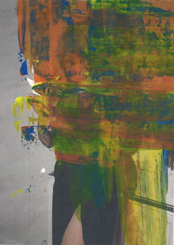
Firstly, I decided to create a physical response, attempting to physically create a glitch affect. I printed out some of my best images from my shoots in colour on a4 paper, and I used different coloured paint to distort the images. I used orange, blue and yellow paint, and I used a paint scraper to layer these colours onto primarily the face on the sheets of paper. I was trying to sort of drag down the paint in straight lines, mimicking this glitch affect that Magno creates digitally. Below are my responses. I do feel like they don't exactly match my vision, which was to have these colourful glitched images with straight lines of paint on the face of the subject, I feel as though the glitch isn't as colourful as I had hoped. I also think that maybe next time I will maybe make the background black and white like Magno does, as I feel there isn't enough contrast between the colour in the glitch, and the background. Despite this I think it was an interesting experiment, and I know what to change in my next development.
|
|
|
|
|
|
Digital Response
Following on from my physical development, I decided to create a digital development using the images from my two shoots. This time, I wanted to focus more on the contrast between the plain background, and the colour of the glitch. I began editing these photos by creating a new background layer, and I reduced the saturation all the way down, and I then upped the brightness in order to create this dull grey background similarly to Magno. I then created another background layer, this time moving the saturation all the way up, and I used the marque select tool in order to cop and paste different parts of the saturated images, onto the not saturated images. I then arranged these different copy and paste colourful sections into different shapes and patterns on the face. Finally, I used the clone tool to colour in the background to be all the same colour as I think this makes the images look much cleaner and neat. Overall I am very pleased with the way these digital edits came out, I learned from my previous developments that I wanted to focus on the contrast between the glitch and the grey background, and I think I have successfully fulfilled my aim. I also think what works well is the fact that the model is holding a phone in the images as well, again reinforcing this sense of connection to technology.

|
|
|
|
|

|
Contact Sheet
Development 11
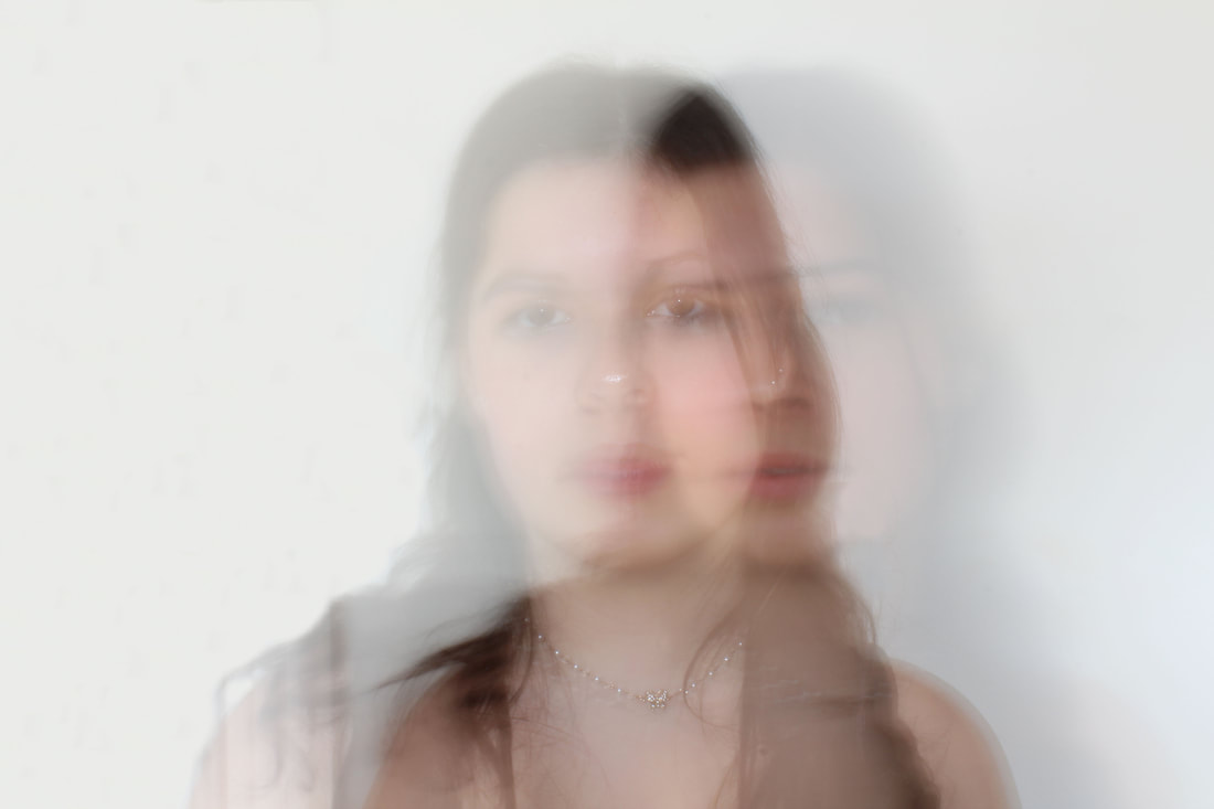
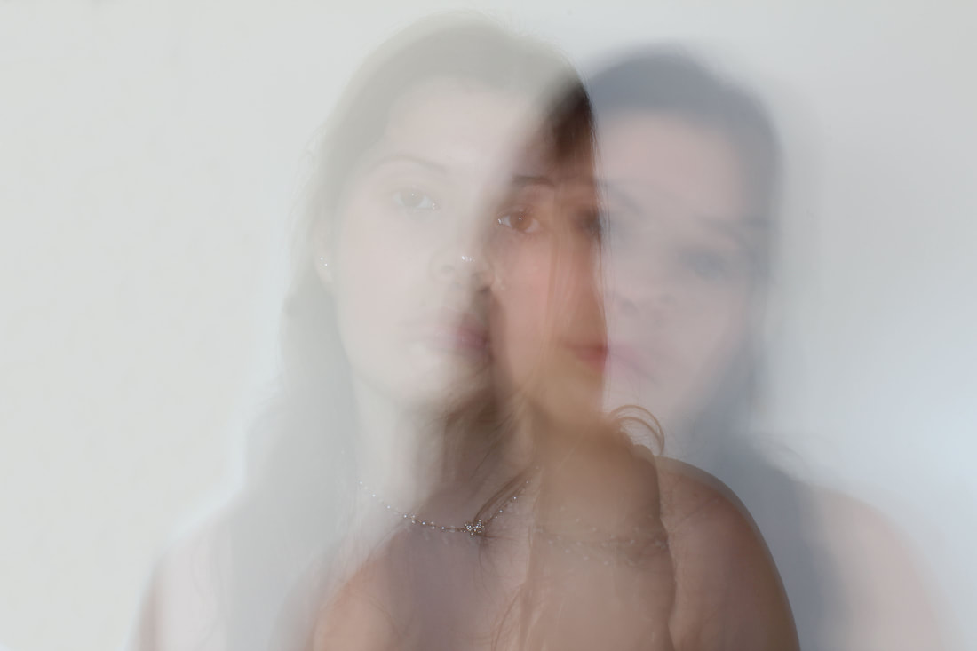
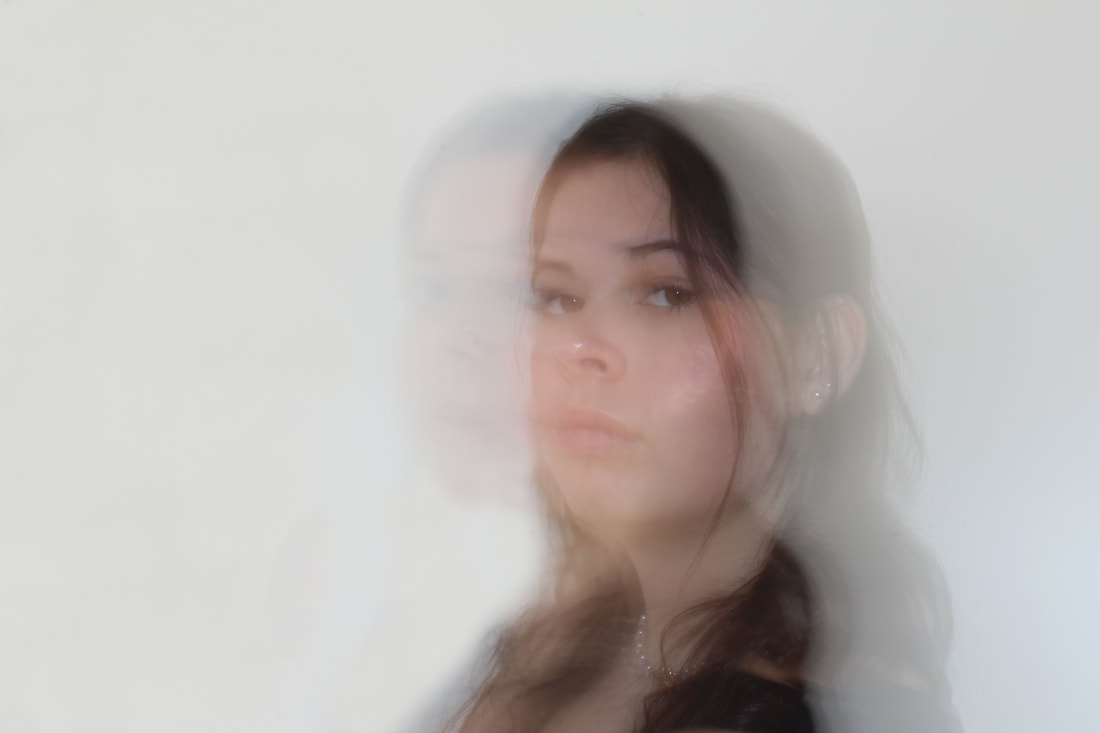
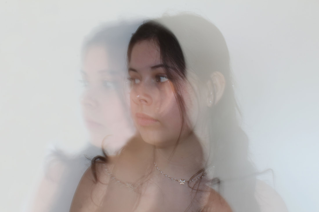
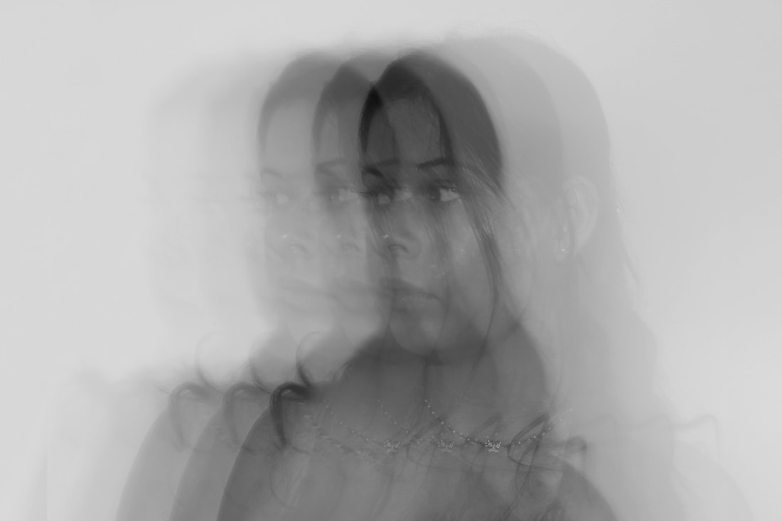
Elena Kulikova
San Francisco based photographer Elena Kulikova began modelling at 16, and immersed herself in a world of commercial photography while simultaneously experimenting with it on her own. Self-taught but mentored by well known photographers that she assisted, Kulikova launched her photographic career in Amsterdam in 2006. In an interview, she claimed, "I’m also very inspired by people. I love the positive aspects of humanity, the art we create, the love we share, and technological advances. I’m always inspired by the human form, eyes especially." The work I am most inspired of hers is a series titled 'Eternity', which depicts different distorted portraits, some stretched, double exposed, mirrored, duplicated. Her manipulation of these images really inspires me, they definitely have a glitch like effect, and her use of multiple exposure is the key thing I am focusing on when analysing her work. I think her images are so interesting because they sort of convey a dream like effect, each different exposure kind of flowing into each other, and this is something that really inspired me and is an effect I will attempt to create in my personal response.
|
|
|
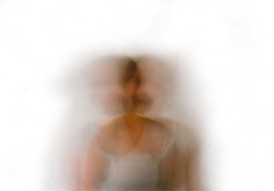
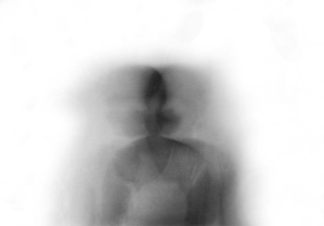
Response
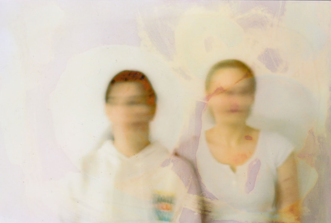
For my response to Kulikova, I really wanted to capture the dream like effect she conveys in her series, as well as creating a double exposed glitch effect. I set up my camera on a tripod and had the model stand in front of a white background. I set the camera to bulb mode meaning I could choose when to open and close the shutter. I also set the Iso down to the lowest setting 100 because i was letting so much light in already, I didn't want my images to be extremely overexposed. While I took the photo, I had the model move slightly to the side, or turn her head, and this was how I created the double exposure effect. I found that the effect worked best when she moved only a tiny inch while shooting, as it meant that her two portraits weren't so far apart in the frame. I think these images are very successful and fulfil my aim of creating some dream like double exposure portraits. The use of the tripod was very helpful as it meant that the only movement in the photo was that of the model, subsequently avoiding camera shale and avoiding excess blur. My manipulation of shutter speed was also very helpful and effective in this response as it meant that I could create a double exposure effect, which was my initial intention.
|
|
|
|
|
|
Further edits
For these further edits I decided to turn them black and white, and I wanted to create more of a glitch effect so i copy and pasted the whole photo on top of the original, turned it opacity to 50%, and nudged the layer op top slightly left or right, to create a multiple exposure effect. I think these are very successful and feel much more inspired by Kulikova, as she also has her images in black and white.
|
|
|

|
Contact Sheet
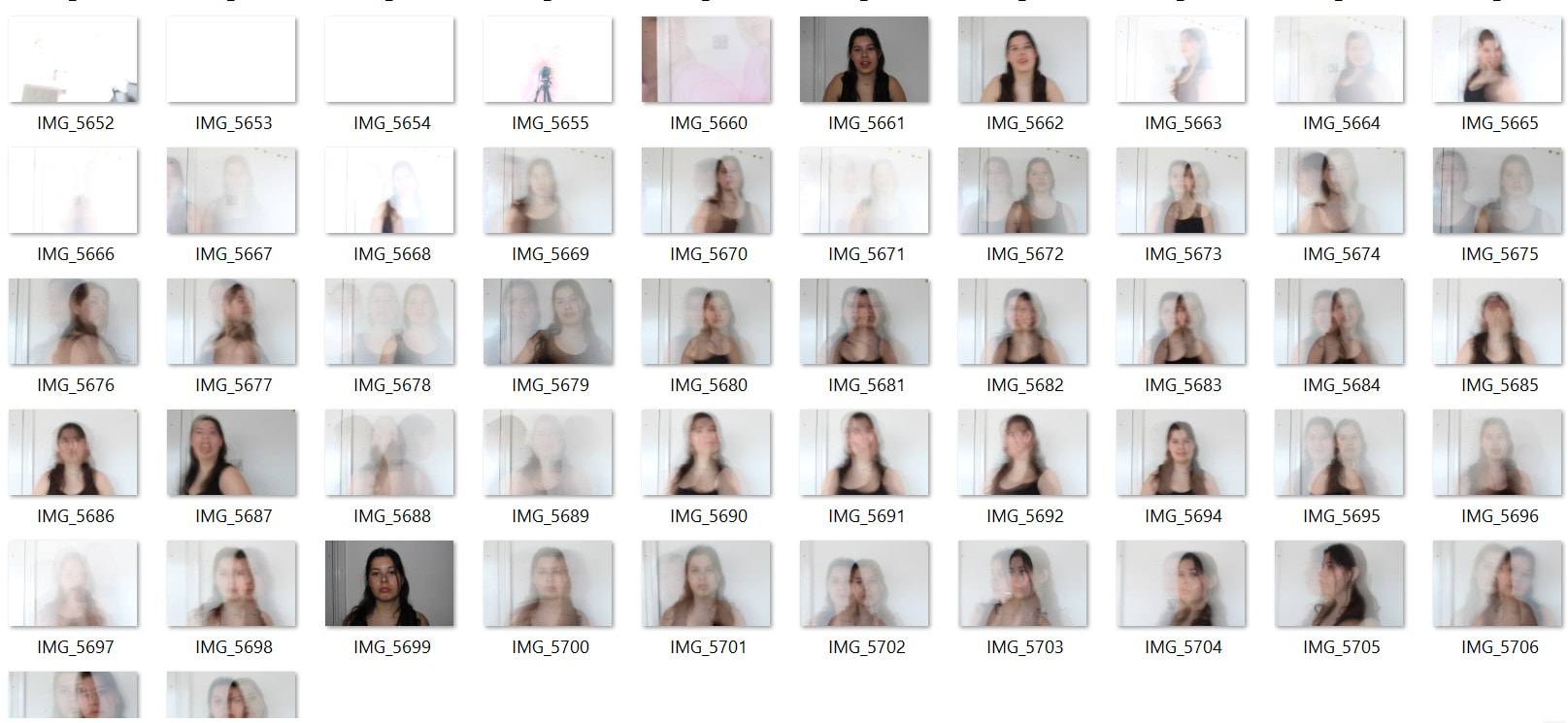
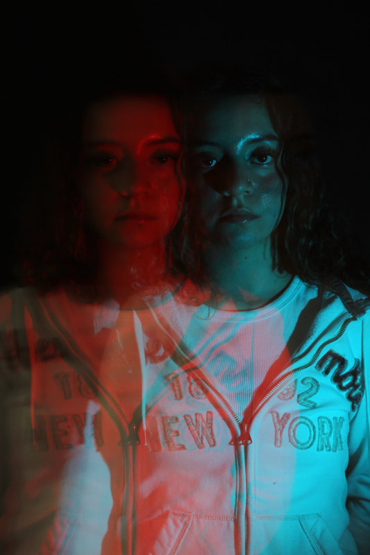
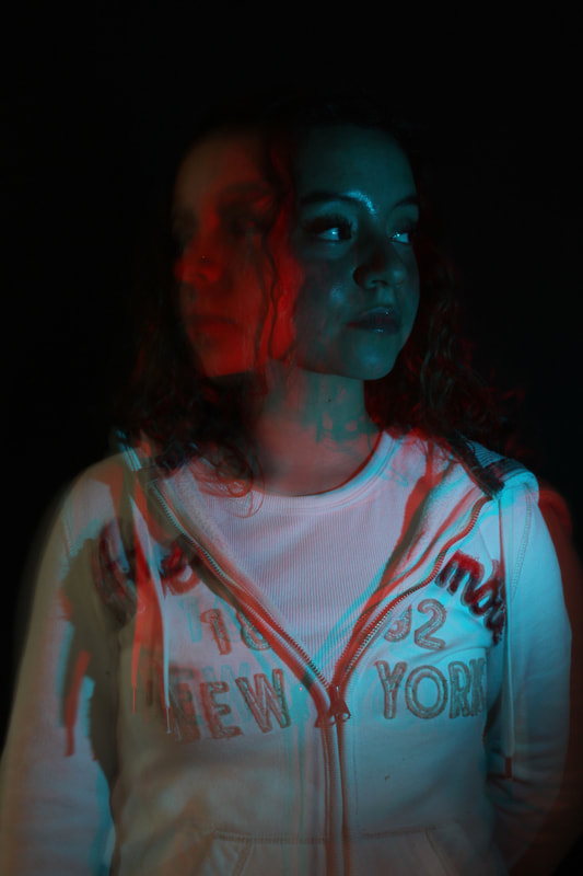
Development 12
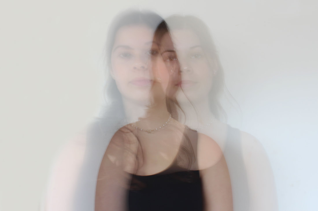
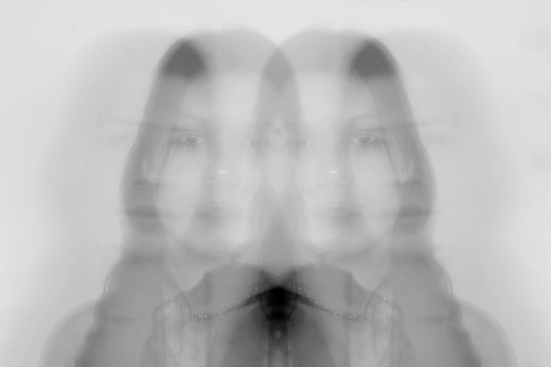
Further response to Kulikova
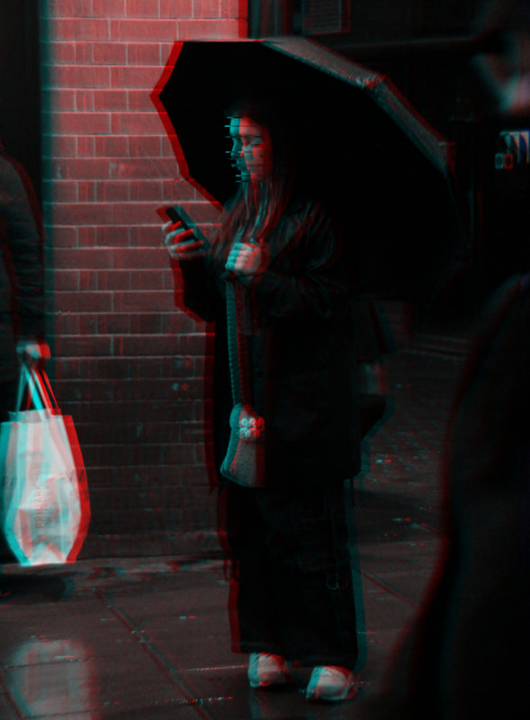
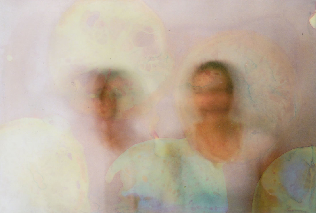
Following on from my previous response to Kulikova, I decided that I wanted to respond to her work again. This time I wanted to incorporate colour, and also continue to explore the glitch effect of double exposure. I set up the studio and I turned of the lights and set up a black background, as I thought this would make the model stand out as she was wearing white. I set the camera again to bulb mode with a low Iso, and I had the model slightly turn her head or move to the left or right, while I had someone use a flash covered by a red neon piece of acetate and a blue neon piece of acetate. This created a double exposure effect, illuminated the face with blue and red because of the flash I used. I think these photos are very successful, and I really like how in some of them, it looks like the model has two faces attached to each other, I think this is visually interesting and captivating. I think the idea of glitch is prevalent here, and I think that the double exposure effect kind of conveys the sense of the divide between reality and fantasy that is brought about by social media. I used a tripod to avoid camera shake, as I wanted he only movement in the photo to be that of the model moving an inch or so, and if the camera was shaking this would have caused excess blur. If I were to reshoot, one thing that I might experiment with would be to use different colours, maybe some green or pink, just to see what effect those colours might create, and to create a more visually diverse series.
|
|
|
|
|
|
Contact Sheet
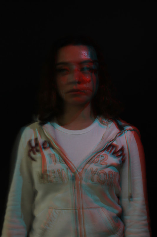
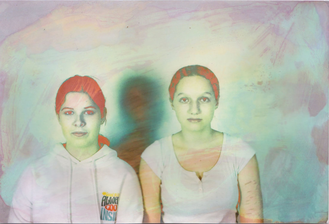
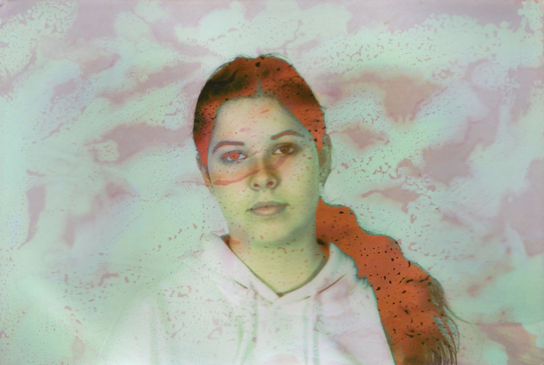
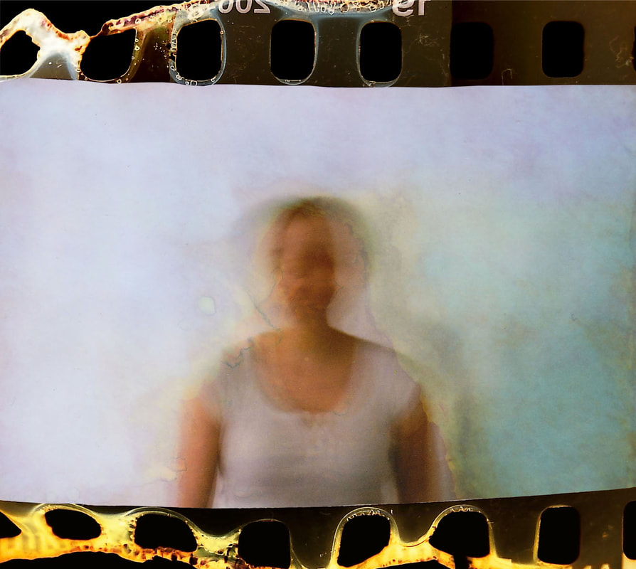
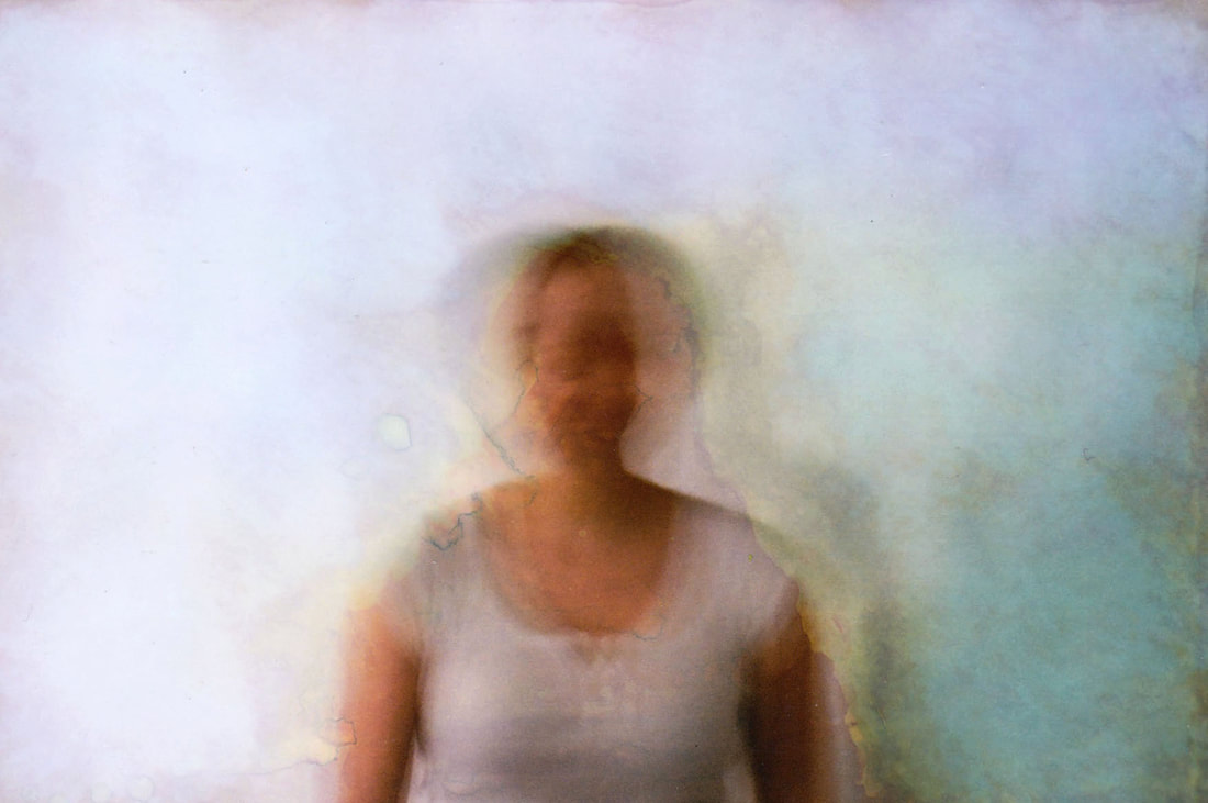
Development 13
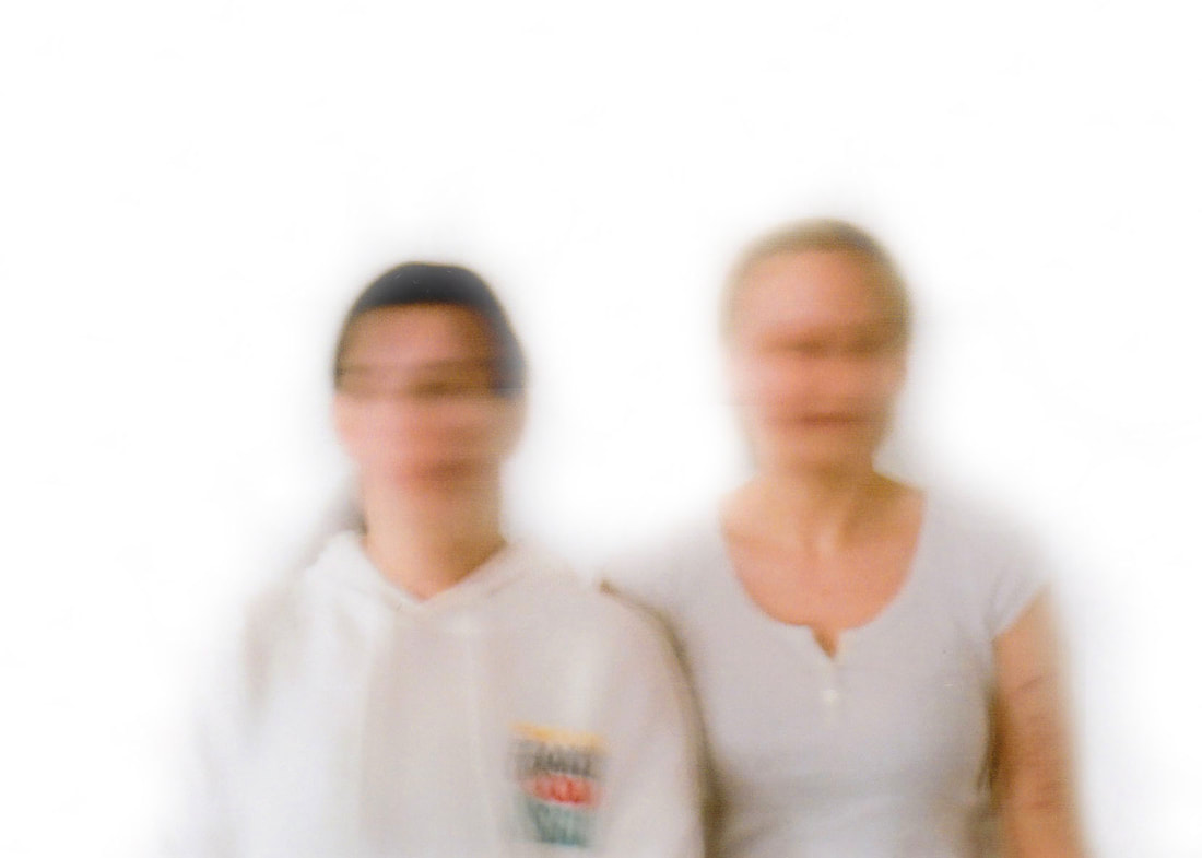
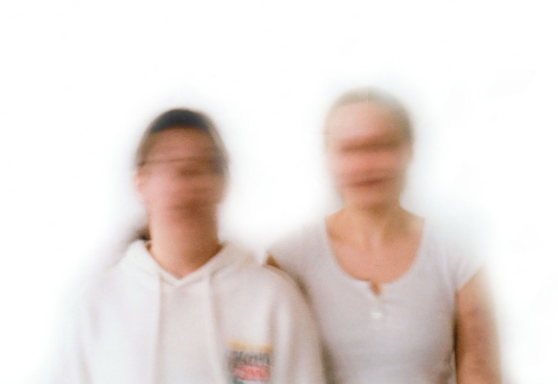
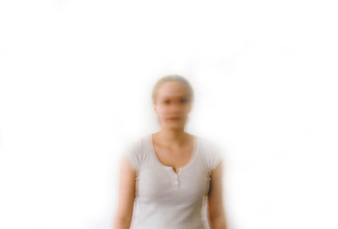
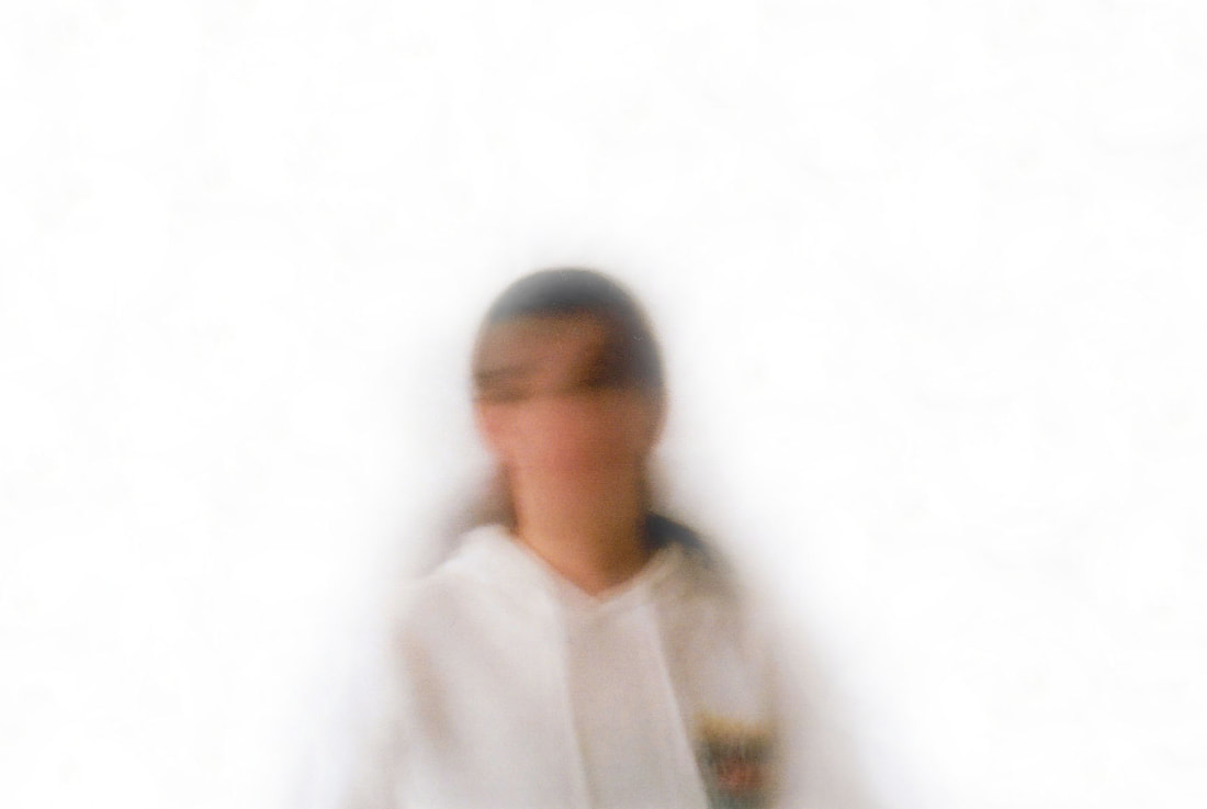
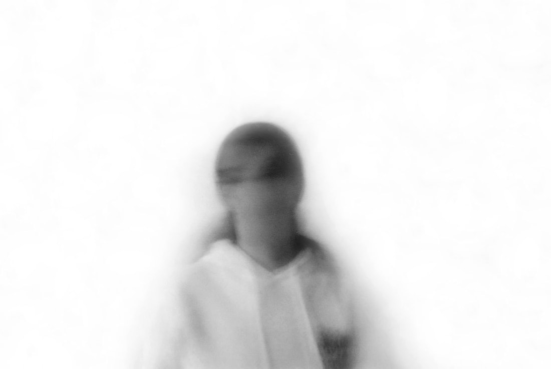
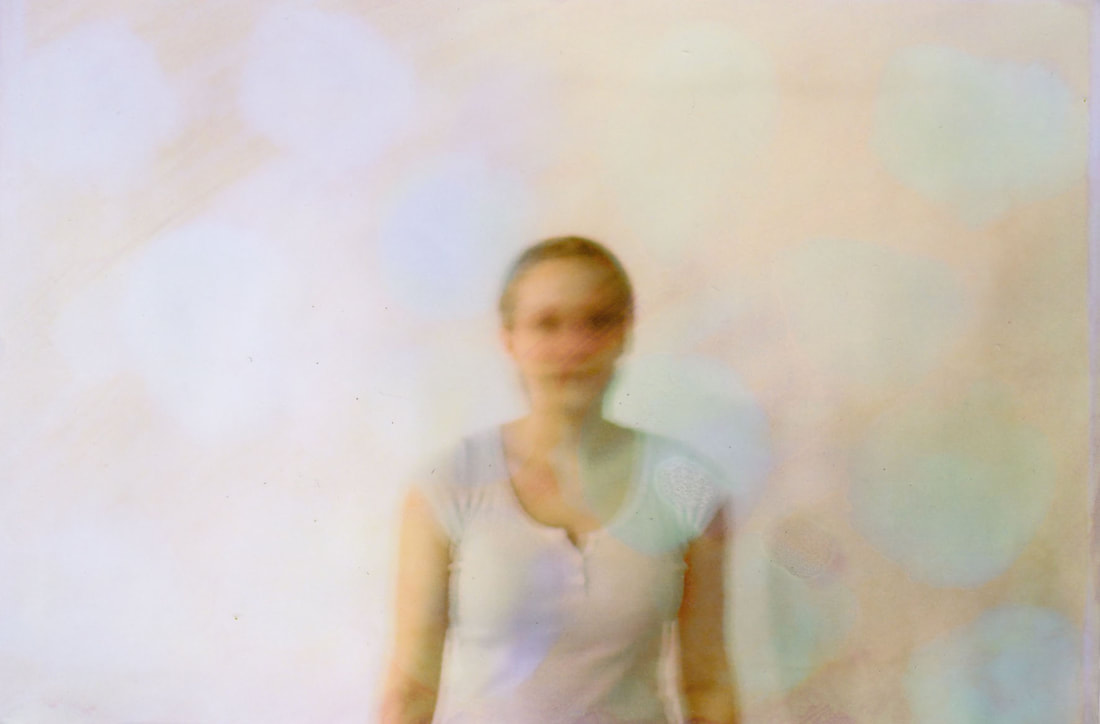
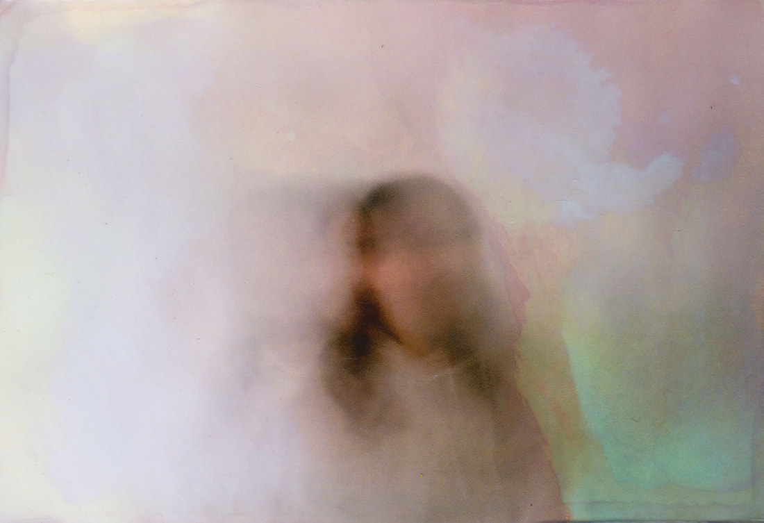
Abstracting Film
Following on from my last response focusing on double exposure as a means of glitching an image, I have decided to continue with this theme and to experiment with the technique on film. I set up a white background and turned on a few studio lights, and had my models do a few different poses; some standing together, and some solo portraits. I had them shake their heads, while I set the film camera with a slow shutter speed so that I could create an 'in-camera' double exposure effect. I also set the camera up on a tripod, which was effective and necessary as it meant that there was no camera shake, and that the only movement or blur in the image was the models, which was my intention. I also took a few still portraits of the models because I wanted to use them in my next development. I then got the film processed, and I found that the background of some of the images was darker than I had intended. By looking at the contact sheet you can see the background came out a grey colour, and so I scanned the prints and pulled them up on photoshop. I firstly upped the brightness, but found that the background was still coming out grey. So I used the clone stamp tool to fill in the background in a much brighter white colour, blending in the models, who were wearing a white shirt and a hoodie, into the now white background. I think this blending adds to the glitch effect successfully because it distorts already blurry image even more, giving these images a dream like-feel, which is reminiscent of Kulikova's work. I firstly edited these in their original colour, just slightly enhancing the saturation to bring out the orange in their skin tones to contrast width he white background. I then went on to create some black and white edits, and similarly to my first response to Kulikova, I think these back and white edits are more effective than colour. They are more successful because the images are less personal as there is no colour; symbolic of the move towards using social media as a means of connecting with people, and the sense of façade that comes with living in a society intertinted with technology.
Colour edits
|
|
|
|
|
|
Black and white edits
|
|
|
|
Contact Sheet
Development 14
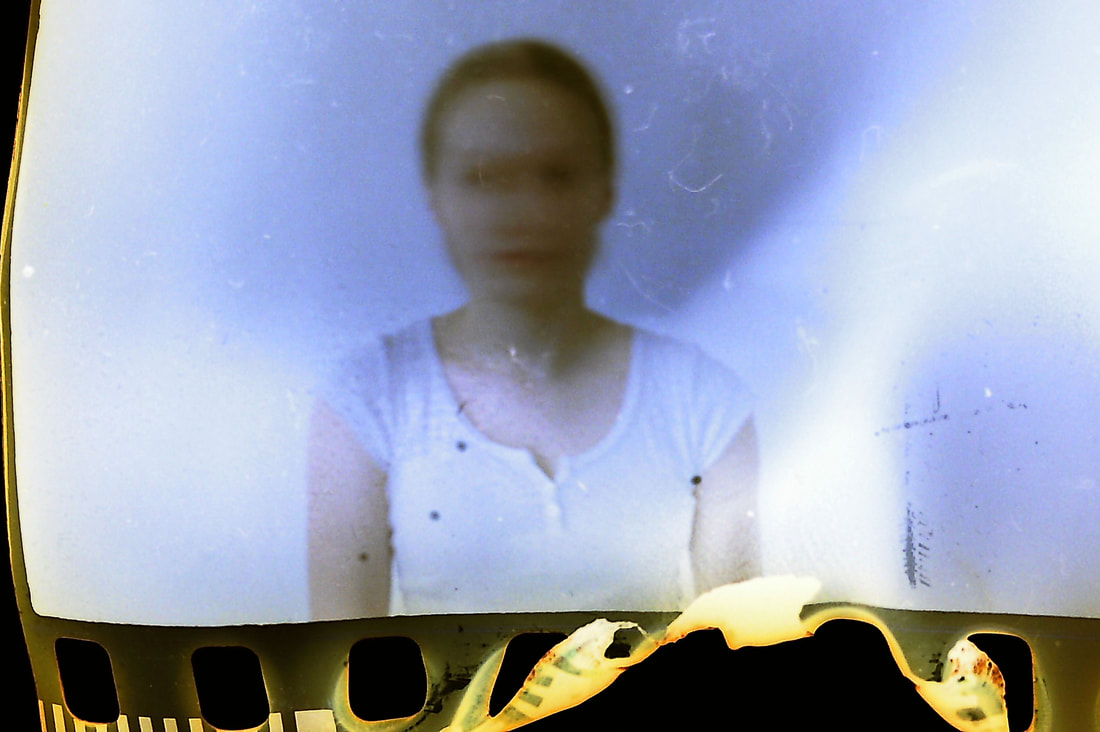
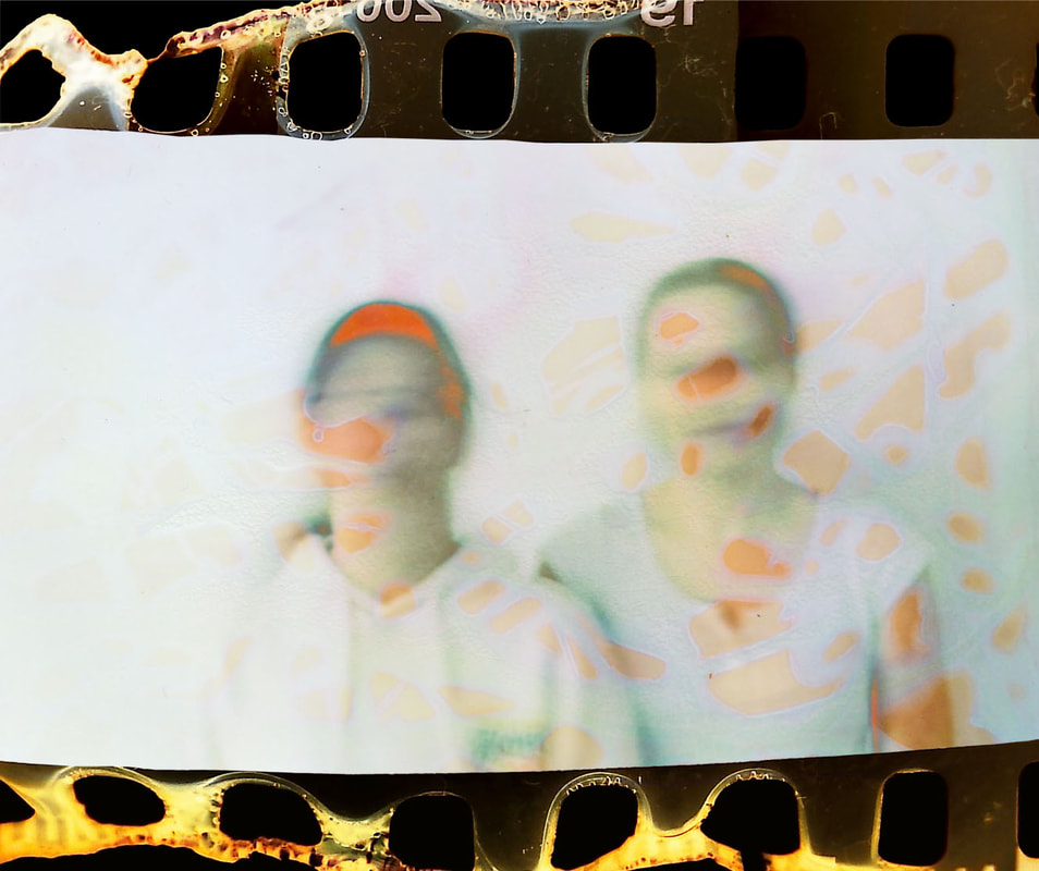
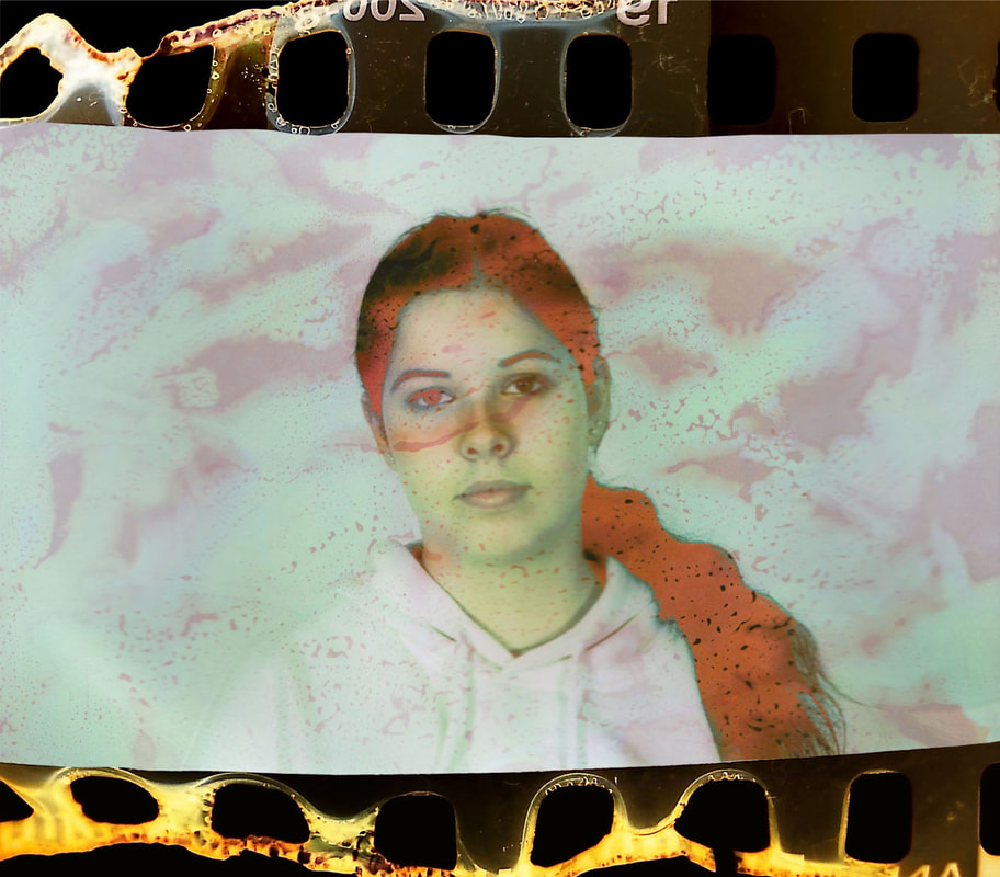
Film Manipulation
Rosanna Jones - Destroy
Rosanna Jones is a photographer and mixed media image maker based in London. Her work specialises in an experimental blend of art and photography; celebrating the physical possibilities of an image, rather than simply its two dimensional form. Her trademark aesthetic has been built through years of painting over, ripping up, burning and otherwise distressing her photography to create tactile portraits that defy the flat images they once were. The series that I am inspired by, is an experimental series titled 'Destroy'. It features multiple images that seem to have been bleached, burned, or scratched, resulting in the distortion of the photos, particularly in the areas surrounding the subject and their portrait. Jones's deliberate intervention in the images of her models obscures them, and her work draws attention to portrait photography’s central conflict—the idea that taking a person’s photo can immortalize them, in a way, but it can also be an act of violence. Fashion photography, which so frequently exploits female bodies, is perhaps the most obvious example of this contradiction. Upon being asked about her processes of manipulation, Jones replied: "All the image treatments I do are done by hand, whether that’s tearing, burning, layering, folding and so on. I use Photoshop to tweak colours and tones, and then print out images to manipulate physically. The ease of recreating these effects digitally just doesn’t compare to the texture and authenticity you can create by doing it by hand, nor the enjoyment I get out of doing it. I’ve always found the process hugely therapeutic and it evokes a feeling that I can’t mirror through digital software."
|

|
|
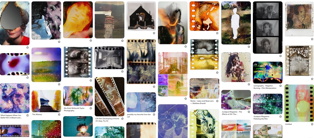
Pinterest board of ideas
Response
Rosanna Jones work links to my project, as I will be adopting some of her techniques of distortion in order to convey the closely linked relationship between humans and technology, as well as commenting on the way that social media can be seen as a form of distorted reality. I have previously been looking at ways to glitch an image and to glitch a model, and this new development is building upon this idea of glitch, and now I will be using the medium of film. I decided to experiment with manipulating both the film prints as well as the negatives, in order to try and create a series of distorted portraits.
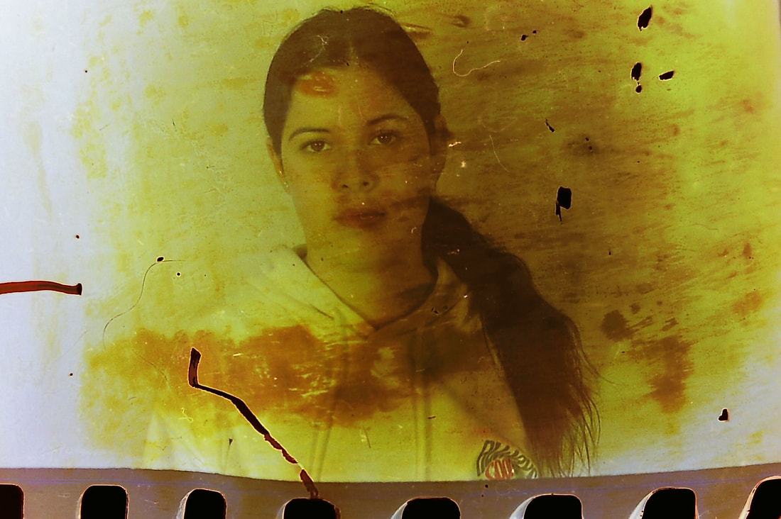
Experimenting with the negatives
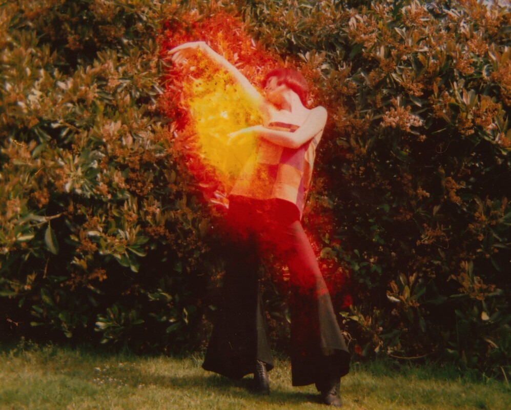
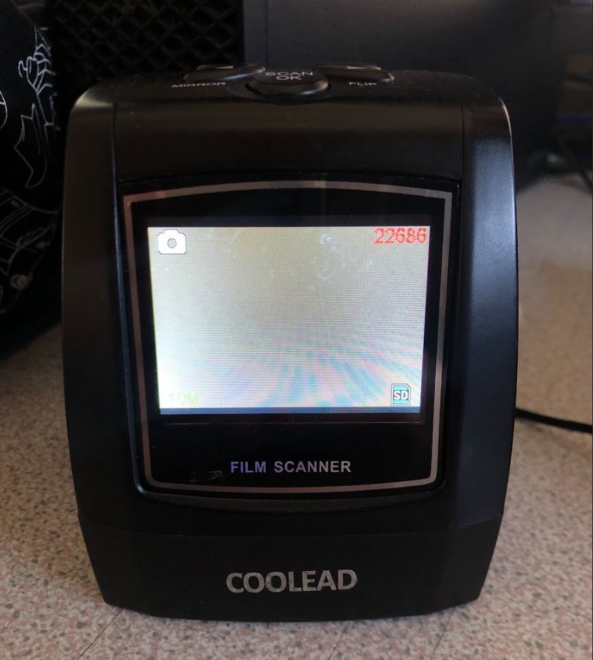
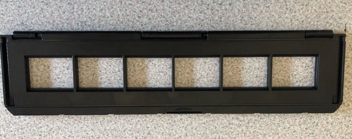
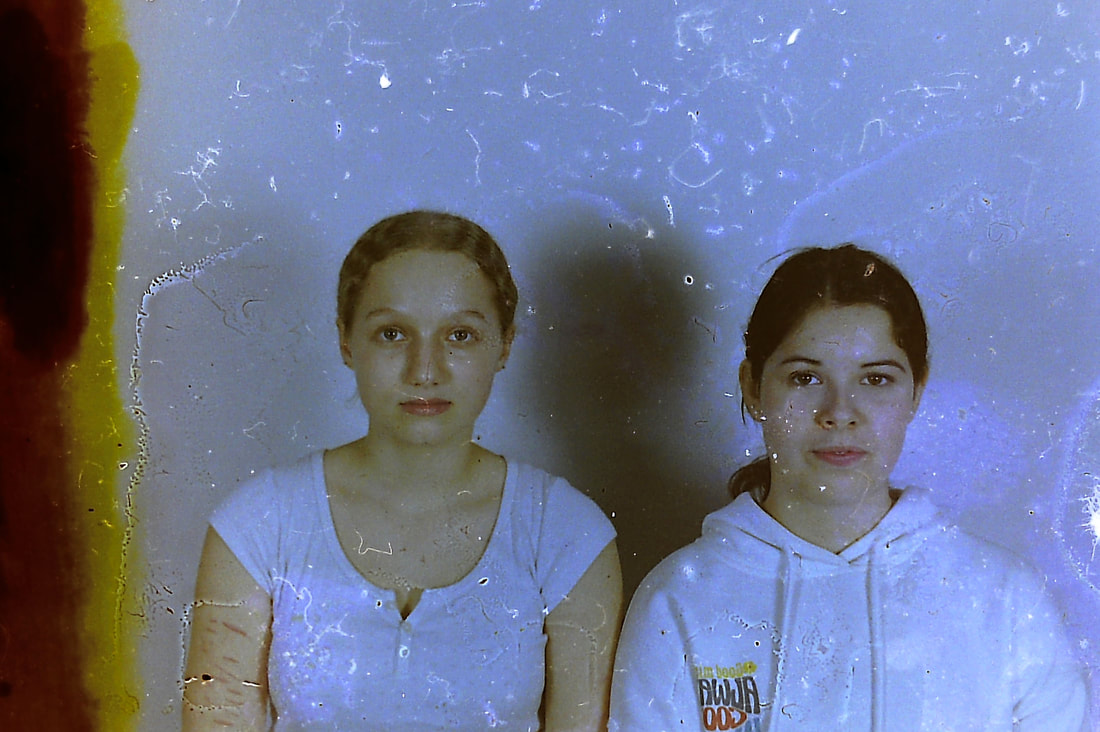
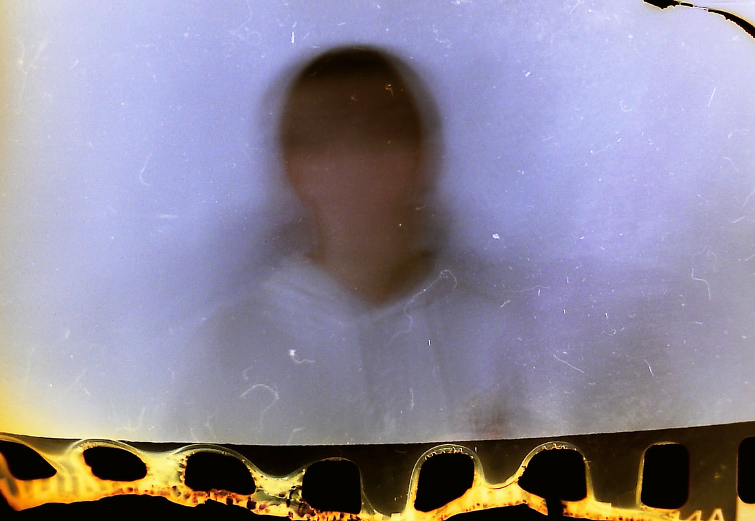
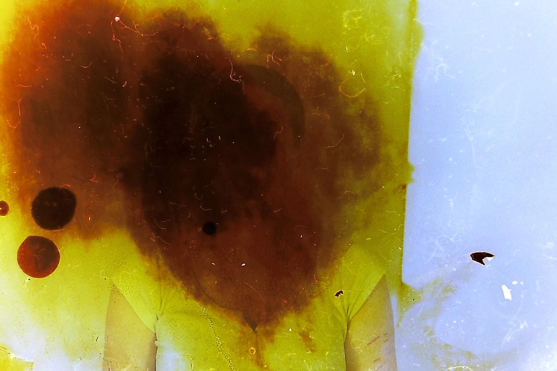
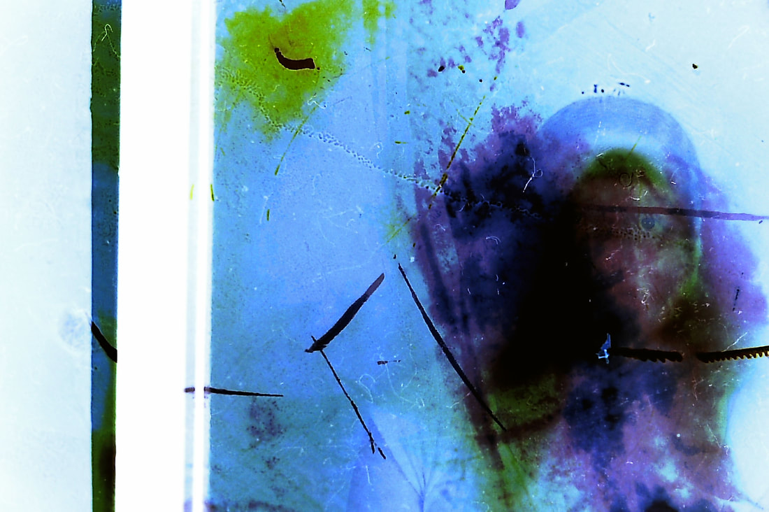
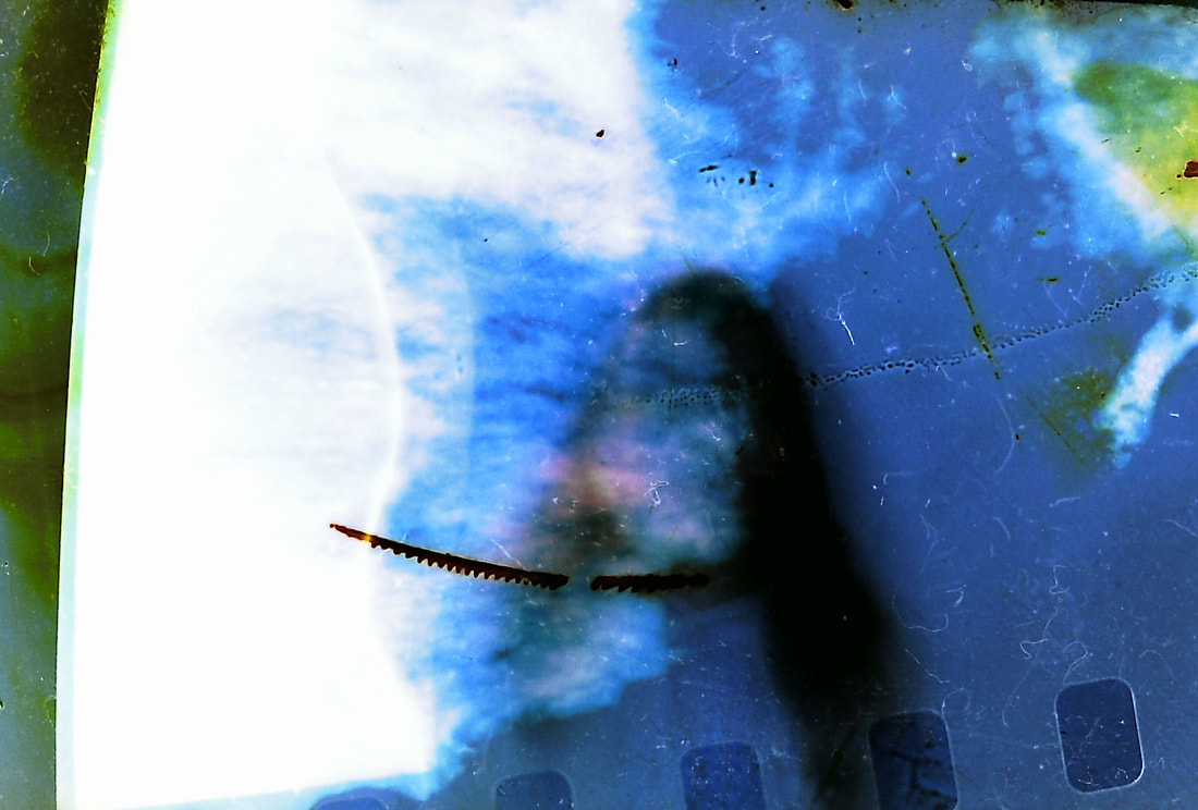
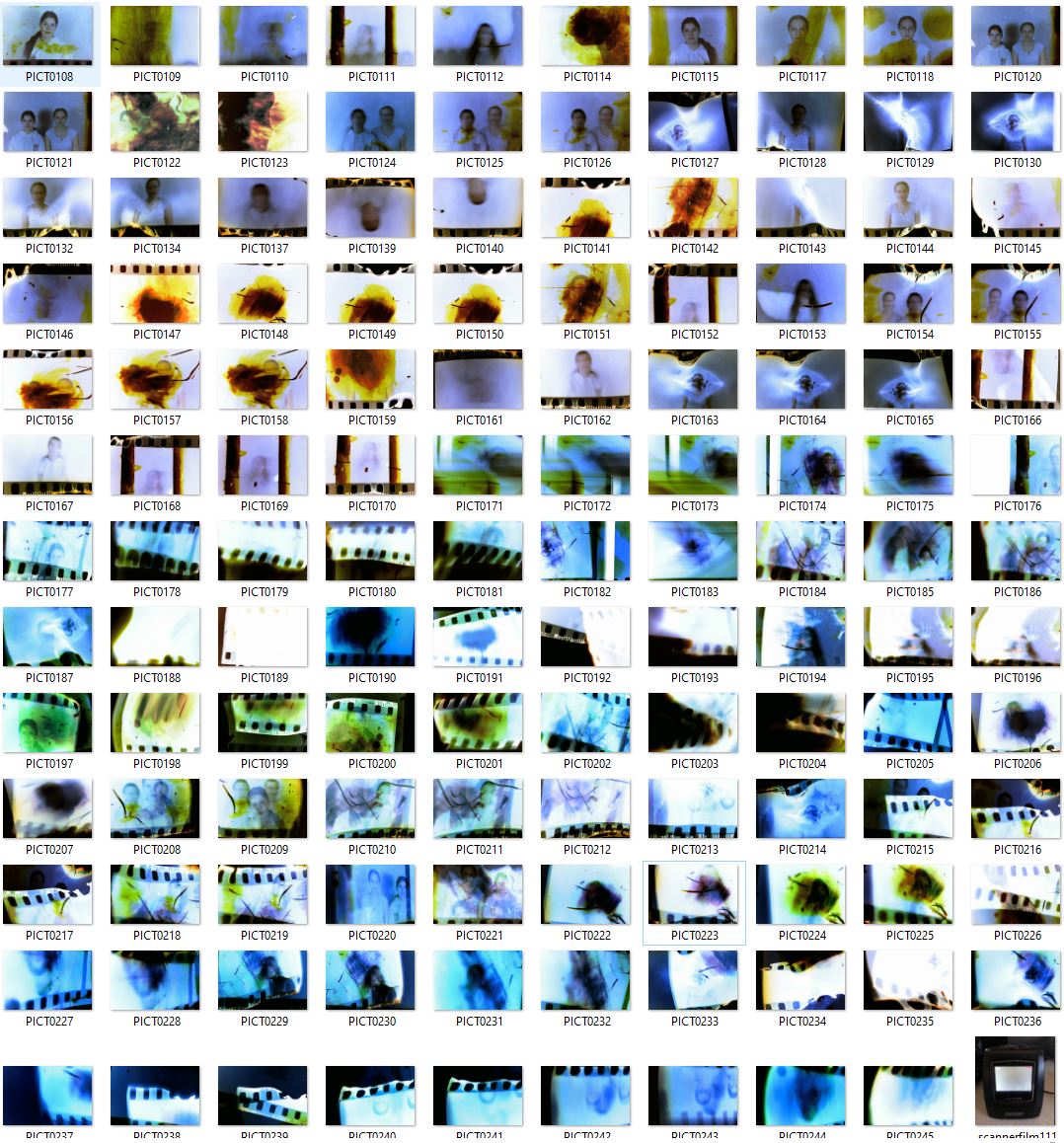
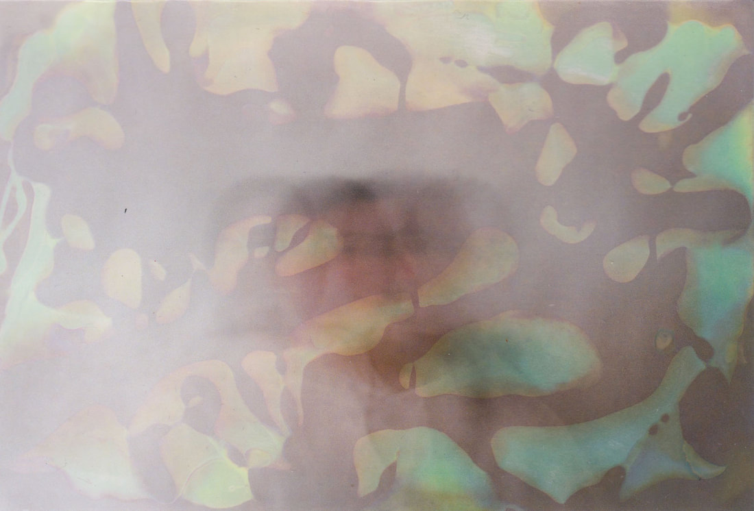
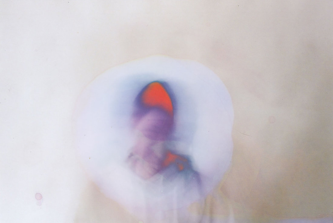
Firstly, I decided to manipulate the negatives to distort the portraits. I used different methods of abstracting them; painting with bleach, lemon juice, scratching, burning, and I also experimented with different household cleaning products such as window cleaner and acetone. I found the bleach to be the most effective substance because it is so strong that it really lifts the colour off of the negative, and it also creates nice deep red colouring which I think is very effective, especially when the bleach was around the face of the model, blurring their features and identity. What also worked really well was burning them. I used a lighter to burn the edges of the negatives, which created this interesting orange colour that curled up a bit in the corners, and this orangey red colour felt reminiscent of some of Jones' works. I also experimented with burning the centre of the negs, which twisted and bent some of the images, which again effectively distorted them. What I feel maybe didn't work so well was the acetone and other household cleaning products, as I just don't think they were strong enough. Additionally I put some of the negs into boiling water, or used the steam from a kettle to try and create another distortion effect, however after having attempting this a few times, I realised that it made no difference to the images at all. In terms of canning the natives, I used a film scanner which is displayed below, and I used the film tray to put them through the scanner. I also experimented without using the tray, which I think works a lot better, as it allows the viewer to see the burnt edges of the film, which I think is a really interesting and eye-catching effect especially with the orange tones that an the bent edges that it creates. I think these negative edits have been really successful in distorting poratrits in an interesting way.
|

|
Edits
|
|
|
|
|

|
|
|
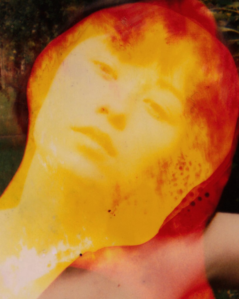
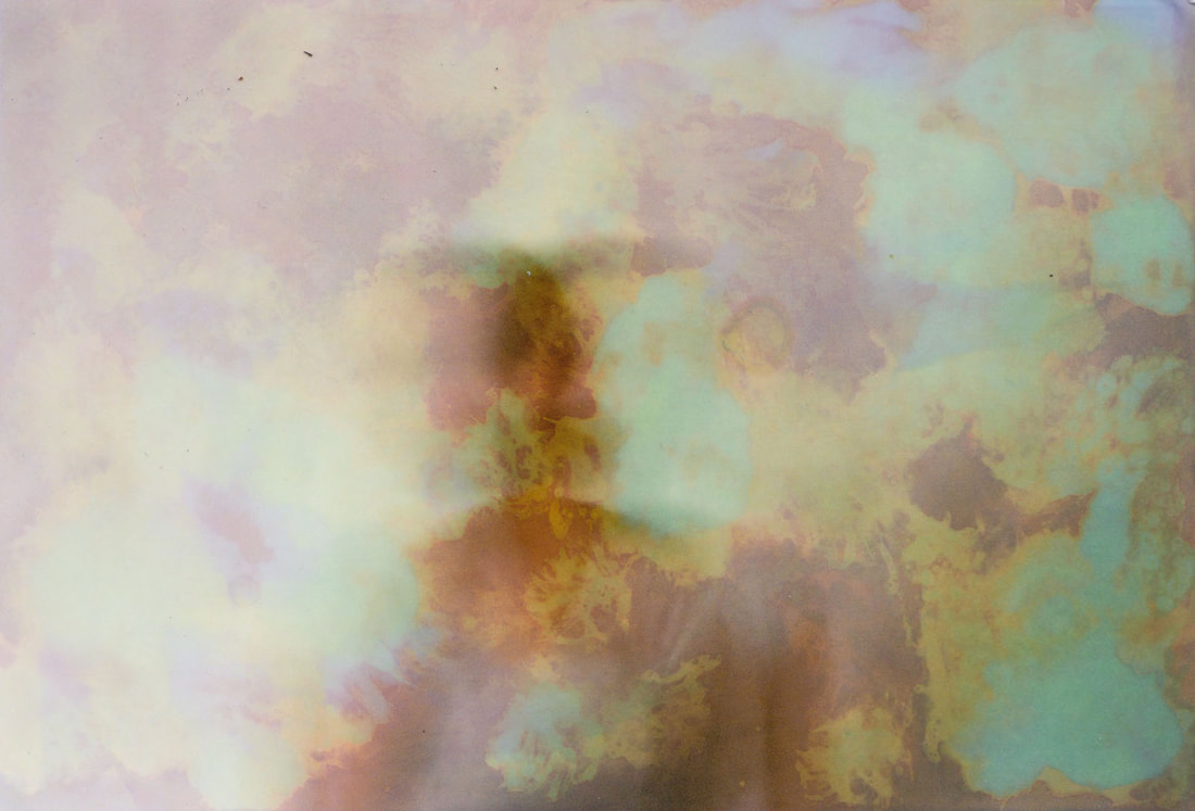
Artist and me
Upon reflecting on my response, I think this image on the right feels most reminiscent of Jones' work. There are definitely key similarities between these two images, the main being the colour; the yellows, reds and oranges that are deep and rich. Both photos use this colour to destroy the image, distorting the models face, which is the focal point of the image. One difference is that in my image, there's a lot of white in the right hand corner, and this is because I used too much bleach on the negative when I was painting it, and I did not wash it off quick enough and so too much ink had been lifted off of the negative. Overall, I think reveals my successful attempt at creating a distorted portrait inspired by the work of Rosanna Jones.

|
|
Development 15
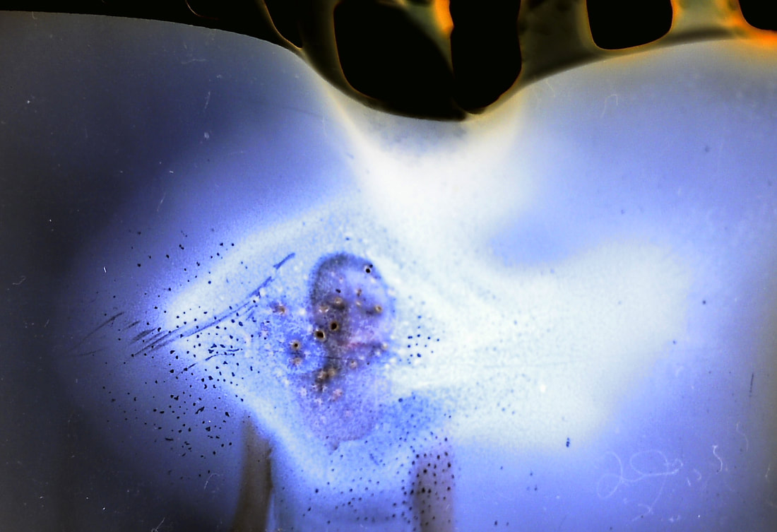
Further edits using the scanner to distort
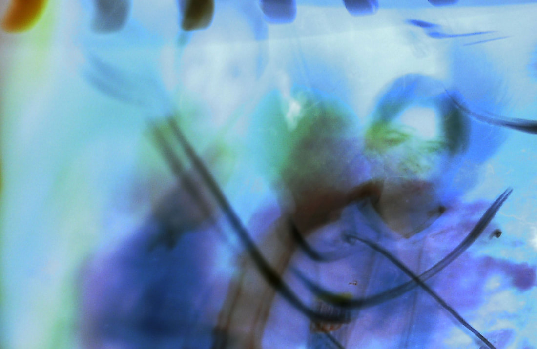
I decided to further experiment with the negatives, using the scanner this time to abstract them. I layered different negs on top of each other and put them through the scanner, sometimes moving them around a bit to create some blur or movement. This was a very experimentational process and was really down to trial and error. I downloaded the images and picked my favourite 6 to display below. Despite being very abstract, in each image you can make out a portrait or an outline of a person, and this was important to me as my aim was to convey our connection with tech. One thing I think could be improved from these edits would be the composition. While they are supposed to be abstract, I think maybe some are a little too off-centre and slightly crooked, so next time I might make sure that the photos are lined up more neatly.
|

|
|
|
|
|
Contact sheet
Development 16
Eduardo Gomez style edits using the film prints
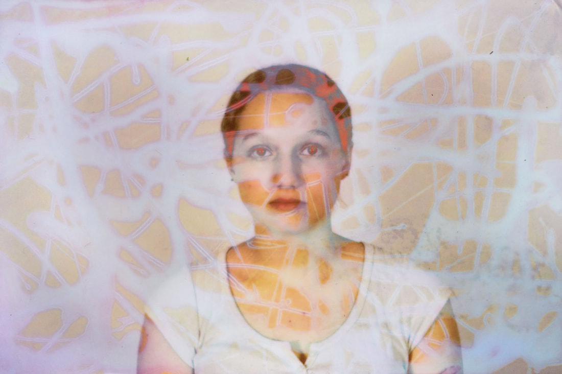
I then decided to create use the prints to create some glitch style edits, inspired by Eduardo Gomez ' work. To create these edits, I opened photoshop and opened a new page. I opened up my portrait photos into photoshop and on each one I enhanced the saturation quite high, and then edited the colour balance to make some bright vibrant portraits. I copied and pasted 4 or 5 of these images onto the new page and used the transform tool to make them fit together on the page. I then used the rectangular marquee tool to select small rectangular areas and I created a new layer for each selection, and then changed the colour balance and hue to create a different colour to the background. I repeated this step many times until I was happy with the final result. One thing about this editing process was that it was very time consuming as I had to individually select each different rectangular section. However despite this, I still managed to create 2 successful glitched edits inspired by Gomez glitch work, using the film pictures I had taken. The final result is very successful and I am pleased, I think these photos are very visually interesting and captivating.


Final Piece
Experimenting with the prints
For my final piece, my intention was to create a series of distorted portraits, with my overall intention of the photos presenting the increasingly close relationship between humans and technology. I decided to experiment with glitching and distorting the prints I have been working on, and I used similar methods to what I used on the negatives. The methods I used include:
-burning the edges of the prints
-bleach (painting, dipping the whole print in, creating patterns using bleach)
-a lemon (I covered a slice of lemon in bleach and imprinted it onto the images)
-scratching the images using scissors
-using honey to create a pattern and then dipping the print in bleach
-watercolours to enhance the colour or to create interesting patterns
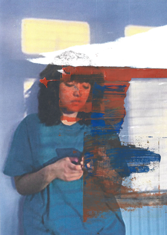
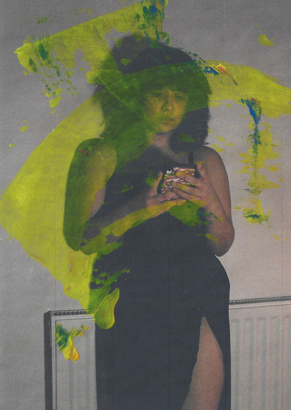
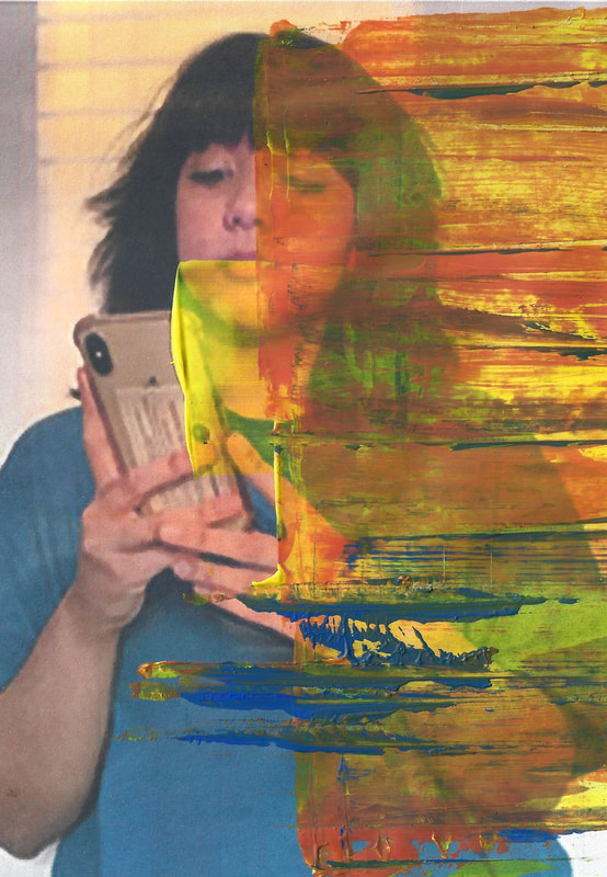
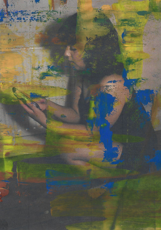
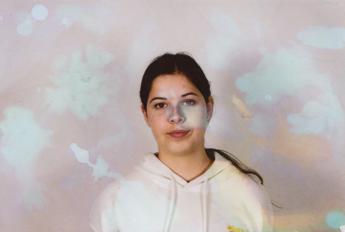
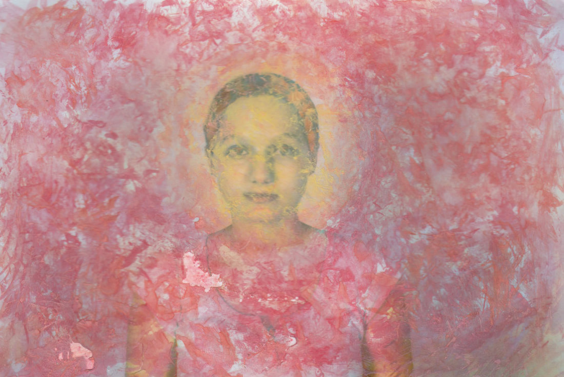
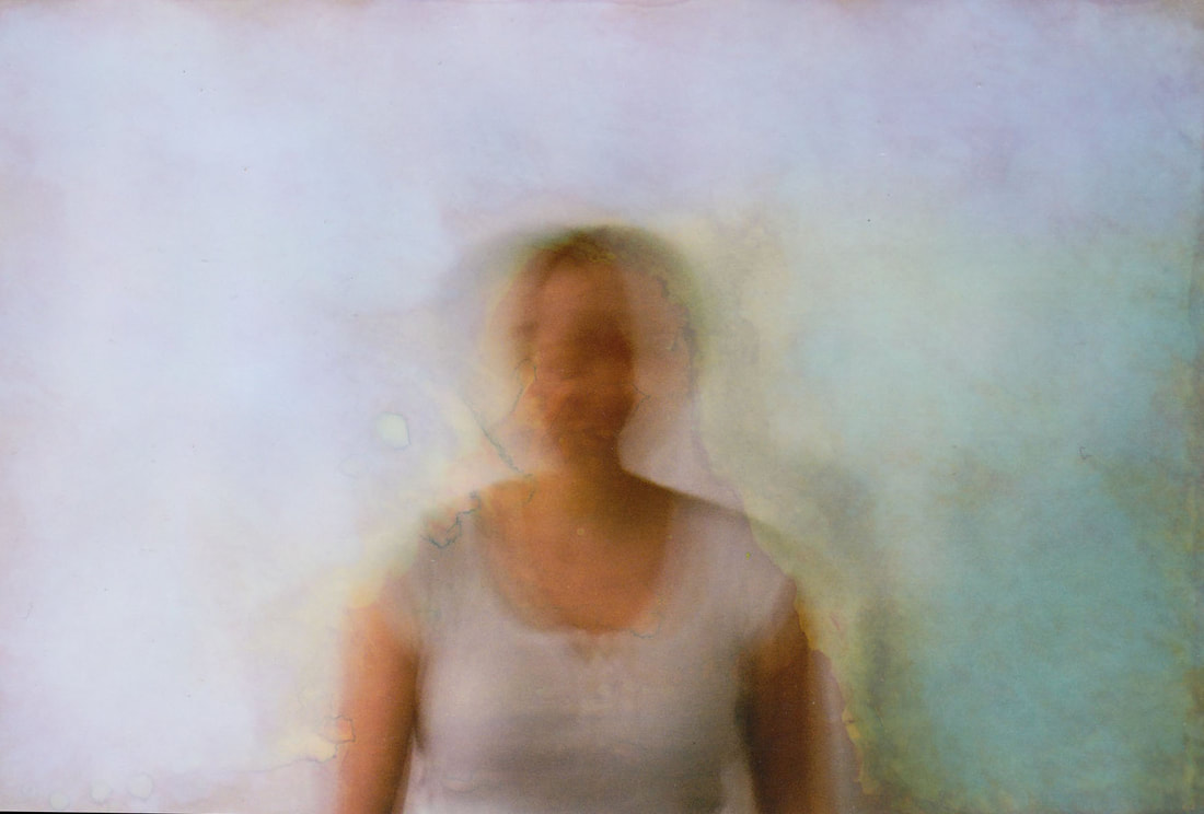
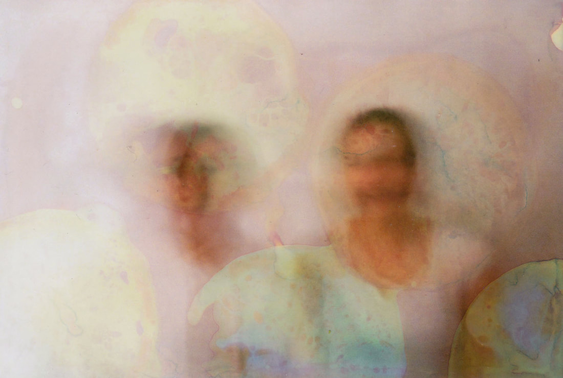
I found that the bleach was not as effective on the prints as it was on the negatives, instead of creating a red-orange tone like in Jones' work, bleaching the prints made them quite pastel and lightened the colours. The bleach was definitely much less intense on the images, and so I used watercolour paint to try and bring back some colour into some of the photos. I used colours such as purple, green and blue, to kind of enhance the effects of the bleach, making these photos more abstract and visually interesting. I found that the most effective methods was using lemon slices coated with bleach, printed onto the photos, and it made interesting patterns and colours, as the bleach mixed with the lemon juice made an interesting reaction on the photos. Burning the edges of the prints again as not as effective as it was when I was using negatives, and so I only experimented with this method of distortion on a few prints. The most successful photos are definitely the prints where I had used double exposure initially, as I think the combination of double exposure and the methods of distortion create a very abstract effect and reveal one of my intentions which was to portray the blurry lines between reality and fantasy in the world of social media. As I was distorting these photos, I made sure to keep a note of what I was using and how I created the different patterns, and I have detailed them by each image. I did also create some further edits combining the distorted negs and the distorted prints, however upon reflection I realised that they didn't quite fulfil my intention and my idea of my final piece, the photos felt a bit to busy and perhaps a bit too harsh and in your face. Once I had physically distorted my photos, I pulled my most successful 6 into photoshop, and slightly upped the saturation, to really enhance the colour in the photos. My final edits are all photos that were initially double exposed, and most of them I used bleached lemon slices and watercolour, and I think these 2 methods were definitely most effective and abstract. The almost pastel colouring of the photos gives them an almost dream like feel, reminiscent of Elena Kulikovas work. In photoshop I also used the clone stamp tool to get rid of any black spots or blemishes on the photos, which may be due to the scanner or any physical dirt from burning the edges. The main aim of my project was to portray the attachment between humans and technology, and to also bring in ideas of how social media is not authentic and distorts reality. I think what I have created here as my final piece is reflective of my intentions to comment on the rapid creating of technological advancements, using various methods of distortion to support my response.
-burning the edges of the prints
-bleach (painting, dipping the whole print in, creating patterns using bleach)
-a lemon (I covered a slice of lemon in bleach and imprinted it onto the images)
-scratching the images using scissors
-using honey to create a pattern and then dipping the print in bleach
-watercolours to enhance the colour or to create interesting patterns
I found that the bleach was not as effective on the prints as it was on the negatives, instead of creating a red-orange tone like in Jones' work, bleaching the prints made them quite pastel and lightened the colours. The bleach was definitely much less intense on the images, and so I used watercolour paint to try and bring back some colour into some of the photos. I used colours such as purple, green and blue, to kind of enhance the effects of the bleach, making these photos more abstract and visually interesting. I found that the most effective methods was using lemon slices coated with bleach, printed onto the photos, and it made interesting patterns and colours, as the bleach mixed with the lemon juice made an interesting reaction on the photos. Burning the edges of the prints again as not as effective as it was when I was using negatives, and so I only experimented with this method of distortion on a few prints. The most successful photos are definitely the prints where I had used double exposure initially, as I think the combination of double exposure and the methods of distortion create a very abstract effect and reveal one of my intentions which was to portray the blurry lines between reality and fantasy in the world of social media. As I was distorting these photos, I made sure to keep a note of what I was using and how I created the different patterns, and I have detailed them by each image. I did also create some further edits combining the distorted negs and the distorted prints, however upon reflection I realised that they didn't quite fulfil my intention and my idea of my final piece, the photos felt a bit to busy and perhaps a bit too harsh and in your face. Once I had physically distorted my photos, I pulled my most successful 6 into photoshop, and slightly upped the saturation, to really enhance the colour in the photos. My final edits are all photos that were initially double exposed, and most of them I used bleached lemon slices and watercolour, and I think these 2 methods were definitely most effective and abstract. The almost pastel colouring of the photos gives them an almost dream like feel, reminiscent of Elena Kulikovas work. In photoshop I also used the clone stamp tool to get rid of any black spots or blemishes on the photos, which may be due to the scanner or any physical dirt from burning the edges. The main aim of my project was to portray the attachment between humans and technology, and to also bring in ideas of how social media is not authentic and distorts reality. I think what I have created here as my final piece is reflective of my intentions to comment on the rapid creating of technological advancements, using various methods of distortion to support my response.
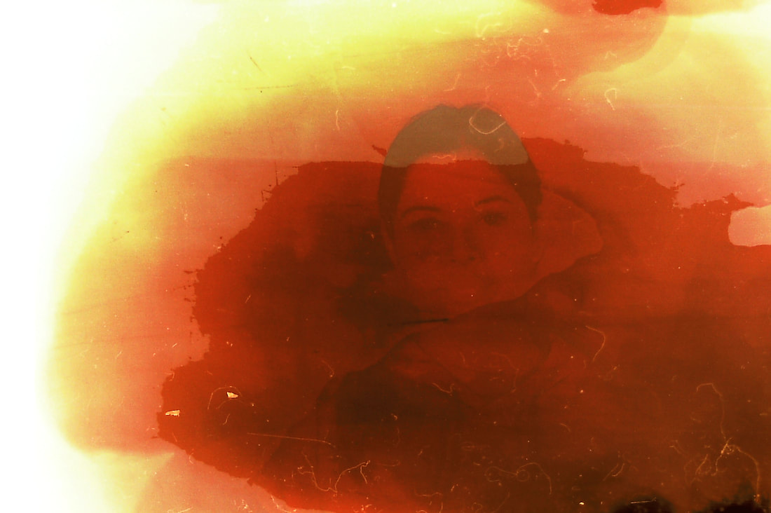
Response
On this image I used a paintbrush dipped in bleach and dabbed different parts of the image to create a distorted feel. I also dabbed a bit of lemon juice on, and the mix of these chemicals lifted off the top layer of the colour on the print, creating a blue hue.
|
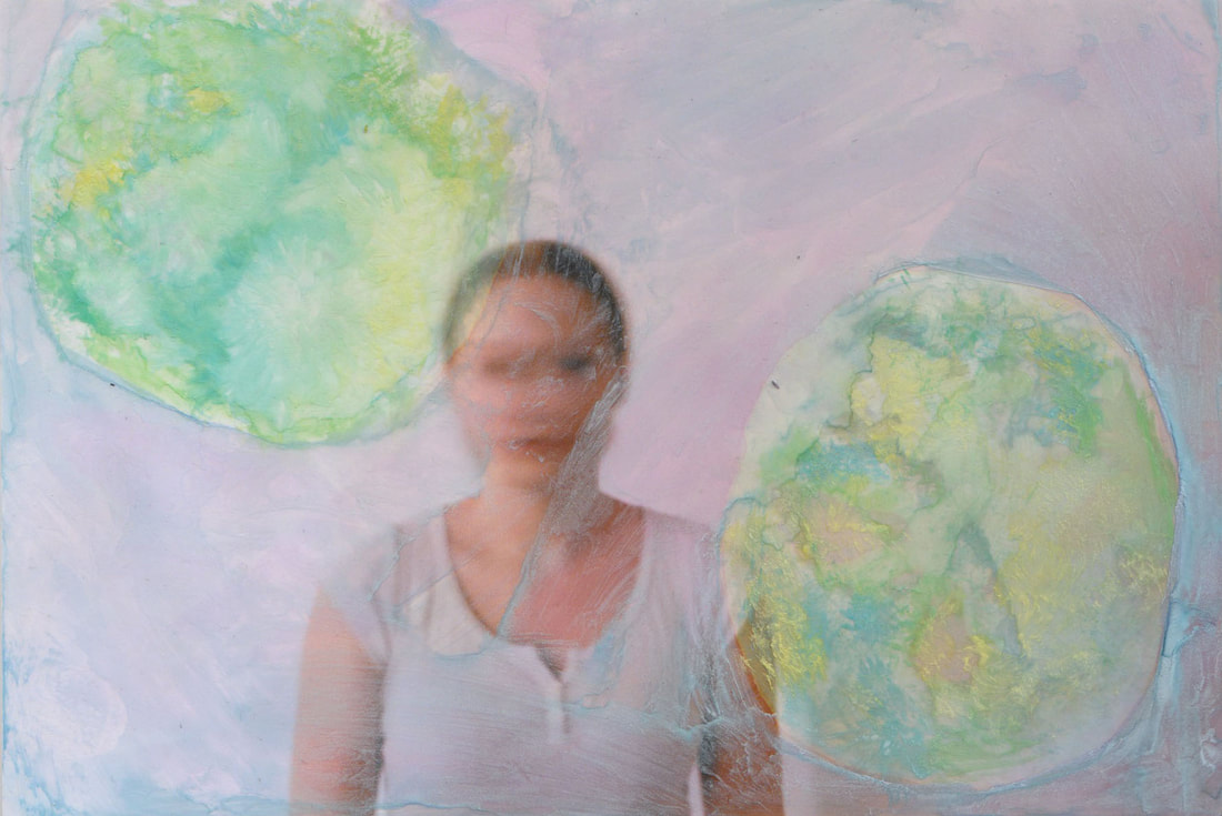
On this image I used 2 slices of lemon which I had coated in bleach, and printed them onto the image. I found that this didn't create as much of a dramatic change that I had anticipated, so I used watercolours to go over the areas where I had put the lemons. I used blues, greens, and yellows to cover these two circle areas, and then I used a light blue to go over the rest of the image.
|

On this image I painted on a thin layer of bleach over the whole photo, and I really like the pastel, almost ombre effect it created, with the different colours blending into each other. What also works well is that the subject starts to blend into the surroundings, fulfilling my intentions of distorting a portrait.
|
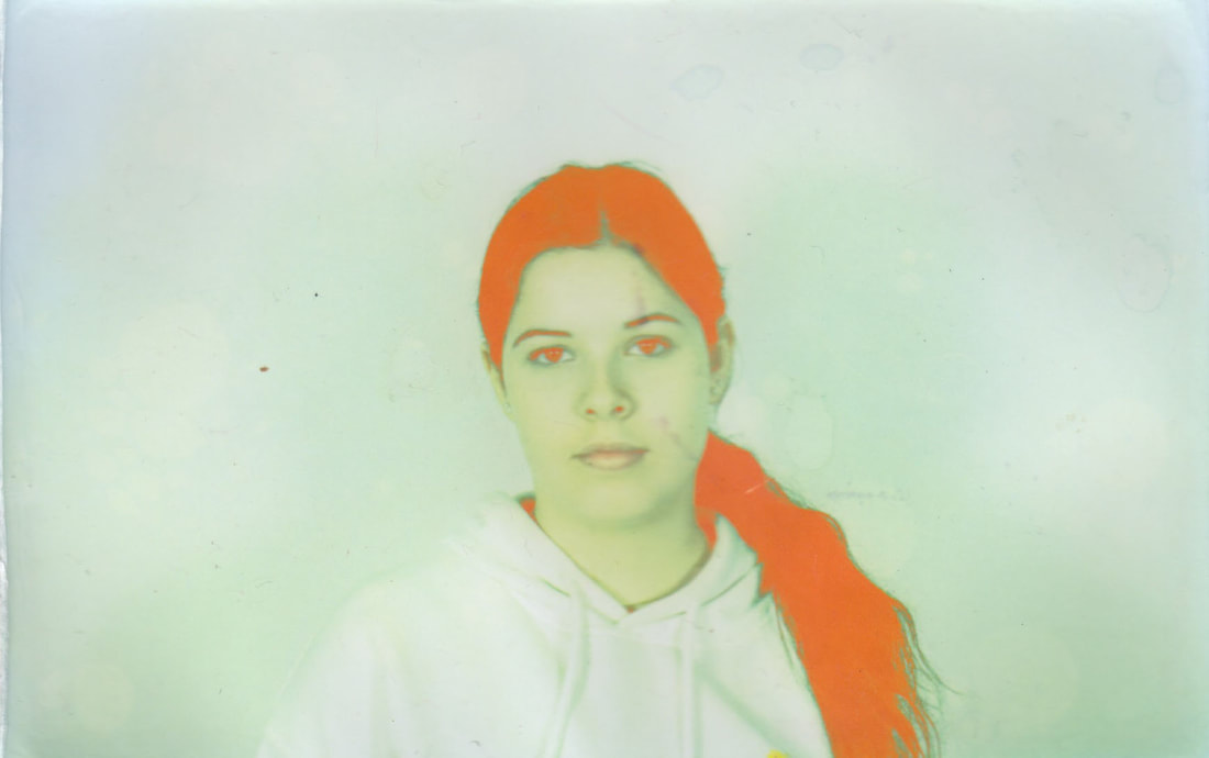
I dipped this entire print into bleach, leaving it in there for around 10 seconds, and then I quickly took it out and rinsed it with water to stop the reaction from continuing. What works well ere is the orangey colour this has created on the subjects hair, really contrasting with the subtler pastel green of the background.
|
On this image I used honey and I drizzled it over the image, covering up some spots more thoroughly than others. I then took my paintbrush and painted bleach onto the sections that I hadn't covering with honey, and then after about 10 seconds I rinsed the image in water taking off the honey and bleach. This resulted in quite an interesting pattern, with some sections left their original colour, and some with a more blue/green/orange tint.
|
On this image I used a thick paintbrush to paint bleach onto the entire image. Once I had let it rinse, I took some scissors and started to scratch the image to try and create an interesting pattern. I think maybe I let the bleach react for too long, as the image has come out quite pastel, meaning that the scratching is not as effective and is definitely less visible than I had hoped.
|
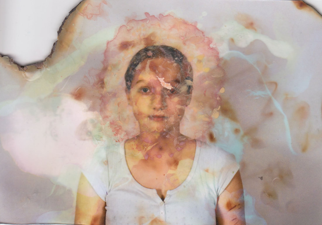
On this image I used a paintbrush and painted a few little lines and sections of bleach quite randomly. I then rinsed and used a lighter to burn the edges of the image, and finally went over the models face using watercolour to try and really distort her portrait. I used reds and yellows as I thought they would contrast well with the blues that I had created earlier with the bleach. I think this image is very effective.
|
On this image I used lemon slices coated in bleach and printed them on different areas of the image. I overlapped them on the portrait section of the image, resulting in this red/orange effect that is rather striking and becomes the focal point of the image. It contrasts with the lighter colours in the background and surrounding areas, and I think this photo is very effective.
|
On this image I used purely watercolour to distort the photo, creating a circle of yellow and orange around the models face, and then kind of blending it out into a darker red colours in the surrounding areas. I think this make the face the focal point of the image and also blurs out the rest of her body, which I think is quite endearing and visually interesting.
|
On this image I used I used a paintbrush and painted a circle using bleach around the subjects face. I repeated this step twice and I really wanted the centre to pop and for the hair to turn a red colour, and I think the result is a very striking image.
|

On this image I used a paintbrush to paint on bleach and lemon juice onto different parts of the image. Once rinsed I used a lighter to burn the edges, and looking back now I think perhaps I should have burnt the edges even more and experimented further, to make it more striking.
|
On this image I used a paintbrush, and painted strokes of lemon juice and bleach over the whole image, lifting the colour to reveal different colours; blues, purples, reds, greens.
|
On this image I used honey and dabbed it in a few little spots, and then dipped the print in bleach. This resulted in an interesting pattern, leaving some sections with a purple/grey hue, and the rest of the background a bright blue/green colour. I Also managed to create the striking red colour in the centre on the models hair, which was created by the reaction with bleach.
|
On this image I used multiple slices of lemon coated in bleach and printed them onto the photo, pressing them down for about 30 seconds each time. I layered them a few time, overlapping the previous sections where I had printed the lemon.
|
On this image I again used slices of lemon coated in bleach, and I think this is my most successful attempt at this technique. This is because the image itself was much darker to begin with, with the background being quite grey, and so the contrast between the background and the bleached areas is much more visible. I think this image is very effective and striking, with the texture of the lemon creating interesting patterns and marks on the print.
|
On this image I used a paintbrush and dotted bleach and lemon juice around the image. This resulted in the interesting patterns and dots of colours that are all over the print.
|
On this image again i used a paintbrush to paint the whole thing with bleach. I focused on some areas more than others, concentrating the bleach in certain areas to really lift of the top layer of colour to reveals the blues undrneath.
|
With this image, I sued a rougher paintbrush, and dabbed the bleach all around the portrait. I think this more forceful and rougher technique has created some interesting contrasts and patterns; the portrait is unrecognisable and in the centre of the image the yellow really contrasts with the background.
|
On this image i dipped it in bleach for only around 5 seconds and quickly rinsed it. I then went over it with water colours, enhancing the green turquoise colours in the right hand bottom corner.
|
In this image I used a spoon to drip the bleach in lines across the print. I left the bleach on for around 20 seconds before rinsing it with water.
|
Finally, in this image I again sued honey and poured it over sections of the print. I then used a light layer of bleach to fill in the rest of the photo, and rinsed, resulting in this interesting pattern and some red/orange tones.
Combining distorted negs and prints - experimenting
I also decided to create some edits combining both the negatives and the the prints, and to do this I pulled the photos into photoshop. I picked the negs where I had burned the edges to create the fiery effect, and I copy and pasted the top edge and bottom edge of the neg and I placed them on top of the scans of the prints. I chose to use the fiery edges as I thought they were very striking and interesting, however I think the edges of the are photos a bit too busy and a bit too bold, almost taking away from the dream like effect that I was set on creating.

|
|
|

|
Best Final Edits
This is my final piece. They are my best six edits of the distorted prints. As I explained I mainly used the saturation and clone stamp tool on Photoshop to enhance the colours and to get rid of any blemishes or darker spots in the photos. These edits are most successful as they combine different methods and techniques of glitching and distortion that I have worked on throughout this project, and the final result is a successful set of abstract, dream-like, blurred, distorted portraits that echo the attachment between people and technology and the internet. As I stated earlier, the main aim of my project was to portray the attachment between humans and technology, and to also bring in ideas of how social media is not authentic and distorts reality. I think what I have created here as my final piece is reflective of my intentions to comment on the rapid creating of technological advancements, using various methods of distortion to support my response.
|

|
|
|

|

|
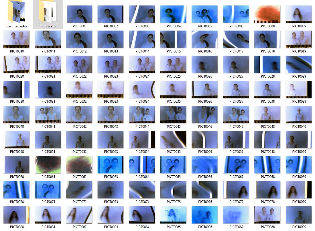
'Attached' project development